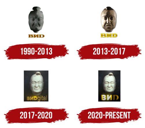
The VIDgital logo, introduced in 2017, underwent a significant refinement in 2020. The logo featuring the smiling head of Guo Xiang saw the golden sheen of the letters removed, thereby enhancing the simplicity and cleanliness of the mask’s shapes and contours. The wordmark was shortened back to ‘VID,’ steering the overall mood of the logo back toward simplicity, professionalism, and confidence.
This new iteration of the logo suggests a brand that values simplicity and clarity in its communication, signified by the straightforward design and clean lines. The smiling Guo Xiang could represent VIDgital’s aim to evoke a sense of joy and positivity in their audience, aligning with the cheerful and entertaining content they produce.
The shift from the golden shine to a more muted tone demonstrates a shift towards professionalism and seriousness, suggesting that the logo platform is committed to delivering high-quality content. This is reinforced by the reduction of the wordmark back to ‘VID,’ simplifying the logo and making it easier to recognize and remember.
The overall tone of the VIDgital emblem, with its emphasis on simplicity, professionalism, and confidence, accurately conveys the brand’s identity. The logo suggests that company values clear, quality content and seeks to deliver a positive and enjoyable experience to its audience.
VIDgital: Brand overview
| Founded: | 1987 |
| Founder: | Vladislav Listyev, Andrey Rasbash, Alexander Lyubimov, Alexander Politkovsky, Ivan Demidov, Alexander Gorozhankin |
| Headquarters: | Moscow, Russia |
| Website: | vid.ru |
VIDgital, formally known simply as VID and stylized as ВИD in Russian, is a distinguished brand in the media and entertainment industry, well-recognized for its significant contributions to television production and broadcasting.
The brand has managed to carve a niche for itself with a diverse array of programming, including game shows, documentaries, and dramas, that appeal to a wide spectrum of viewers. Through its content, the brand showcases an adept understanding of the audience’s preferences, curating shows that captivate, educate, and entertain.
Meaning and History
VIDgital’s brand identity is underpinned by its stylized logo, which symbolizes the brand’s creativity and innovation. The logo, a combination of Russian letters forming “ВИD,” is minimalist yet memorable, reflecting the brand’s ability to communicate powerful messages through simple and effective storytelling.
The brand’s tagline, “Зрительным искусствам,” translates to “For the visual arts.” This succinctly encapsulates its commitment to promoting the visual arts through its broadcast content, further demonstrating its unwavering dedication to providing high-quality, meaningful entertainment.
The commitment to the viewer, coupled with an innovative approach to content creation, has helped establish the brand as a reliable and respected name in the world of television production and broadcasting.
What is VIDgital?
VIDgital is a Russian television company founded in 1987, with its headquarters in Moscow, Russia. Known for its production and broadcasting of various television shows, it has made significant contributions to the entertainment landscape in Russia. In addition to production, VIDgital also provides other media services like distribution and licensing of content.
1990 – 2013
2013 – 2017
2017 – 2020
2020 – today
VIDgital color codes
| Mustard Green | Hex color: | #d4cc20 |
|---|---|---|
| RGB: | 212 204 32 | |
| CMYK: | 0 4 85 17 | |
| Pantone: | PMS 605 C |
| Black | Hex color: | #020302 |
|---|---|---|
| RGB: | 2 3 2 | |
| CMYK: | 33 0 33 99 | |
| Pantone: | PMS Black 6 C |
| Pastel Gray | Hex color: | #d3ddc9 |
|---|---|---|
| RGB: | 211 221 201 | |
| CMYK: | 5 0 9 13 | |
| Pantone: | PMS 621 C |


