The time spent with the channel is hours of joy and entertainment. The TV studio brings a lot of humor, love, and useful information into the lives of children. The Nickelodeon logo represents a friendly space for the next generation.
Nickelodeon: Brand overview
Meaning and History
Nickelodeon opened subsidiaries and programmed thematic blocks throughout its career before becoming a self-contained universe. In January 1988, Nick Jr.’s morning and afternoon cycles were launched, targeting preschoolers. In the summer of 1991, Nicktoons appeared, presenting original cartoons and becoming a brand in its own right. It is now a separate channel that debuted in 2002.
In 1999, Nickelodeon partnered with Sesame Workshop to form the Noggin education division. It became the first unique TV program with its interactive website. Later (in 2009), the teenage TV block TeenNick appeared, created based on TEENick and The N. So, the world of children’s TV broadcasting gradually became independent. She had followers in many countries. Gradually, original films, amusement parks, and even themed cruises were added.
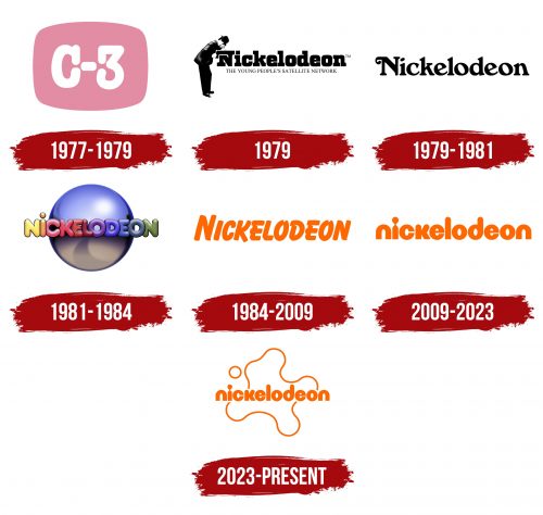
The name of the TV channel used in the logo is associated with the first five-cent cinemas that bore the name “nickelodeons.” In the course of evolution, the emblem has changed, improved, and adapted to modern requirements as the children’s broadcast network has dramatically expanded. There are six variants of the personal sign in her arsenal.
What is Nickelodeon?
It is an American television channel targeting children and adolescents between the ages of two and seventeen. It is based in New York and is owned by ViacomCBS. The official launch of the television network took place in 1979.
1977 – 1979
After the program’s opening, it has not yet received its logo because it was an interactive cable TV project called QUBE, which was part of its structure. Warner Cable launched it as a dedicated channel C-3, later given over to Nickelodeon. The logo fully corresponded to its name. It was a purple geometric shape that mirrored a television screen’s outline. It bore the white lettering “C-3” in characters with large serifs at the top. Moreover, the letter and the number had them, making them a little similar.
1979
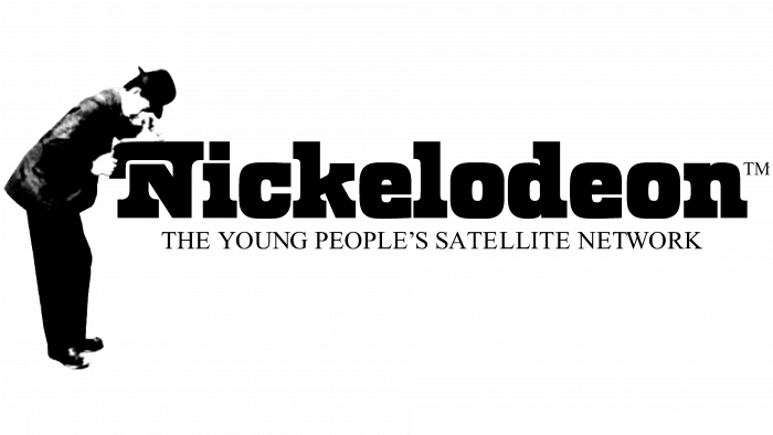
On April 1, 1979, the name and the first brand name of the children’s television network appeared. It got its name from the cinema, which cost one nickel (five cents) to enter. It was this concept that was reflected in the logo. It depicted a man standing near a movie camera. He seemed to be showing a film: he looked down (presumably through a kinescope) and held the cinema equipment with his hands. It was played by “N” – the first letter in the word “Nickelodeon,” written in the Odin Becker font. At the bottom was the phrase “The Young People’s Satellite Network” in serif characters. The operator wore a jacket, trousers, hat, and boots, indicating that he was officially dressed and was at work. Joseph Iozzi authored this version.
1979 – 1981
The next emblem was based on the Windsor Bold typeface. The developer also removed the person and slogan that were written at the bottom. Now, all the space was occupied by the channel’s name. In the word “Nickelodeon,” all characters were lowercase, except for the first. The tops of “k,” “l,” and “d” were the same, while “N” had a left-sided curl.
1981 – 1984
The concept of the new emblem belongs to Lou Dorfsman. He matched the silver-blue balloon designed by Bob Klein with the television network name made by the Frankfurter typeface. This is a volumetric font, where each letter looks filled with air. All symbols were multi-colored: “N” yellow, “I” orange, “C” pink, “K” red, “E” light brown, “L” burgundy, “O” purple, “D” light lilac, “E “is blue,” O “is blue,” N “is green. Among them, only “i” was lowercase; the rest were uppercase. The background ball also had several shades: at the top, it was bluish-cobalt with a white sheen; at the bottom, it was silvery-violet. The logo was animated on the screen. In 2012, he moved on to a subsidiary project, Nick Jr.
1984 – 2009
Since 1984, the children’s channel began to use different versions of the inscriptions, made in the Balloon Extra Bold font. Later, the “splat” style began to prevail. The search continued until Fred / Alan, Inc. did not offer her version of the logo, which received massive recognition. Corey McPherson Nash and Tom Pomposello are also designers. The emblem was orange lettering with slightly oblique uppercase letters. The lower leg “K” was longer than usual and protruded beyond the word boundary. The “E” on the left had a slice, and the middle bar was out of bounds. At the top of both “O’s,” there was a triangular ledge.
2009 – 2023
Management approved a different logo designed by Eric Zim, aiming at a simpler and more childish style. The design proposed by Trollbäck & Company (2009-2011) was used for the broadcasts. To update the logo, the author converted all letters to lowercase and returned the typeface resembling the bubble characters Bauhaus (unofficial name Litebulb). Small characters have become streamlined and rounded. “D” has an angle at the bottom right, “n” now resembles an “o” without the bottom, and “i” has a dot connected to a stick, so it looks like a miniature man. This logo was voted the best and took third place in the Brand New Awards 2010.
2023 – today
In a historic move, Nickelodeon has opted for a logo redesign after 14 years, breathing new life into their renowned ‘Splat’ emblem of the ’90s. This transformation ushers in a sophisticated, rounded, and textured version of the logo that oozes a contemporary and inviting charm.
Despite its novel appearance, the fresh rendition subtly maintains a strong connection to the image of the 1980s, ensuring it’s immediately recognizable to the audience. Rogers, a key figure in the design process, highlights the objective of this rebranding: to carve out a versatile identity that could seamlessly represent the brand across different platforms, such as TV, digital channels, and social media. This transformation also paves the way for adapting to future creative trends while keeping a child’s perspective at the forefront.
The reinvention of the ‘Splat’ logo stems from a system of circular grids, lending a hand in generating extra shapes on the same grid, thus enhancing the central symbol. Keeping true to Nickelodeon’s roots, the animation chosen is a fusion of traditional target animation and cutting-edge 3D design, aligning with the brand’s classic style.
Regarding the color scheme, the signature Nickelodeon orange has been retained but is further enriched with a gradient mix of purple, yellow, and pink hues. Adding meticulously calibrated typography imparts a sense of modernity and crispness to the image. A duo of fonts, ROC Grotesk and Neue Plak, balance gracefulness and a more fun, compact style. Rogers articulates that choosing these fonts opens up a vast realm of possibilities for the future evolution of the brand.
The redesigned Nickelodeon logo represents a nostalgic journey with a modern touch. It captures the essence of the brand’s rich history while embracing the ever-changing path of media and entertainment. Through this transformation, Nickelodeon solidifies its position as a timeless and beloved brand, resonating with both past and present generations of viewers.
Nickelodeon: Interesting Facts
Nickelodeon, also known as Nick, is a big name in kids’ entertainment. It started in 1979 as the first cable channel just for kids. It’s a worldwide sensation with TV shows, movies, online stuff, and even theme parks.
- Beginning: Nickelodeon started broadcasting on December 1, 1979, as Pinwheel, focusing on educational content for kids. The same year, it changed to Nickelodeon, mixing fun with learning.
- The Orange Logo: In 1984, Nickelodeon introduced its famous orange logo, which looks like a splat. Although this logo has been redesigned a few times, it always maintains its playful vibe and orange color.
- Nickelodeon Studios: Opened in 1990 in Florida, this place was where they made a lot of their shows. It also had fun stuff for visitors to do, like watching shows being made. It closed in 2005 but had a big impact for 15 years.
- Innovative Shows: Nickelodeon was the first to have a morning block of cartoons called “Nicktoons” in 1991. This included classics like “Doug,” “Rugrats,” and “The Ren & Stimpy Show.”
- Nick at Nite: This channel started in 1985 and was for a wider audience. It showed reruns of old sitcoms at night, a new way to get adults to watch a kids’ channel in the evening.
- Going Global: Nickelodeon now has channels and shows worldwide, making its characters globally known.
- Kids’ Choice Awards: Since 1988, this awards show lets kids vote for their favorites in movies, TV, and music. It’s famous for slimming celebrities and has an orange carpet.
- Nickelodeon Movies: Started in 1995, this part of Nick makes movies based on their shows and original ideas. Hits include “The SpongeBob SquarePants Movie” and “Rango.”
- SpongeBob SquarePants: Since its start in 1999, SpongeBob became super popular, leading to movies, merchandise, and even a musical. It’s a big part of Nickelodeon’s success.
- Helping Out: Nickelodeon also focuses on educating kids and helping with social issues through programs like “The Big Help” and “Nick News,” covering environmental and civics topics.
Nickelodeon has made a lasting impression on kids’ TV. It is known for its mix of fun, creativity, and learning, which are big parts of childhood worldwide.
Font and Colors
The TV channel has a few more visual identity signs, but these are basic. Moreover, after the redesign, the children’s TV network does not completely remove the logo – it transfers some of it to its departments and programs for use. The emphasis was on graphics in early versions, but then it was abandoned; it remained only in animated versions.
Nickelodeon tried different typefaces for its identity, including Odin Becker, Windsor Bold, Frankfurter, Balloon Extra Bold, and Bauhaus (or Litebulb).
The corporate logo palette was initially monochrome and then rainbow. But since 1984, only one color has been used—orange. It is considered official.
FAQ
What is the Nickelodeon symbol?
The channel’s logo has changed greatly to suit its focus and viewership. The original logo was unique. It showed a man looking into a nickelodeon, an old movie player, inside the letter “H.” This design paid homage to early movie theaters, where people watched movies for five cents.
The logo started as a family project. Joseph Iozzi II, the designer’s son, was the first advertising model, adding personality to the brand image. Lubalin, Smith, Carnase, Inc. created the logo font, which is known for its fresh approach to type design. Their work ensured the logo was easy to read and matched the brand’s playful and creative style. Over time, the brand has moved toward simpler, more modern logos that better appeal to today’s viewers.
What is the nickname of the slime logo on Nickelodeon?
The logo, commonly called the “splat,” was inspired by the brand’s iconic green slime. This slime became a key feature in “You Can’t Do That on Television” and quickly became associated with the brand. The use of slime in various shows has made the brand famous for creating interactive and memorable TV moments that children love.
Why did Nickelodeon change its logo?
The brand updated its logo to highlight the uniqueness of its new channels and expand its services. The new logo must be simple and versatile, fitting well across multiple media platforms and marketing needs. This change was important to make it easily recognizable across the various branches.
Saima Zarghami, the company’s chief executive, noted that the updated logo was designed to be a universal symbol of the brand, linking all its different parts into one coherent image. This streamlined design helps viewers easily recognize the brand, which is crucial for maintaining its strength and presence in a competitive media environment where visual consistency is key.
What was the original Nickelodeon logo?
The original Nickelodeon logo debuted on C-3 and featured a purple television screen. The brand name was displayed in a serif font, and the letters and numbers looked the same, giving the logo a unified look. The logo featured a man in a black suit, adding a recognizable human touch to the design. This logo helped create a distinctive and creative brand identity in the entertainment industry.
When did Nick change its logo?
In 2009, the brand significantly updated its logo to give it a modern look and align it with its expanding services and media platforms. Most recently, in 2021, the logo was changed to a blue color scheme. These changes aim to keep the brand’s visual identity fresh and attractive.
Why is the Nick logo blue today?
In March 2021, Nick’s logo changed to blue in support of the launch of Paramount+. This update was about a new color that made the logo visible on all screens and helped differentiate the different divisions of the brand. The blue logo is part of a broader branding strategy to make the brand more recognizable and consistent across platforms.
