![]() MTV Logo PNG
MTV Logo PNG
Music with a capital letter sounds on the channel. The MTV logo shows admiration for magical chords. Broadcasts may cover only a small percentage of all the content created in the world, but they do so with style and taste.
In the late 1970s, Warner-Amex Satellite Entertainment, a joint venture of Warner Communications and American Express, identified a gap in television for young audiences. Robert Pittman, a former WNBC program director, worked on music video formats. At the same time, John Lack supported PopClips, created by Michael Nesmith of The Monkees.
On August 1, 1981, at 12:01 a.m. ET, MTV launched. John Lack opened the broadcast with “Ladies and gentlemen, rock and roll,” over footage of the Space Shuttle Columbia. The first video aired was “Video Killed the Radio Star” by The Buggles.
Early distribution was limited to parts of New Jersey. To present the channel to advertisers and record labels, MTV staff brought them to a rented apartment in Fort Lee. Programming followed a radio structure, with five video jockeys introducing clips and news, while record labels supplied content free of charge.
In its early years, MTV faced criticism for limited rotation of Black artists within its album-oriented rock format. In 1983, under pressure from CBS Records, the channel aired Michael Jackson’s “Billie Jean,” followed by “Beat It” and “Thriller,” increasing exposure for artists such as Duran Duran, Madonna, ZZ Top, and Tina Turner.
In 1984, MTV launched the Video Music Awards. The same year, MTV Networks became a separate public company. In 1985–1986, Viacom acquired MTV Networks, adding VH1 and Nickelodeon. In 1987, MTV expanded internationally with the launch of MTV Europe.
In 1992, MTV introduced The Real World, marking a shift toward reality programming. By the late 1990s, shows like Total Request Live shaped pop exposure for artists such as Britney Spears and Eminem. By the 2000s, programs like Jackass, The Osbournes, and Jersey Shore replaced music videos. TRL ended in 2008.
Meaning and History
![]()
Before becoming MTV, the channel was called The Music Channel and used a different logo. The only thing that unites them is the large “M” formed from the word “music” with a specific designation on the side. Initially, it was a note; now, it is a “TV ” icon concept by the Manhattan Design agency.
What is MTV?
MTV stands for Music Television, an American 24-hour music channel. It is owned by MTV Entertainment Group, which is part of Paramount Media Networks. The channel was founded in 1981, and its headquarters is in New York City.
1977 – 1981 (pre-launch)
![]()
First, Warner Cable started a channel called Sight on Sound. He was experimental and concerned with all aspects of music. It was on this basis that the now-famous MTV was subsequently created. He had his badge, which exactly echoed the name. It was an improvised eye; therefore, it had a round shape, and the phrase “Sight on Sound” was compactly inscribed and occupied three rows, each with one word.
The lines were aligned on two sides. The legs “n” and “d” were connected to form a single solid line on the right. On the left, the capital “S” and “g” rested against the semicircle wall. The inscriptions were curly, with bold letters and smooth transitions. The lowercase “o” looked like an inverted recording microphone hanging from a stand.
1980 – 1981 (pre-launch)
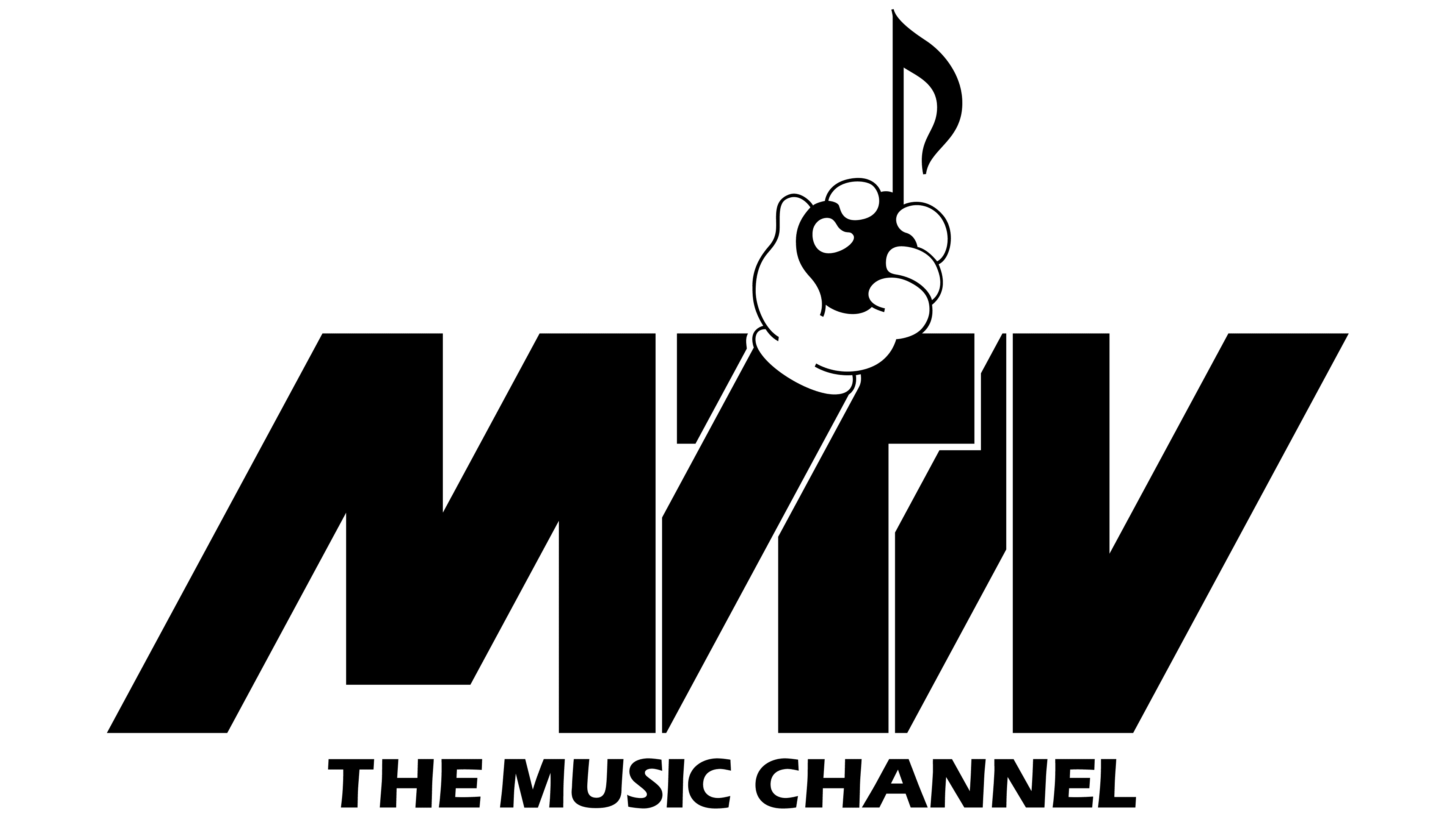
He needed a new logo after it became clear that the music channel would not be called Sight on Sound but MTV. This version was not used for long and was changed before the official launch of the cable channel. The black acronym “MTV” in bold italic sans-serif was the center of attention. Between the “T” and “V” (in the background) was a wide diagonal line. And from “M” to “T,” stretched a black hand in a white glove. It was tilted parallel to the second diagonal and partially covered the “T” standing beside it. The palm squeezed a musical note like a grenade with a check, symbolizing explosive content. At the bottom, the phrase “THE MUSIC CHANNEL” was written in small but capital glyphs. The designers slightly deformed the text, tilting the letters to the right.
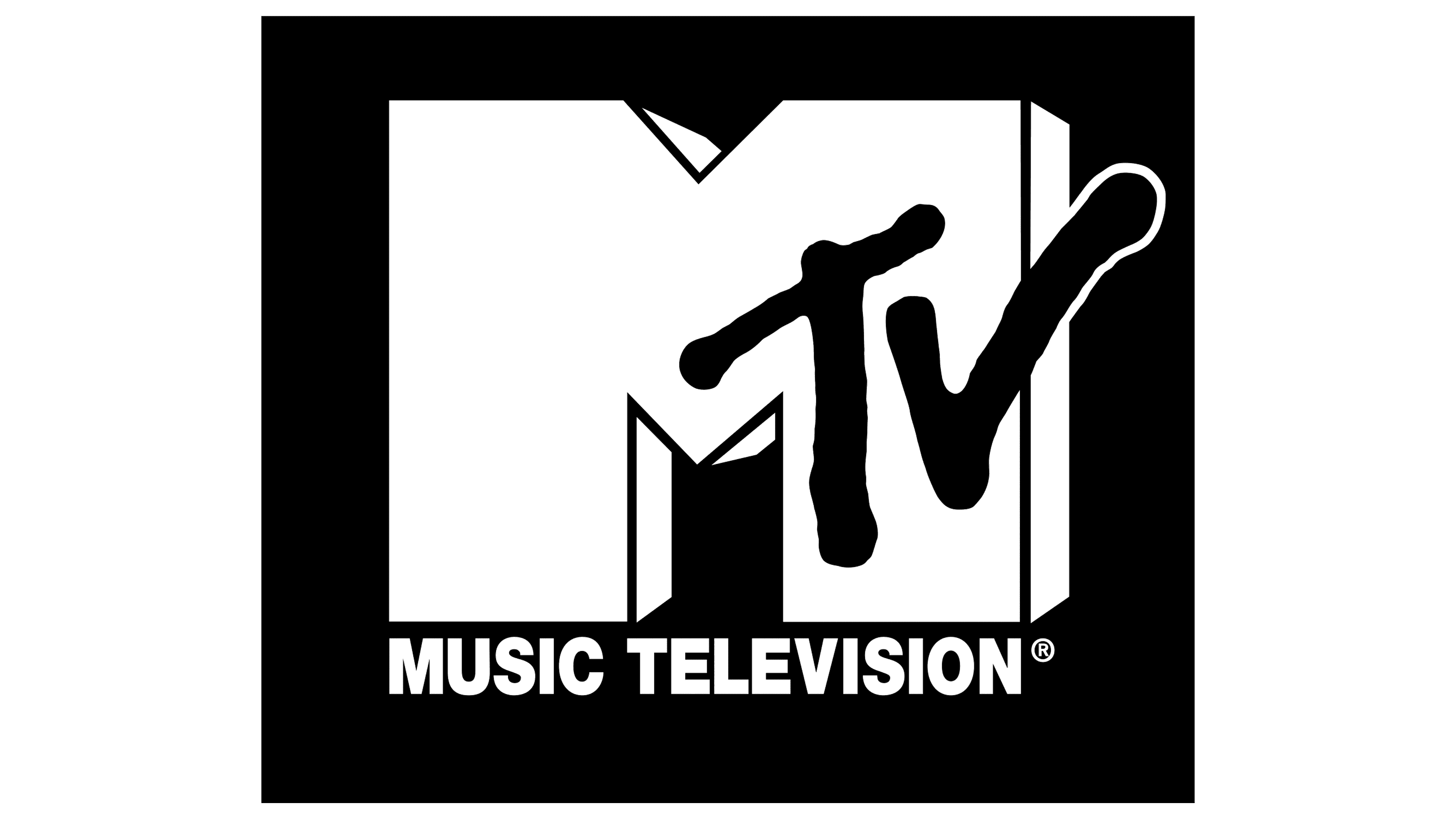
1981 – 1994
![]()
After renaming the specialized channel, the Manhattan Design Studio worked on its identity. In particular, Patty Rogoff (her representative) drew the monumental “M” that everyone now knows, and Frank Olinsky (the designer at the same agency) drew the abbreviation “TV.” The process was led by Fred Seibert, who oversaw the rebranding of several channels. The background letter was a cube and three-dimensional, even though it consisted of only one outline. The superimposed inscription was executed in a thin “trembling” line. At the bottom was the black phrase “Music Television.” In style, it was strict and was considered a sign of the upper class.
1994 – 2010
![]()
From 01.08.1981 to 18.03.2009, the phrase “Music Television” was located under the emblem. Its shortened version was on the “M” on the right side. The white abbreviation on a dark background looked impressive; the right part of the “v” extended beyond the inscription and was outlined in black. The geometric projection makes the letter itself massive, wide, and three-dimensional. Due to the logo’s unique design, the music channel quickly gained widespread recognition.
2010 – 2021
![]()
In 2008, at the opening of FNMTV, the studio used a revised, truncated logo that flashed on air during most television programs. The next year, the updated sign became MTV’s official symbol, debuting on March 18, 2009, on the channel’s official website.
The bottom inscription “Music Television” was removed from the logo because it was already recognizable and no longer needed as a marketing element. The network switched to a different broadcasting format, sharply reducing the number of programs and focusing only on multi-format music. This shift in emphasis started earlier and culminated in a small logo change. The second option was developed independently by MTV employees.
The current version looks like the “M” from the previous format, chopped off. She is squat, with short legs and no protruding part of the letter “v.” It now has a lot more space, which was required to visually transform the sign into other custom logos, since the network has several distinct directions. So, she changed the logo to fit the required visual context, as the trend toward flexible design identity is highly relevant now.
The letter “M” is more of a graphic than a text caption. It has a custom sans-serif typeface. The “TV” sign contrasts with it, as it is handwritten in italics. The emblem’s color scheme is simple: black and white, which serve as a background for each other, creating a sense of three-dimensionality.
2021 – today
![]()
The new logo appeared officially in mid-September 2021 and was first used at the Video Music Awards. Its developer is Loyalkaspar Studio. The most important point in modernizing the identity is rejecting the three-dimensional effect. The letter “M” now stands exactly in front of your view. This is to facilitate scaling the logo so advertising is visible across all media. At the same time, the designers offered a different custom-made font. All facets of the symbol are even and clear; on the right leg, the designation “TV” is visible in the negative space. It has been kept the same.
Font and Colors
Several typefaces were used during the logo’s modification: Helvetica Black (later transformed into Helvetica Neue Black), Kabel Black, and Gravity Grotesk (current version). The color scheme remained stable, consisting of black and white. The first was the large “M,” and the second was the abbreviation “TV.”