


![]() BET Logo PNG
BET Logo PNG
African Americans are important; they are black stars worthy of a channel dedicated to them, says the BET logo. The emblem demonstrates completeness and compactness. The channel presents a variety of content that will interest a black audience.
Robert L. Johnson was born on April 8, 1946, in Freeport, Illinois. He graduated from the University of Illinois in 1968 and earned a master’s degree at Princeton in 1972. In 1976, he joined the National Cable Television Association and identified a programming gap for Black audiences. In 1979, Johnson left NCTA and raised $15,000 from the National Bank of Washington, with $500,000 from John Malone of TeleCommunications Inc. This funding launched Black Entertainment Television, whose first logo was designed by Cheryl D. Miller.
BET debuted on January 25, 1980, as a two-hour weekly block on Madison Square Garden Sports Network, later USA Network. Early content relied on music videos that MTV overlooked. In September 1982, BET became an independent channel and expanded across North America and the Caribbean.
By 1985, the network reached profitability and began producing original programming. In 1989, Johnson formed BET Holdings, which went public on the New York Stock Exchange in October 1991 and reached about 26 million households.
During the 1990s, BET expanded with channels such as BET on Jazz and, in 1998, partnered with Starz to launch BET Movies: Starz! In 1998, Johnson and Liberty Media took the company private at about $1.3 billion. Viacom announced the acquisition of BET Holdings for $2.3 billion on November 3, 2000, and completed it in 2001. Johnson remained CEO until 2005–2006, when Debra Lee took over. After the 2019 ViacomCBS merger forming Paramount Global, BET became part of CBS Entertainment Group, with spin-off plans paused in 2023.
Meaning and History
![]()
BET launched in 1980, but it became a full-fledged channel only in 1983. It was a short block of programs featuring sitcoms with black characters and clips from African American artists for the first three years. Despite the limited broadcast time, Black Entertainment Television’s network has been on par with other organizations. Even then, she had her recognizable symbol, which became the basis for all subsequent logos.
The graphic sign was created by Cheryl D. Holmes Miller, who advocated for racial and gender equality in design. She believed that black specialists have a great advantage over whites: they can fulfill orders for people of any ethnicity. Therefore, Cheryl was eager to design logos for African American-owned companies. By the way, she was white, unlike her father and many relatives.
In the 1980s, a woman founded the studio Cheryl D. Miller Design Inc. and went on to create a corporate identity for Fortune 500 companies, including BET. So many of this channel’s emblems are her merit.
What is BET?
BET is the abbreviated name of the television channel Black Entertainment Television. It was created in 1980 specifically for African Americans. Its primary content includes documentaries, feature films, comedy shows, series, news programs, concerts, music videos, and more. The channel annually presents its own BET Awards, recognizing the achievements of US minorities.
1980 – 1989
![]()
In 1980, Robert Louis Johnson launched the long-titled cable network: Black Entertainment Television. This phrase was presented on the logo (below, in small print) and supplemented by the abbreviation “BET” (above, in large letters). On the left was the original symbol of a black five-pointed star and a stylized “B” in white.
Cheryl D. Holmes Miller designed the logo and wordmark. She was asked to do so by Robert Johnson himself, who came to her to share his vision of a cable network for African Americans. For the work done, the designer received only $ 125.
1989 – 2001
![]()
The logo design changed in 1989. The company removed its full name and merged the abbreviation with the letter “B.” An unusual stylization replaced the standard serif: “B” looked like two joined semicircles and was painted solid black. In contrast, “E” was replaced by three wide horizontal lines, one of which became a “T” shaped like a furniture leg. The star has turned white and has a black outline with clipped corners.
2001 – 2005
![]()
In 2001, Robert Johnson sold his business to media conglomerate Viacom and became a $ 3 billion fortune. As a result, BET lost its status as a black channel but retained its logo. The designers only slightly corrected the letter shapes and made the star pointed. The lines are smoother, and the bottom-right corner “T” has been rounded.
2005 – 2011
![]()
After Johnson left office, Debra L. Lee took over as leader. The staff reshuffle coincided with Black Entertainment Television’s 25th anniversary, so the network now has not only a new CEO but also a completely different logo. The concept has remained unchanged, whereas its implementation has not. In this version, the star was not on the left inside “B,” but on the right, against a blank white background. At the same time, its contour has become much wider.
The lettering has taken on a more readable look: at least the designers have completed the letters “B,” “E,” and “T” with the missing elements. It is a collaboration between Click 3X and Push Creative.
2011 – 2021
![]()
In 2011, the star turned as black as in the classic version used in 1980-1989. The design of the abbreviation has not changed: the letters, as before, are interconnected and look unusual.
The BET graphic mark is the result of Cheryl D. Holmes Miller’s work. True, the modern version appeared after a small revision, to which the designers from Click 3X and Push Creative were involved. They retained the basic elements (the five-pointed star and the abbreviated channel name) and presented them from a completely new perspective.
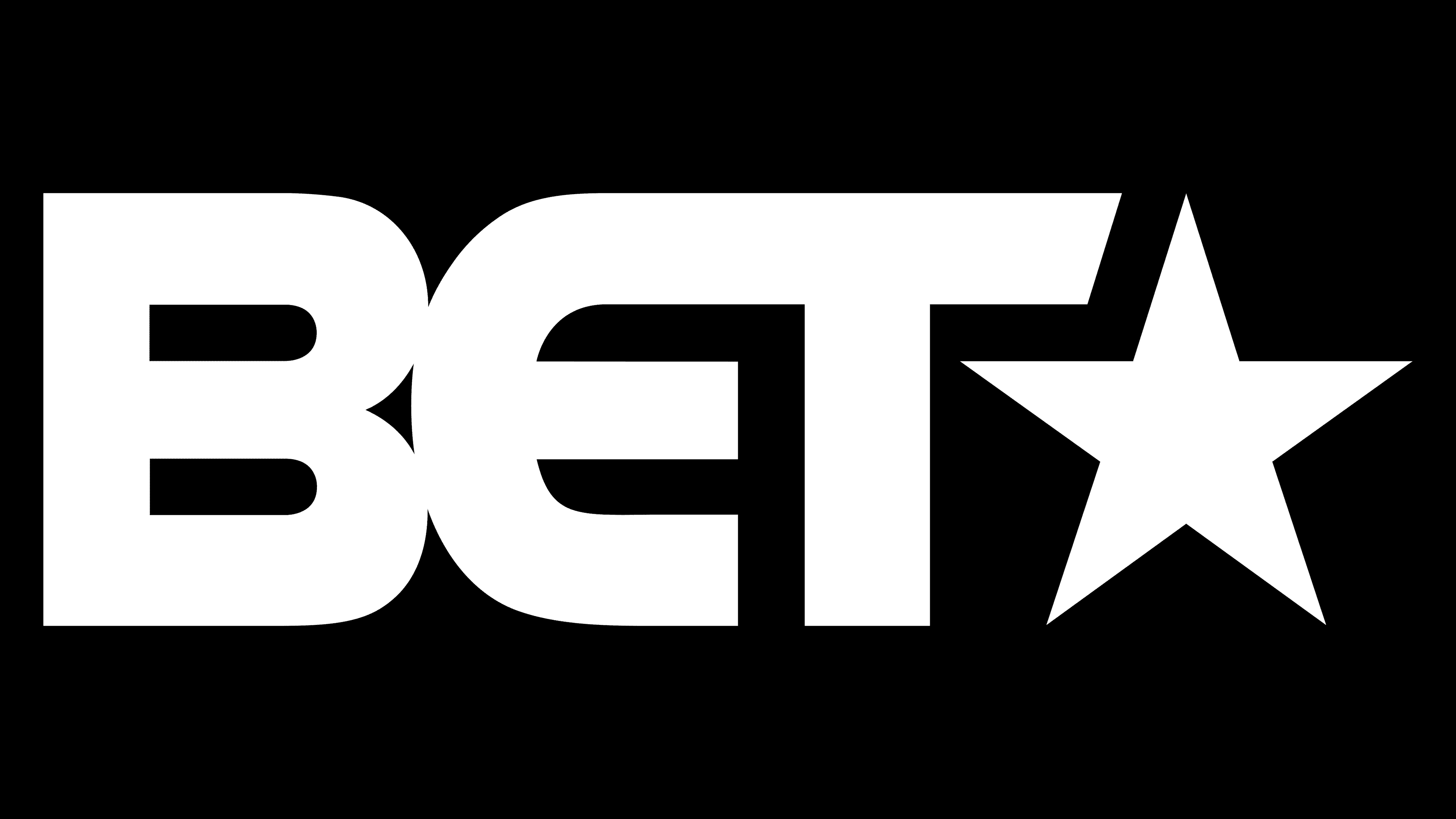
The lettering combines corners and rounds two opposites that together create a movement effect. In this case, the upper-right corner “T”-shaped element echoes the star, linking the abbreviation to the graphic symbol. The typeface is unlike any other; the designers used their modification of the grotesque typeface.
The main color is black, which is quite logical given the channel’s directionality. White against the background only creates the necessary contrast.
2021 – today
![]()
This is the first modified logo; earlier versions consisted of single-lettering, and now it is arranged in two rows. Above are the first two letters (BE), below – the third (T) with a five-pointed star. Unlike previous years, the modern version is typed in a geometric font. The letters are so even that they resemble squares with slots in the places of the in-letter gaps. The typeface has been changed to match the stencil-style. This is a custom flat sans serif with wide letters. The author of the updated version is Sibling Rivalry Studio. This emblem first appeared in the summer of 2021.
Font and Colors

For the logo in use today, the designers opted for a custom typeface with chunky and bold sans-serif characters. But the color palette has been preserved: the black-and-white combination still prevails in the logo. The first is a square background; the second is an inscription and a star.