The Aardman logo tells the story of a major movie studio capable of making dreams come true. The emblem is about the vibrant cartoons that mesmerize audiences and the impressive popularity and fame of the company that creates them.
Aardman Animations: Brand overview
Aardman is a British animation studio working in stop-motion animation using drawing, claymation, plasticine characters, and computer animation. The studio’s cartoons have grossed $1 billion in sales. The company employs 500 people. Among the best-known creations are “Flush,” “Arthur Christmas,” and “Chicken Run.”
On April 12, 1972, a new era in animation dawned. Aardman Animations was founded by Peter Lord and David Sproxton in the culturally rich city of Bristol, England. This pioneering duo had a vision to create unique, engaging stories through the art of animation.
Aardman Animations distinguished itself by its unique use of clay animation in stop-motion animation, which gave its creations a special charm. One of the first works to showcase this style was Morph, a character that captured the hearts of audiences and began the brand’s journey into creating beloved characters.
With an emphasis on craftsmanship, the brand moved on to more elaborate projects. In 1989, they introduced a new duo to the world – Wallace and Gromit. These characters, known for their quirky adventures and heartwarming relationships, further cemented the brand’s reputation for creating exciting plots and memorable characters.
The brand’s unique style gained worldwide attention when it teamed up with DreamWorks Animation. This collaboration resulted in critically acclaimed films such as Chicken Run and Curse of the Rabbit, demonstrating the brand’s ability to create compelling feature-length animated films.
With the advent of digital technology, the brand jumped at the opportunity to explore new formats. They expanded their repertoire to include digital animation while maintaining a commitment to quality storytelling. This willingness to adapt and evolve has allowed the brand to stay relevant and continue to captivate audiences.
Meaning and History
The company was formed in 1972, but the first logo appeared in 1989. This is because, in the early years, the team did separate assignments for television: creating characters and short stories. Only in 1989, the team of three founders began to create short five-minute films, one of which was awarded an Oscar and then began shooting full-length cartoons. Therefore, there was a need for a studio logo. Its creation was most likely influenced by Nick Park, who joined the team in 1985. It was in his series of cartoons about Wallace and Gromit that the emblem first appeared.
What is Aardman?
It is an animation studio headquartered in Bristol. It works in stop-motion animation. The most profitable film was Chicken Run, which grossed $220 million. The studio has nine films and eight multi-episode series to its credit.
1989 – 1998
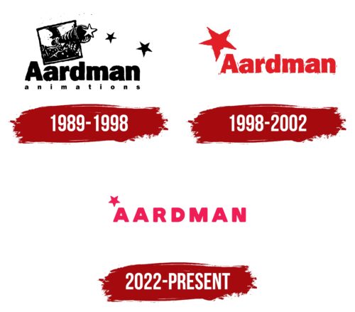
The original logo combines fairy-tale beauty with an interesting concept. It is based on a square. The figure serves as a window or a beautiful frame. The theme of the window is confirmed by the fact that behind it, there is an image of the sky. The frame indicates the shooting style of the company. Stop-motion implies frame-by-frame shooting with small changes in the position of the characters, which creates a sense of movement when viewed quickly.
Inside the square is an image resembling the following:
- Moon.
- A face.
- A circle of Yin and Yang.
The moon alludes to secrets, fantasies, and dreams. The face indicates a director making cartoons. The combination of “yin” and “yang” elements suggests a variety of pictures for adult and children’s audiences. The idea was that the studio planned to make cartoons for all ages.
Below the face is a picture of a bow tie. The rest of the picture is a jacket and arms studded with stars. From the center of the composition comes a lens or telescope, from which stars are raining down. It seems that the person behind the window, located in the sky, shoots cartoons. Each of them is a masterpiece that is given to people. The logo conveys the idea of creativity beyond the ordinary – beautiful fantasies and fairy tales that the company presents to the audience. At the same time, the ideas for the pictures are taken from the life observed by the director.
Interestingly, the first star from the lens is white, while the rest are black. This technique indicates new products that are gradually becoming famous and popular.
Below the image is an inscription. In large letters, the name of the studio is written, and in small letters, the type of activity. The name of the company is given by the name of the character from the cartoon. Aardman is a nerd Superman in a series of short films for the British Broadcasting Corporation.
1998 – 2022
In 1997, the company signed a multi-million dollar contract with DreamWorks to work on Chicken Run and four other animated films to be released over a 12-year period. The studio’s new phase was marked by a rebranding.
A red company name and a bright star above the first letter signaled a breakthrough in the work. New popular cartoons. Cooperation with industry leaders. High box office receipts.
The company plans to work actively. Employees enjoy their work and are passionate about what they do.
2022 – today
After the massive success of new cartoons and filming of animated series, the company changed its logo again. Designer Gavin Strange worked on the logo.
The letters of the new inscription became capitalized. The color changed from red to crimson. The size of the star has decreased, but it is still above the first letter of the name.
The capital letter reflects the growth of popularity and financial condition of the company. The change in proportions: the increase in letters and the decrease in the star indicates a transformation. Aardman used to aspire to a dream, but now – most of the dream has been realized.
Font and Colors
The crimson color is very cartoonish and fantastic. This shade is rarely seen in reality. It indicates a company living in a dream world. In psychology, the color reflects passion and active development. Aardman is passionate about what it does and has made a huge leap from a short-term project to a major studio. Peter Lord and David Sproxton founded the company to fulfill a dream and make a cartoon. However, 50 years later, the studio earned over $130 million from each feature film.
The font resembles Goda Black with smooth cuts at the top of the letters, making them more childlike and grotesque.
Aardman Animations Logo Color Codes:
- coral pink: #D94169; RGB 217,65,105
FAQ
Does Aardman continue to operate as a company?
Yes, Aardman Animations Limited continues to operate as a renowned British animation studio based in Bristol. The studio is world-renowned for its unique animated films and TV shows, especially those featuring iconic characters such as Wallace and Gromit, Shaun the Sheep, and Morph.
How does Aardman create its cartoons?
Aardman specializes in creating stop-motion animation. Physical models of characters such as Shaun the Sheep and Wallace and Gromit are placed on real sets. These models are photographed repeatedly to produce a series of images, which are then combined to create the appearance of smooth motion.
Who owns Aardman?
Aardman Animations took the unconventional step of transferring most of its shares to its employees. This was a deliberate strategy by the founders to keep the company independent and prevent it from being taken over by a major studio like Disney.
Why does Aardman succeed in animation?
Aardman Animations is distinguished by its signature stop-motion animation style. This unique form of storytelling allows them to create compelling plots and iconic characters. Their filmography is a testament to skill, creativity, and meticulous attention to detail.
What is the main focus of Aardman Animations?
Aardman Animations is dedicated to creating compelling stories for film, television, and video games. The company also utilizes short forms of storytelling, often partnering with global brands to create commercials and other branded content.
What principles guide Aardman Animations?
Aardman adheres to core values that influence its creative work and work culture. These include integrity, craftsmanship, a sense of humor, independence, teamwork, and transparency. The company strives to create an environment where creativity thrives and has a positive impact on society.


