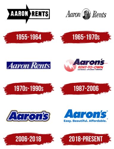
Aaron’s emblem suggests development and progress, an increase in wealth that is possible for people of all incomes thanks to a special installment policy. The emblem shows that it is easy to solve everyday problems with the help of the company’s stores.
Aaron’s: Brand overview
Aaron’s is a privately held rental and installment housing company for North American residents. The firm and its franchisees sell products online and in 1,300 stores in the United States and Canada. The company has annual revenues of up to $4 billion.
The creator and owner of Aarons (originally Aaron Rents) is an enterprising sales executive named Charles Loudermilk. He named the company based on considerations of the initial letters “Aa” that secured it top positions in the directories. The business grew from renting furniture, real estate, automobiles, appliances, and office equipment. In 1982, the businessman began selling shares in the company, retaining a 42% stake. Laudermilk currently serves on the board of directors. He was succeeded as president by Stephen Olsen.
Meaning and History
The creators of Aaron’s brand defined the core concepts with which it should be associated: affordability, flexibility, optimism, caring, help, trust, and respect. They proceeded from the premise that the furniture, electronics, and appliance supplier offers quality home goods that provide comfort. This position is reflected in the visual identity of the company. For a long time, the logo has been using a pleasant blue color – a symbol of tranquility. It brings a sense of harmony, relaxes, and reduces anxiety.
Aaron’s logo has come a long way in its evolution to be used successfully in a variety of mediums. It can be found on the company’s official online store and in physical stores in the United States and Canada. It is a powerful visual signal that the seller is unconditionally trustworthy.
What is Aaron’s?
A consumer goods leasing company. The company has stores in Canada and 47 of the 50 US states. It has been in existence since 1955. The company has more than $3 billion in assets. The president of Aaron’s is Stephen Olsen.
1955 – 1964
In 1955, Aaron’s Rents, Inc. was founded. Its logo looked like an oddly shaped advertising sign: a large black arrow on the left and a white rectangle with a triangular cutout on the right. This design served as the basis for the lettering “AARON RENTS.” The word on the left was highlighted in white because it stood out better against the dark background. In contrast, black was used for the second half of the text. A bold sans-serif font emphasized the company name.
1965 – early 1970s
During this period, the brand had an emblem consisting of two parts. The main element is the inscription “Aaron Rents.” It was made in a contrasting italic font with serifs, roughly similar to the font Bodoni Recut FS Condensed Italic of FontSite Inc. Between the words was an oval containing a black and white portrait of a man holding a bagpipe.
Early 1970s – 1990s
The company began using a trademark written in bold italic serif typeface. The font resembled Riccione Serial Bold Italic by SoftMaker, Dai Banna SIL Light Bold Italic by SIL International, or FreeSerif BoldItalic by GNU FreeFont. A white version of the logo on a dark blue background has survived to this day – in this form, it was presented in an advertisement on the pages of the print edition.
1987 – 2006
Aaron’s new logo contained a three-tiered lettering. At the top was the blue brand name, crossed out by a thin red stripe. The modern, bold sans-serif font matched the brand’s aesthetic, and its softness signaled care and customer focus.
The bright red word “RENT-TO-OWN” occupied the second line in a slanted grotesque. It hinted at the company’s core business. At the very bottom was the dark blue phrase “ELECTRONICS APPLIANCES FURNITURE,” a category of goods that could be purchased. To the right of the inscription was a stylized image of a lightning bolt dividing a circle of thin red and white stripes into two parts. The symbol of energy was represented in the form of negative space.
2006 – 2018
For Aaron’s logo, blue letters of the name were chosen, resting on a white cushion with a double outer outline of blue and brown-green. The logo appeared around 2010 after Aaron’s Rent was renamed Aaron’s.
The white “pillow cloud” symbolizes the dreams that the brand helps to realize, and the double outline symbolizes the special protection of customers from life’s adversities. The company’s offer is beneficial to those who cannot avail of a bank loan for certain reasons. Thanks to Aarons, they can afford new items. In addition to the trade offer, the company has a fund that invests in the future of girls and boys from low-income families (BGCA clubs) in the communities where the outlets are located. In this way, Aarons protects the future of the country and helps families.
2018 – today
In 2018, the holding company split into PROG Holdings, Inc. (consumer lending and leasing) and The Aaron’s Company (leasing, furniture manufacturing, and online platform).
For the new logo, they chose a lighter letter color and removed the dark, heavy outline. This made the logo more airy and modern.
Underneath the company name, the company’s core principles are stated: “Easy, Beautiful, Affordable”:
- Easy. Buying and renting from Aarons is easy. Just choose an item online or in-store, and it will be delivered to your home.
- Affordable. You won’t need a large sum of money to get started, so the offer is affordable for 50% of low-income families.
- Beautiful. The company sells quality and beautiful items from well-known brands. In addition, the network has begun to renovate retail outlets and open stores like GenNext with more presentable and comfortable sales areas. By the beginning of 2022, there will be 100 of them.
Aaron’s helps low-income families gain access to the benefits of civilization and live with dignity. This is the message of the logo.
Font and Colors
The color of the modern logo is a light sky blue on a white background. It is associated with lightness, simplicity, and beauty, which express the essence of Aaron’s offerings and principles of work.
- Light blue is the realization of clients’ dreams, an opportunity to improve their standard of living.
- White color – fair terms, transparency of the offer. The old logo had double protection of the lettering.
- Blue outline – an indicator of experience, the right choice, and quality developments. Rent helps users to understand whether the thing suits them, whether it is comfortable, and choose the ideal option for themselves. The price list contains quality and tested items and the best designs.
- The swamp exterior color is a combination of shades of life (green), casualness (brown), permanence, and reliability (gray). Their combination suggests that Aaron’s protects and enhances the living conditions of its users. It is a reliable partner.
The font of the old and new logo is the same – Futura Pro Extra Bold.
Aaron’s Logo Color Codes:
- blue color: Hex #214193; RGB 33,65,147; Pantone PMS 7687 C
- white: Hex #FFFFFF; RGB 255,255,255; Pantone 11-0601 TCX
FAQ
What does the Aaron’s logo represent?
Aaron’s symbol for its digital platforms is a simple design: a single letter “A” enclosed in a blue square.
What was the original Aaron’s logo?
Aaron’s original logo was a black arrow pointing to the right and a white rectangle bordered by a black border. Inside the arrow in white lettering was the name “Aaron,” and inside the rectangle in black lettering was the word “Rents.”
What is the current name of the Aaron Corporation?
Effective November 17, 2020, following a structural reorganization, Aaron’s Holdings changed its name to PROG Holdings, Inc. The division responsible for Aaron’s business was rebranded as The Aaron’s Company, Inc.
What is the background of The Aaron’s Company?
The Aaron’s Company originated in 1955 and went public in 1982. The company was founded by Charlie Loudermilk, who developed a unique “rent-to-own” model to offer quality merchandise to segments of the population that conventional retailing has little or no focus on.
