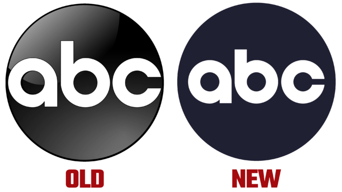
The company will not completely change the logo; it will only improve the corporate font.
The current ABC logo was created in 1962 by designer Paul Rand. Of course, over 60 years, the image has received several modifications and improvements. In the fall of 2021, the network will launch a logo with a modified font.
The designers have retained the main motif of the logo – the image of the globe, better known as the corporate “dot.” Inside is the name of the company, made in small letters. The first change that immediately catches the eye – the letter “b” is now “shortened,” and the ends of the letter “c” have become closer to each other. You can see the perfect letter spacing and the same circles within each element of the title. The right side of the letter “a” has become more pronounced due to the deep notch.
The second change is the size of the letters themselves. The name has been reduced, and now this element has more space inside the circle. The third change is the color of the picture. The designers removed the gradient transitions, which showcased many shades of black, gray, and white. ABC claims the entire background is now filled with black, but not a “pure” shade. The designers used HEX # 202033 and Pantone 534U or 534C.
Additionally, ABC has developed specific guidelines for local affiliates that complement their logo with a company image. The network states that the optimal ratio will be at least 60% of the height of other elements. For companies with a logo, like ABC, made using a circle, it is worth increasing the figure to 75%. An example is “Circle 7,” the logo of ABC-owned stations in New York, Chicago, San Francisco, and Los Angeles.
It is unknown at what level the update will be performed, whether used at the network level or being developed only for certain ABC stations. Replacing many items, such as branded microphone parts, can be costly for a company.


