The ABC logo belongs to the American Broadcasting Company and demonstrates informative simplicity and impressive recognizability. The emblem reflects the brand’s essence and philosophy, encapsulated in its slogan, “Start Here,” representing its core goals and objectives.
ABC: Brand overview
| Founded: | May 15, 1943 |
| Founder: | Edward J. Noble, Louis Blanche |
| Headquarters: | New York, U.S. |
| Website: | abc.com |
Meaning and History
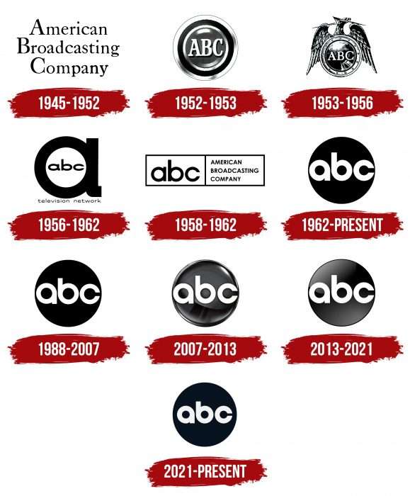
The network began in 1927 as a radio station within the NBC Blue Network. 1942, the broadcasting services separated, and a year later, it became an independent station. In 1945, it received a new name and personal logo, which has changed multiple times. In 1948, the company transitioned from radio to television.
What is ABC?
ABC is an abbreviation for the American Broadcasting Company, existing since 1943. It is a commercial television network owned by The Walt Disney Company.
1945 – 1952
The debut logo is simple, consisting only of the company’s name – American Broadcasting Company. The words are arranged in three classical tiers: the first letters are uppercase, and the rest are lowercase.
1952 – 1953
This version was short-lived and replaced. However, it became legendary as it laid the foundation for modern logos based on it. It’s a round gray icon with several alternating black and white frames. In the center is the company’s abbreviated name – “ABC.”
1953 – 1956
In 1953, the broadcasting network received a new logo based on the Federal Communications Commission’s press release. The letters are arranged on a round shield, topped by a bald eagle with lightning in its beak.
1956 – 1962
This period’s redesign is associated with the transition to color broadcasting. Therefore, it was decided to revise and modernize the existing version. It featured a large lowercase “a” with the letters “ABC” in the middle. This version was popularly nicknamed “ABC Circle A.”
1958 – 1962
At that time, a verbal sign consisting of two parts was used. The first (left) contained the company’s name abbreviation, and the second (right) contained its full name.
1962 – today
1962 was a significant year in the emblem’s history, as graphic artist Paul Rand designed the design that started the era of the round dark logo with light and lowercase “abc.” The debut of the new version occurred on October 19 of the same year, but it was officially approved only the following spring – in 1963, along with the color variant.
1988 – 2007
Designers slightly modified the original logo to remain understandable even at small sizes. For this, the width of the letters was slightly reduced, preventing them from merging on the screen into one white spot.
2007 – 2013
Before launching the next television season, the channel approved a whole set of branding changes. These changes also affected the emblem, which appeared on a shiny metallic background. The Troika Design Group developed the new design.
2013 – 2021
The logo removed the steel reflection, giving the disc a new format. Its author was Loyalkaspar, who was inspired by Paul Rand’s work in 1962.
2021 – today
ABC abandoned the logo’s three-dimensionality in favor of simplicity and universality. Now, it has become flat, significantly improving its typography. Returning to the traditional emblem also indicates a return to the roots, as the overall style created by Paul Rand in 1962 was preserved. It now features Heldane and GT America fonts, which, according to management, are timeless, bold, and practical.
The lowercase letters inside the large “dot” are slightly compressed. This reduction makes them easier to read and visible against any background and screens of different sizes. Circles in the letter space now serve as the basis for new screen identifier animations. According to the company’s representatives, their logo has become more graphically flexible, which is extremely important in the era of small displays, where some design elements, such as three-dimensionality and gradients, are poorly displayed.
ABC: Interesting Facts
The American Broadcasting Company (ABC) is a big TV network owned by Walt Disney Television, part of The Walt Disney Company. ABC has been around for a long time and has done many cool things on TV.
- Starting: ABC was founded in 1943 as “The Blue Network” and became its current name in 1946. It was first a radio network before moving into TV.
- Getting into TV: ABC started its TV journey in 1948 with its first station in New York City. This was the beginning of its growth into a big TV network.
- Cool Shows: ABC has had some popular shows like “The Flintstones,” the first prime-time cartoon; “Wide World of Sports,” a big sports show; and “The Bachelor,” a reality show that’s still on.
- News: ABC News has produced important programs like “Nightline.” It’s known for good news coverage and investigating big stories.
- Soap Operas: ABC had famous soap operas like “All My Children” and “One Life to Live,” which were on TV for over 40 years.
- Cartoons on Saturday: ABC had great cartoons in the ’70s and ’80s on Saturday mornings, like “Schoolhouse Rock!” and “Super Friends.”
- Joining Disney: In 1996, Disney bought ABC, which helped ABC have more shows and stuff related to Disney’s movies and characters.
- Sports: ABC Sports showed big events like the Olympics and “Monday Night Football,” bringing football games to TV at night for the first time.
- Diverse Shows: ABC has shows like “Fresh Off the Boat” and “Black-ish” that feature families from different cultures and backgrounds.
- Reality TV: ABC helped make reality TV popular with shows like “Dancing with the Stars” and “Shark Tank.”
- The Oscars: ABC has been showing the Academy Awards, a big movie awards show, since at least 2028.
ABC has grown a lot since it started, from radio to being a big part of TV in America. It’s known for entertaining shows, good news programs, and big sports events.
Font and Colors
American broadcasting logo
Except for a short period, the television service’s symbol has always been a circle with the company’s name abbreviated. Depending on the period, it received a revised design that met the technical requirements of that time.
Until 1956, the letters were in uppercase and complemented by serifs. Then came the lowercase version, which is still used today. The logo’s color palette is mainly black and white, but in 1962, it became more diverse: “a” was displayed in red, “b” in blue, and “c” in green. But the background always remained dark.
FAQ
What does the ABC logo represent?
The ABC logo is a simple black circle colored white, with three lowercase letters ABC in the center. The letters are smooth and streamlined. Designer Paul Rand developed this version in 1961.
Why did ABC change its logo?
The logo changed in the summer of 2021 when it was officially launched on three channels: Good Morning America, America This Morning, and World News Now. The change was due to the need to adapt the logo to digital devices of various formats.
What does ABC mean?
ABC is an abbreviation for the American Broadcasting Company.
Who owns ABC News?
ABC News is the news division of the American Broadcasting Company, which Walt Disney Television owns.
What does the ABC emblem represent?
The ABC emblem consists of three interlaced rings, symbolizing the ABC ecosystem triad: the main channel ABC, ABC News, and ABC Studios. This interconnected design also conveys unity and cohesion, emphasizing the strength and identity of ABC.
Is ABC a brand?
ABC is a commercial television network based in America. It is part of Disney Entertainment, a division of The Walt Disney Company.
Where did the ABC logo come from?
Created by renowned graphic designer Paul Rand in 1962, the ABC logo features a simplified monochromatic design depicting the alphabet letters A, B, and C.
Who created the ABC logo?
Famous graphic designer Paul Rand created the widely recognizable ABC emblem in the early 1960s. Since its inception, subtle changes in texture, angles, and shades have been made to meet modern advertising needs.
What does the American Broadcasting Company logo signify?
The circle in the ABC symbol signifies concepts such as the “circle of life” and global interconnection. This simple yet effective design captures the viewer’s attention.
