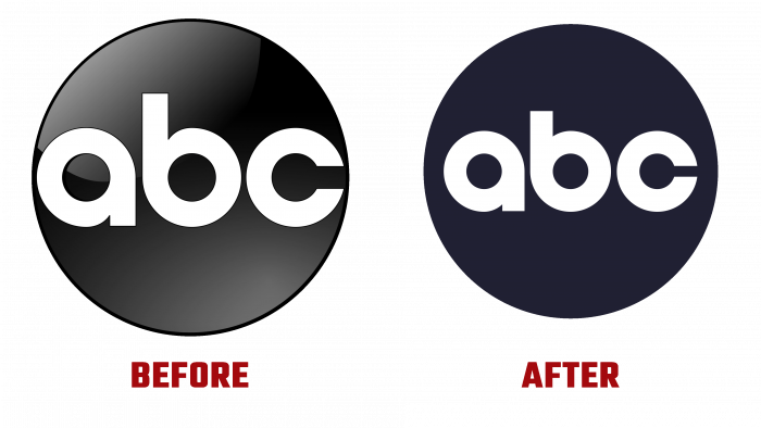
There are cases in the design world when the forgotten old is better than the new. There are also cases when the new identity tightly hammers a nail into the box with the old logo, hidden far and long in the attic of history. And there are cases when the author’s idea of the designer cannot be understood at all; it seems that you have already seen this logo or graphic element, there is a feeling of déjà vu.
Probably an indicator of brand stability is the conventionality and conservatism of visual design carried through the years. Following the path of market gurus such as Apple and Starbucks, ABC (American Broadcasting Company) decided to redesign their 60-year-old logo within the same design framework to stay true to tradition.
In the design of large and small businesses, there is a tendency to simplify the identity; creatives play on the contrasts of two colors and font sizes. The same thing happened here with the “old-timer” of the TV market.
Three letters enclosed in a circle, an oversized font, and the absence of a gray-to-white gradient made the black-and-white picture a monolithic and more formal look. The gradient appeared and faded, then had a soft reflex like a plastic lapel pin earlier. This can be explained by the currents of the visual culture of that past century.
The letters have become smaller in size, the same round and smooth as before, but fit comfortably into the black circle.
Some might say this is an example of bad advertising, backward design, or a leap back in time. But, taking into account modern trends, although it looks almost the same as the old one, the ABC logo nevertheless acquired innovation and integrity. Now the brand is keeping up with the times, remaining a leader in the broadcasting industry.


