


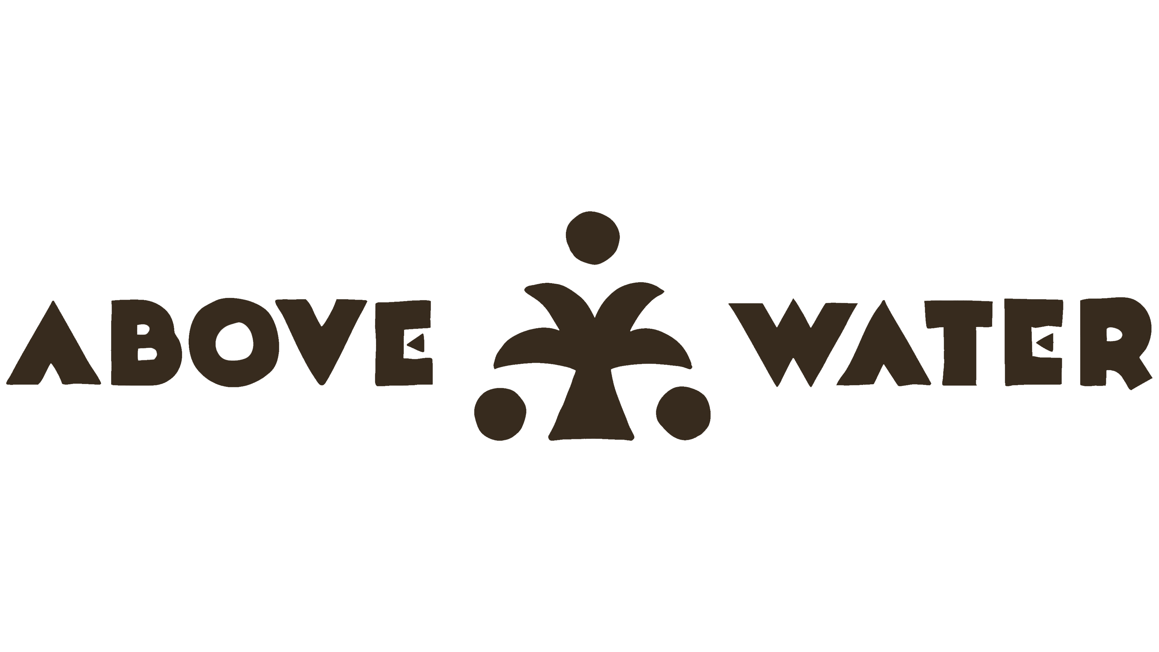
Above Water introduced a new line of sparkling beverages with an identity inspired by ancient rituals and modern science. Ho Chi Minh City studio Cho Choi Creative created an emblem featuring a palm tree and two human figures, paired with a heavy wordmark with irregular edges. The project dates to 2026.
The brand is part of Earth Made, a Korean-Vietnamese company founded by entrepreneur Jun Young Park. Its drinks use young coconuts from Vietnam’s Ben Tre province. The brand blends coconut water with sparkling water, vitamins, minerals, and other functional ingredients. The name Above Water references the water inside coconuts growing above the ground on palm trees. The line includes options formulated to support hydration, energy, and gut health.
Cho Choi Creative explored the coconut’s cultural role to distinguish the brand in a category familiar with white-and-green packaging, palm leaves, and photographs of opened coconuts. In the studio’s interpretation, the coconut is a ritual offering and symbolic substitute for a human head, associated with renewal and divinity. The team built a fictional world around the drink where ancient rituals coexist with technology.

The full emblem depicts a scene of palm tree worship. Two figures kneel on either side, facing the tree. Circles represent their heads, with a third circle above the canopy. The trunk is divided into several sections, and the figures are arranged symmetrically. The designers drew on archival images of palms and ancient peoples. Simplified silhouettes and rough edges give the image a hand-drawn appearance.
The compact version retains the palm and 3 circles. It echoes the overall shape of the full scene and accommodates a different wordmark arrangement. In the two-line logo, the emblem with the figures sits above ABOVE WATER. In the horizontal version, the simplified palm separates ABOVE and WATER.
The wordmark uses Noir et Blanc by Daniel Pelavin of Pelavin Fonts, a typeface with Art Deco influences. The heavy uppercase letters were modified to match the emblem’s drawing style. Repeated letters received subtle variations to reinforce the handmade impression, while the typeface’s geometric foundation remained intact.
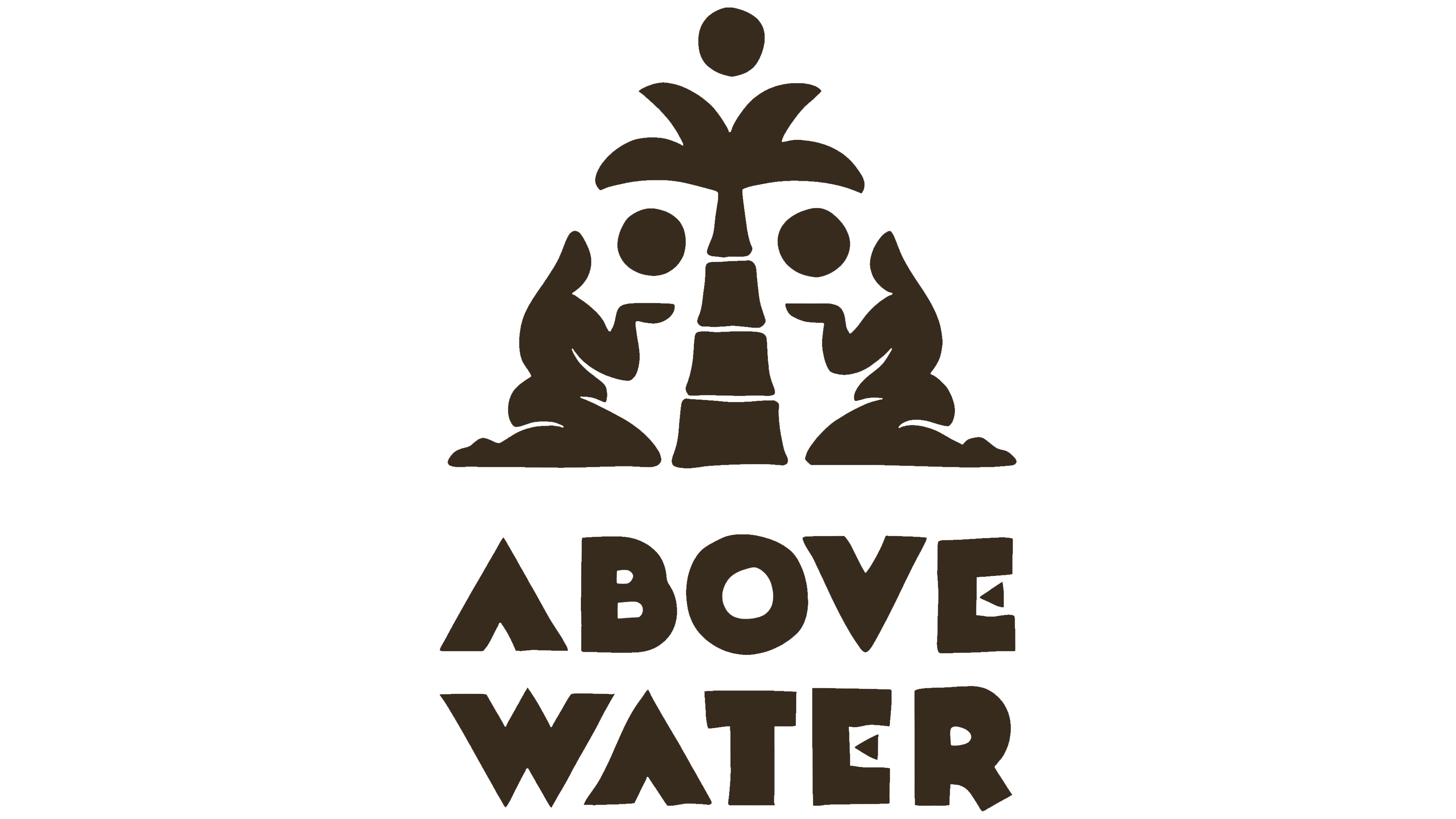
A small triangular notch at the bottom of the “A” replaces the conventional crossbar. The nearly circular “O” combines a heavy outer shape with a small counter. The “V” resembles a wedge, the “W” consists of sharp diagonals, and triangular cuts appear in the “E.” In the vertical version, letters are stacked one above another. Some remain upright, while others are rotated 90 degrees. Along with mirrored “E” letters, the arrangement resembles a typography-built totem.
Pea green, dark brown, and cream reference the coconut’s outer husk, shell, and flesh. Additional colors distinguish the flavors and product benefits. Green accompanies Pure Hydration, yellow identifies the yuzu-flavored Gut Health drink, and orange-red represents the lime-flavored Energy Boost. Illustrations inspired by carved stone reliefs extend the ritual theme. Laboratory vessels appear alongside them, connecting the coconut’s history with the drinks’ functional ingredients.
Tin Lai led creative direction, and Trang Ká served as design director. Chang Be and Audrey Tran worked on the design, while Mikeyokei handled the custom lettering.