


 ABX Air Logo PNG
The ABX Air logo features symbols that reflect its focus and values. It uses a trapezoid to show its commitment to aviation. The red “A” represents the company’s name and energy, showing it’s a dynamic, passionate airline. A small plane symbol above the “A” suggests progress and a forward-looking attitude. The simple font used for the company’s name emphasizes its professional, reliable approach. The logo communicates ABX Air’s dedication to quality and customer-focused air transport.
ABX Air, the former Airborne Express, is a cargo airline based at the Wilmington Air Park near Wilmington, Ohio, USA. Founded in 1946 as the Airborne Flower Traffic Association, the company has transported goods for over 70 years.
The Airborne Traffic Association began as a humble flower delivery service but has grown exponentially. After acquiring an aircraft hangar and specialized aircraft, the company became a major force in cargo transportation. Its success story is an inspiring one of ambition and hard work.
In the 1980s, Airborne Express began an ambitious mission to expand its services beyond the United States. After acquiring Midwest Air Charter and other airlines, the company rebranded in 1988 and quickly became the country’s fifth-largest airline.
In 1993, the airline made a savvy move that dramatically increased its balance sheet from $1.1 billion to $1.4 billion. By acquiring the Seattle-based air cargo company Pacific Air Freight, the company expanded its shipping network and provided critical support to major US retailers, including Amazon.
In 2003, DHL made a move that would change the face of the aviation industry by acquiring Airborne Express. Five years later, Air Transport Services Group (ATSG) acquired the company and consolidated it with Hudson Aircraft, an ATSG subsidiary specializing in ACMI operations. As a result, Airborne Express was rebranded as ABX Air.
Today, ABX Air is a cargo airline and a go-to partner for express delivery companies, e-commerce retailers, and the US military. With an all-cargo fleet, it can fly across the US, Canada, Europe, and Asia, delivering goods to destinations in record time.
ABX Air is committed to delivering superior customer satisfaction. It continually innovates to provide tailored supply chain solutions, including charter and brokerage services, for diverse industries. With this unwavering focus on customer satisfaction, ABX Air is ready to take flight.
Meaning and History

ABX Air’s emblem embodies its history and commitment to excellence in the air cargo sector. The design conveys strength, reliability, and efficiency, and its colors and style reflect the company’s dedication to secure, consistent service. This identity has evolved with the airline, reinforcing its position as a trusted name in global air freight.
What is ABX Air?
ABX Air, formerly known as Airborne Express, is a key cargo airline based at Wilmington Air Park near Wilmington, Ohio. The airline has evolved significantly since its inception, adapting and growing into a major global air cargo carrier.
1980 – 1990s

During the pivotal 1980s and 1990s, ABX Air embraced a logo as bold and formidable as its services. The black inscription, composed of thick, individual lines, was not just a design choice but a statement of strength and capacity, echoing the airline’s ability to transport heavy cargo across vast distances. The logo’s lettering was sized and scaled to mirror the heavyweight nature of cargo operations, capturing the essence of a company that plays a critical role in global logistics.
The design incorporated three underlined strokes of varying lengths beneath the company name, enhancing the logo’s overall impact. These underlines were more than decoration; they symbolized the extensive network of routes ABX Air’s fleet covered, connecting corners of the globe. The stripes could serve as visual metaphors for the airline’s operational reach, highlighting the vast expanse over which its cargo planes flew.
A particularly ingenious aspect of the logo was the diagonal ends of these lines, which gave the impression of a ship’s hull. This subtle design choice cleverly drew a parallel between air freight operations and maritime shipping, underscoring the common thread of transportation and logistics that runs through both modes. The imagery evoked by this analogy was powerful, positioning ABX Air not just as an airline but as a vital link in the larger logistics and transportation system.
The logo significantly revisits the company’s origins by using its original name, Airborne Express, arranged across two levels. This strategic move maintained continuity with the brand’s legacy while embracing its evolution. The dual-level placement balanced the logo’s visual weight while preserving and celebrating Airborne Express’s historical essence.
1990s – 2003
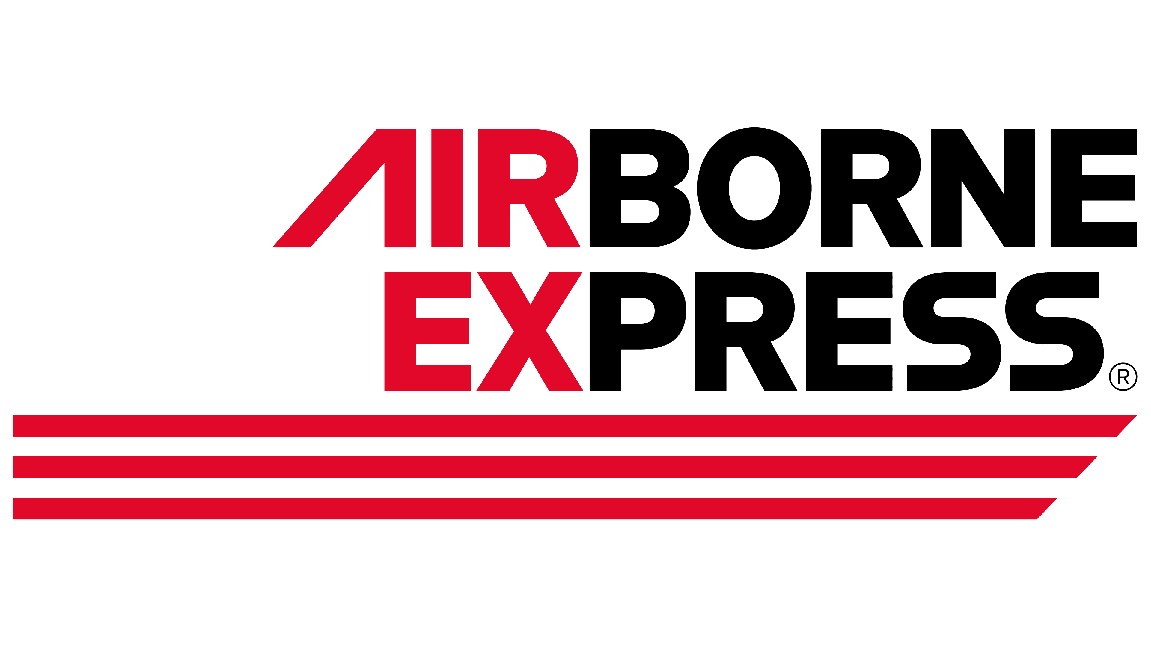
From 1990 to 2003, the ABX Air (formerly Airborne Express) logo underwent a significant transformation, reflecting the airline’s evolution and adaptive strategies in the competitive cargo industry. The most notable change was shrinking the brand name and shifting from monochrome to a bicolor scheme. This design change introduced red as a dynamic new color for the first letters of each word in the brand name, creating the memorable abbreviation “AirEx.”
The introduction of red revitalized the emblem, adding speed and dynamism crucial to the fast-paced world of air cargo delivery. Red often signals energy, movement, and urgency, qualities essential to the air transport industry. This strategic use of red made the logo more visually compelling and highlighted the efficiency and speed that AirEx aimed to convey to its clients.
The red elements in the logo could be likened to guiding lights or runway dividers, symbolizing precision, direction, and safety. These lines metaphorically illustrate the takeoff trajectory, emphasizing AirEx’s readiness and ability to transport cargo swiftly and safely to its destination. This imagery reinforced the company’s commitment to operational excellence and reliability, underscoring its pivotal role in the logistics and transportation sector.
2003 – 2021

The 2003 rebranding ushered in a new perspective on the company’s visual identity, marking a significant evolution in its brand representation. The acquisition of DHL Airways and the subsequent name change were symbolized by a dynamic, striking design that mirrored the company’s ambitions and newly expanded operational scope. The redesign was not just a visual change; it reflected the company’s strategic shift and growth aspirations.
The logo featured a prominent red “A,” standing out as a beacon propelling the company upward. This bold use of color and shape symbolized the airline’s leap into a broader market, establishing regular flights between Europe and the USA and significantly widening its geographical reach and revenue streams. The design conveyed strength, scale, and a burning desire to grow. The unique crossbar of the “A” suggested additional pathways branching off the main runway, indicating more routes and a larger fleet.
A miniature airplane figure within the logo succinctly communicated the company’s line of business. The choice of black for this model underscored the heavy-duty nature of the cargo airliners that form the fleet’s backbone. The plane accelerating along the runway before soaring into the sky captured the essence of ABX Air’s operations, lifting off to begin its journey across the globe.
The slightly wave-like letters in the logo suggest turbulence and wind, adding a dynamic element to the design. The logo’s black and red elements interplay to create a balanced and visually compelling composition. The vibrant, dynamic red reflects the energy, movement, and speed that define ABX Air’s commitment to fast, efficient cargo delivery.
In contrast, black conveyed professionalism, competence, and sophistication, lending the ABX Air emblem gravitas and impact. This color scheme was carefully chosen to reflect the dual nature of the company’s services: robust, reliable, agile, and swift. This reimagined visual identity in 2003 marked a pivotal moment in the company’s history, capturing its readiness to face new challenges and seize opportunities in the ever-evolving world of cargo aviation.
2021 – today

ABX Air’s rebranding in the years following 2003 shifted toward a more understated visual identity, moving away from the vibrancy and expansiveness that characterized the earlier logo. The new design features three gray rectangles that mimic the silhouette of an airplane’s tail, a subtle nod to the cargo boxes that are fundamental to the airline’s operations. This imagery is strategically overlaid with a bold red letter ‘A’ that resembles both a runway and an airplane wing, symbolizing movement and direction.
A black airplane taking off into the distance embodies the company’s ongoing journey toward its goals. This element directly represents ABX Air’s core business, air freight transport, and visually communicates the company’s dedication to delivering cargo efficiently across vast distances.
Adjacent to the imagery, ABX Air is spelled out in stretched, upright, and simplistic black letters. The angular contrast between the graphic and the text creates a sense of discord, potentially diluting the logo’s impact. This dissonance may undermine the design’s cohesiveness, leaving the logo short of making a strong impression.
Despite this, the logo’s overall design succinctly captures the essence of the company’s field of operation. It symbolizes ABX Air’s ambition to reach new heights and its commitment to continual growth within the cargo aviation sector. Focused on the core aspects of freight transportation, the logo reminds us of the airline’s role in the global supply chain as it strives for excellence and expands its service offerings.
Font and Colors
ABX Air uses a distinctive logo style that makes it look like it’s moving. The letters are bold and lean forward, as if the wind is pushing them. This isn’t just for looks; it tells a story of constant movement and progress. The letters also vary in thickness, evoking planes moving through the air.
The font they chose for the logo is simple but strong. It’s easy to read, meaning anyone can recognize it immediately. They might have used fonts like Arial Pro Extra Bold Italic or Sublime Extra Bold Italic. The idea here is to be clear but also show some personality. This design doesn’t just look good; it lasts and stays meaningful.
The colors in the ABX Air logo aren’t random. The symbol uses light gray, red, and white, while the text is dark gray, almost black. Light gray evokes advanced technology, red conveys energy and passion, and white signifies clarity and accuracy. The darker text conveys reliability and trust.
FAQ
What airline code is ABX?
The airline code “ABX” represents ABX Air Inc., a company specializing in air cargo. Airline codes are unique abbreviations assigned to each airline, helping airports, air traffic controllers, and logistics firms quickly recognize them. This organization helps plan flights, manage cargo, and monitor air traffic.
“ABX” is vital because it ensures cargo reaches its intended destination and enables end-to-end shipment tracking. It also simplifies ticket and cargo document management and supports analysis of flight data and cargo volumes.
These codes are part of a system created by international aviation organizations to ensure that air travel and cargo transport operate efficiently and safely. The “ABX” code is a key component of the aviation industry, helping ensure coordination and safety.
Is ABX Air still in business?
Yes, ABX Air is still doing well in the air cargo industry. It started in 1980 and has over 40 years of experience delivering things quickly. Over the years, it grew significantly and became the third-biggest express airline in the US.
ABX Air is known as one of the top companies moving cargo by air using Boeing 767 planes. These planes show that ABX Air has been around for a while but still meets today’s needs. ABX Air plays a major role in moving goods worldwide, ensuring they reach their destinations without a hitch.
Does DHL own ABX?
DHL doesn’t own ABX Air; it is part of the Transport Services Group, Inc. (ATSG), which is based in Clinton County, Ohio, USA. While DHL is a major customer of ABX Air, it doesn’t own it. ABX Air and DHL work closely, with ABX Air flying many of DHL’s packages. This makes DHL an important part of ABX Air’s operations, but ATSG manages everything from cargo flights to other logistics services through its companies, including ABX Air.
Who owns ABX Air?
Air Transport Services Group, Inc. (ATSG) owns ABX Air, a major player in air cargo services. ATSG provides services such as cargo movement, aircraft leasing, and logistics management. ABX Air is important to ATSG because it enables ATSG to offer a wide range of aviation services.
ATSG is based in Wilmington, Ohio, and is known globally for its air logistics and freight services. ATSG bought ABX Air to improve its operations and expand its capabilities. With ABX Air’s planes and expertise, ATSG can offer customers more flexible, effective ways to move cargo. This teamwork is key in the air cargo business, which depends on speed, reliability, and efficiency. With ATSG’s support, ABX Air can keep growing and maintaining high-quality service.