The entire 20-year history of the Index Exchange brand from Toronto, which works for the success of the world’s leading manufacturers, is dedicated to accelerating the development of advertising technologies. Scale, transparency of prices, modern developed infrastructure – all these are the basis for creating conditions for a brand to save money and increase the efficiency of each client. The brand provides the maximum possible number of “assistants” for the effective work of marketing departments, thereby increasing the client’s income, helping to create modern, attractive digital content, which is impossible not to pay attention to. Index Exchange leads everyone to success through change, which it follows itself, making a change in its own visual identity.
The design agency With You and a partner studio in London – Egg took as a basis the central mission of the brand – accelerating the evolution of advertising technologies, around which the entire formation of the new brand identity was built. Index Exchange’s drive to evolve with its industry has become central to building key visual identity elements. Defining topics were selected that determine the presence of positive impulses that cause development, growth, and the manifestation of innovation in the company’s activities. All this influenced the creation of a new strategy and visual language and became the determining factor for creating a modern and attractive design. The result of such joint and creative work has become a renewed brand with an optimistic attitude, focused on the promising market of the future.
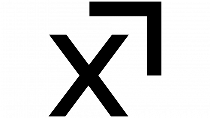
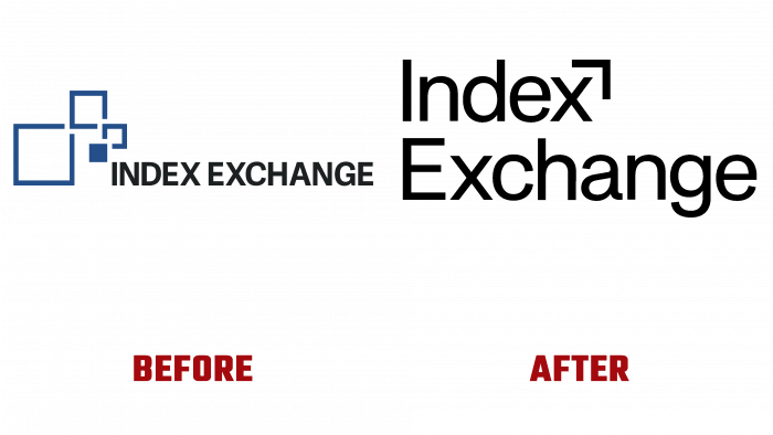
The logo has undergone a cardinal evolution, retaining only the basic essence and verbal form – construction based on the text in the form of the brand name, which gives rise to talk about the preservation of the achievements made throughout the company’s history. Visually, it has become dynamic, folding, renewing, and shrinking. Modern design has become more laconic and utilitarian. The squares that overloaded the “picture” were transformed into a simple arrow, which is visually formed as an element in conjunction with the letter “x.” It symbolizes the company’s desire to move only forward, moving its industry towards achieving its goals. The shape of the arrow – a right angle, became the starting point for creating a flexible and unified design system covering all elements of the brand’s identity – from image and advertising printed materials to the digital visual presentation of the brand itself, its activation in an updated form.
The color palette was chosen strictly to serve the digital brand in harmony, ensuring the visual creation of some unity between technology and humans. Evergreen, Dusk, and Stone – the growth, accessibility, and cultural identity that characterize Index simultaneously provide that accent contrast while softening each other. Thus, overall attractiveness, memorability, and mandatory brand awareness are achieved.
