The ACTRA logo is multifaceted and vibrant. It represents an active organization that cares for actors and hosts. The emblem shows that the alliance is a close, friendly community where each member is protected.
ACTRA: Brand overview
| Founded: | 1943 |
| Headquarters: | Toronto, Ontario, Canada |
| Website: | actra.ca |
ACTRA is an alliance of Canadian English-speaking artists and hosts. It includes 28,000 members. It works as a union to defend the rights and interests of its members. It provides the HAVEN helpline service, the ACTRAonline performer database, and the PRS copyright protection society. It presents the John Drainie Award and ACTRA Awards.
Meaning and History
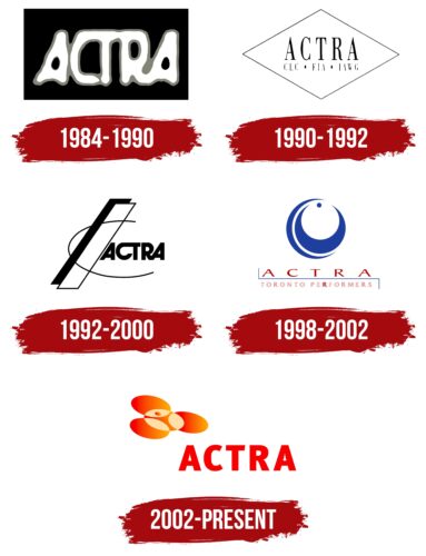
From the very beginning, ACTRA used the abbreviation in its logos, showing that it values conciseness and precision. The emblem has gone through several transformations, each of which differed drastically from the previous ones, pointing to the diversity of genres, work directions, and opportunities for the organization’s members. Each symbol demonstrates one of the facets of the conglomerate, the peculiarities of individual channels. It conveys a view of the world of radio and television of that time.
What is ACTRA?
The union of popular channels, actors, actresses, and hosts in Canada working in film, radio, and television. It has nine branches across the country. It cares for safe working conditions, fair pay, and contract compliance. The organization’s income is $4.8 billion.
1984 – 1990
This emblem features the name in blurry white letters with a gray outline on a black rectangular background. The limited space indicates the association, an association with its own rules and charter. The background also signifies the limited territory in which the union operates.
ACTRA stands for Association of Canadian Television and Radio Artists, and later Alliance of Canadian Cinema, Television, and Radio Artists. The blurriness of the letters indicates uneven coverage. New members gradually joined the team. The movement started with the RATS team and only involved Toronto radio. The composition gradually changed.
The blur symbolizes radio and television waves—the temporary association of various representatives of acting professions on a voluntary basis. The inscription resembles an unfocused camera lens.
1990 – 1992
In 1990, the logo changed to a white diamond with a thin black border and a clear, elegant inscription with serifs. Below are the acronyms of other organizations linked to ACTRA: Canadian Labour Congress (CLC) International Federation of Actors (FIA).
The addition of white elements gave it an airy and light feeling. It pointed to artistry, invisible waves, news, live broadcasts, and communication – intangible matters that the movement’s participants work with.
The shape of the diamond, as a rotated square, hints at non-conformity and a creative approach.
1992 – 2000
A white stripe with a large black shadow and a semi-oval line surrounding the letters ACTRA – this became the logo of the association in 1992.
The stripe symbolizes:
- A TV tower.
- An arrow shooting upwards.
- The letter I as part of the word information.
Two figures: a white one and its black shadow, indicate two sides of the lives of famous people: bright on stage and complex, associated with continuous hard work. ACTRA knows both and cares for creative people.
The semi-oval symbolizes the planet, the spread of the group’s ideas worldwide, and cooperation with similar movements. The figure indicates a television or radio broadcast.
The letters CT and RA are linked in pairs. The first pair talks about cinema and television actors, and the second – is about radio hosts.
1998 – 2002
The symbol places a special emphasis on performers from Toronto, where the movement originated.
The symbol is a circular shape, similar to an earring. Blue crescents form the base of the figure. At the top is a blue dot on which the structure is balanced. The design showcases beauty, harmony, and a play of colors and textures. It reveals the idea of diversity.
It resembles the image of a professional radio microphone head, indicating the primary union of radio workers. Below are the red letters ACTRA and the inscription Performers Toronto, separated from each other by a thin red line.
The image hints at the appearance of the online magazine Performers from ACTRA Toronto about the branch’s actors.
2002 – today
A white circle with a schematic figure of a person became the basis of the modern logo. The central element is surrounded by three other circles, creating a flower image. Each petal represents:
- Television, film, and radio actors. Their union formed the association.
- ACTRA’s values: diversity, equality, and inclusivity for all community representatives.
- The areas in which the association advocates for members’ interests: the right to work, fair pay, and proper conditions.
At the heart of all ACTRA’s efforts is the artist. The figure’s outstretched arms in the circle and the red costume show a bowing posture after a performance, demonstrating openness and service to people.
Font and Colors
Red color became the main one in the emblem. It personifies artistry, leadership, and people accustomed to being the center of attention. It shows the active work of the alliance, lobbying for the interests of creative people. The presence of orange shades speaks of a warm, friendly community: communication and mutual support.
The font of the inscription is FF Meta Pro Black. Capital letters speak of the talented members of the group and the importance of public people for the life of society.
ACTRA Logo Color Codes:
- Jasper Red: Hex color:#db3535; RGB:219 53 53; CMYK:0 76 76 14; Pantone:PMS Warm Red C
