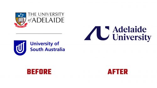
Adelaide University has revealed a new logo that marks the union of two historic institutions—the University of South Australia and the University of Adelaide—into a single entity focused on the future of education, research, and innovation.
The previous logos of the two universities had distinct identities. The University of Adelaide’s logo features a traditional academic crest, symbolizing its deep-rooted history. In contrast, the University of South Australia’s logo was modern and playful, featuring an impossible object in its shield, reflecting its innovative spirit. The challenge in creating the new logo was to honor both legacies while presenting a forward-looking vision.
The new logo for Adelaide University is an abstract monogram built around the letters “A” and “U.” The “A” is rendered in a serif style, nodding to the university’s academic tradition. The “U” introduces upward motion, symbolizing energy and progress. This upward movement subtly references the geographical shape of South Australia, grounding the university in its local context.
The design is minimalist, moving away from the intricate details of the old crests. This simplicity reflects the university’s ambition to lead educational innovation while inviting interpretation and engagement. The monogram is accompanied by a logotype in a contemporary serif font, adding a sense of seriousness and maturity, balancing modernity with tradition.
The new identity’s color palette plays a crucial role. It retains the deep navy blue common to both founding institutions, ensuring continuity and a sense of heritage. A digital blue signals the university’s focus on future-ready education, while a new purple hue evokes the jacaranda trees in South Australia, symbolizing growth and the blossoming of new ideas.
The visual identity extends beyond the logo and colors, creating a comprehensive design system that expresses the university’s core principles of being ‘proven,’ ‘audacious,’ and ‘open.’ This system is designed to adapt across various contexts, whether the university highlights its expertise, challenges norms, or engages with the community.
The monogram’s sharp serifs and abstract form may provoke mixed reactions, but its distinctiveness makes the logo memorable. It symbolizes that Adelaide University is more than just a merger; it is a new educational force poised to lead in a rapidly changing world.
Adelaide University’s new logo and brand identity reflect its vision to be a “Force for Firsts,” honoring the past while boldly stepping into the future. The logo serves as a reminder of the university’s commitment to excellence, innovation, and community, positioning it as a transformative institution ready to nurture bold ideas and drive progress.


