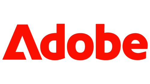
Adobe, known for its significant strides in AI tool improvement, recently turned heads with a less-expected move. Amidst the frenzy of major announcements, the tech giant subtly debuted an intriguing rendition of its logo in the latest promotional videos for Adobe Firefly’s new text-to-image features.
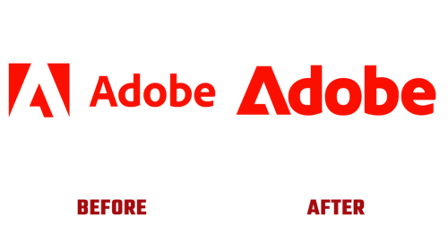
This fresh logo interpretation doesn’t aim for a complete revamp but rather an ingenious modification. Eschewing the traditional white triangle on a red background followed by ‘Adobe’ in Adobe Clean, the company has smartly substituted the ‘A’ in its name with its symbolic graphic mark, culminating in a unique wordmark. While preserving its readability and recognizability, this nuanced change brings a dash of boldness and distinctiveness to the brand identity, leaving one to ponder, “Why wasn’t this thought of before?”
However, it’s crucial to understand that this is not a replacement for the classic Adobe logo. The renowned white triangle on the red backdrop remains the official emblem. What has changed is Adobe’s recognition of the ‘A’ graphic mark as an independently sufficient symbol, thereby negating the necessity of coupling it with the full ‘Adobe’ name every time.
The new design’s noteworthy aspect is incorporating a heavier typeface that seamlessly aligns with the graphic mark’s weight. This merger results in the triangle filling the ‘A’ space in the wordmark. This intelligent integration spawns a more contemporary and bolder design, strikingly contrasting the existing Adobe logo.
Marva Warnock, co-founder John Warnock’s wife, was the creative force behind the original Adobe logo, designed for its 1982 debut. The logo saw its only alteration in 1990, with the introduction of the now-iconic red and white color scheme. Thus, this latest inventive application is the modern-day update that Adobe requires.
The reimagined logo lends itself to be independently used for smaller applications, or it can couple with ‘dobe’ for instances where the complete brand name display is warranted. This modification seems so apt that viewing it as the quintessential Adobe logo is tempting. While the classic logo continues to serve as Adobe’s primary emblem, this recent iteration teases the potential redundancy of the older design.


