


![]() Adventure Time Logo PNG
Adventure Time Logo PNG
The Adventure Time logo is a heroic symbol of the comedy animated series. It appears as a legendary sign of opposition to all negativity, though the characters themselves evoke a positive smile. Such an emblem emphasizes the seriousness of the surrealist cartoon concept despite the amusing nature of the main characters.
Meaning and History
![]()
The idea of creating Adventure Time emerged after the release of a short film as part of Random! Cartoons aired on Nicktoons in 2007. However, after it went viral online, the channel declined further production, and the filming was halted entirely. This occurred even before Cartoon Network commissioned Fred Seibert and Pendleton Ward to create something similar.
Pendleton Ward drew inspiration for the creative work from various sources. He was inspired by video games (particularly Dungeons & Dragons), animated masterpieces (My Neighbor Totoro by Hayao Miyazaki), and other sources. As a result, the series’ main characters are quite unusual, and their adventures resemble quests. The cartoon was created using hand-drawn sketches instead of computer graphics. The storyboard determined the characters’ dialogue and actions, significantly impacting the filming duration. Each episode took 8-9 months to complete. Therefore, work was carried out simultaneously across multiple episodes; they were filmed in parallel.
The Adventure Time logo appeared in 2007. Its concept was derived from the original animated film, considered a pilot. As a result, all logos share similarities in elements, colors, and design. They perfectly match the adventure style while steering clear of humor, as the creators wanted to emphasize the underlying seriousness of the animated series.
What is Adventure Time?
Adventure Time is an animated film based on the concept of writer and director Pendleton Ward. The American animated series follows a boy named Finn and his talking dog, Jake, who can magically change size and shape. They live in a post-apocalyptic time in the city of Ooo. The series consists of 10 seasons, which include 283 episodes. Full-scale filming lasted eight years: from 2010 to 2018.
2007
![]()
The pilot project used a graphical-text logo with no predominance of word elements over drawn ones, as they were harmoniously combined. The film’s title was arranged in two levels. It was red and resembled fragments of a brick wall in texture, with characteristic “cracks.” The central part of each letter took the shape of a mountain ridge.
In the word “Adventure,” all glyphs were lowercase, except for the first one, which was uppercase. The inscription “Time” was more exotic: some uppercase letters were replaced with a wide sword fragment running through the entire word. Its handle was located before the “T,” and its edge ended at the “E,” forming the central segment. The blade was silvery and shiny. A blue gemstone adorned the brown handle.
2010 – 2018
![]()
The new Adventure Time logo conveys an atmosphere of magic, adventure, and extraordinary events. It combines a bold style with fantasy elements and heroic motifs, creating a visual connection to the storyline. Its signature features remain consistent with the pilot design, while some details have been refined to enhance its expressiveness.
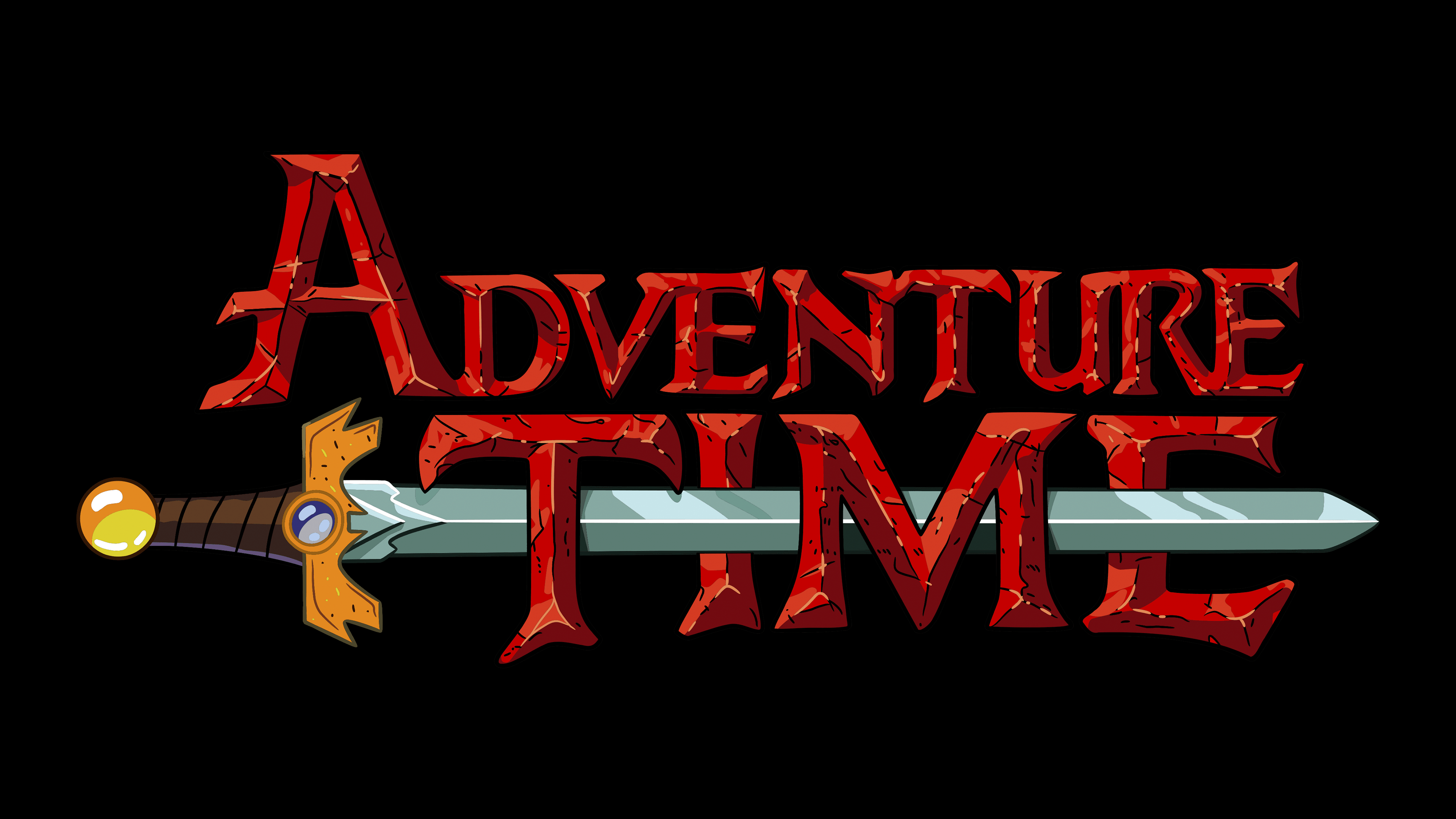
The emblem features a bold “Adventure Time” inscription in red, with uneven, cracked lines that evoke the appearance of ancient, time-worn runes. The letters’ lines and angles appear carved from stone or aged metal, adding a sense of antiquity and magic.
A sword runs through the lower part of the logo, emphasizing its heroic aspect. The golden hilt, with a rounded pommel and a blue accent, suggests it is a magical artifact. The blade is dark gray, with a central stripe that adds depth and volume. This element highlights the show’s adventurous spirit and fighting resolve.
The red letters symbolize the energy and danger accompanying the characters’ journeys. The golden hilt represents wealth and magic, while the gray blade adds a touch of realism. The white background enhances the brightness of all the elements, making them stand out vividly.
Following the show’s revival, the logo underwent minimal changes. The blade became a darker gray with a thin stripe, adding detail and modernity. The hilt received a more uniform golden shade, and the pommel became fully rounded, creating a polished look. The lettering was slightly refined to improve readability and overall balance.
The logo encapsulates the core themes of Adventure Time: magic, friendship, overcoming challenges, and the pursuit of the unknown. The sword at the center reminds us that every journey comes with challenges requiring courage. The cracks in the letters symbolize the ancient history and rich mythology of the world where the story unfolds.
Font and Colors
The typeface used in the fantasy series’ logo is Adventure Time, created by Font Meme specifically for this animated film. At the same time, the letters resemble the symbols of another font, Thunderman, by Tmanfan. They are visually similar but not identical.

The emblem’s palette is bright and attractive. The predominant color is brick red, with black veins used for the letters. The sword is painted brown and silver, while the precious gem is blue.