The Aer Arann logo symbolizes the airline’s strong connection to Irish heritage and its significant role in regional aviation. The design serves as a visual representation of the company’s mission to connect remote areas of Ireland with major European hubs. The emblem identifies Aer Arann as a reliable carrier offering unique services, including access to lesser-known destinations.
Aer Arann: Brand overview
Aer Arann was established in 1970 by Peadar McDonnell and Ralph Lannon, two pilots from Galway, Ireland. They wanted to link Ireland’s regional airports, supporting travel and economic growth in rural areas. The airline began with a Britten-Norman Islander, an aircraft well-suited for Ireland’s short runways and variable weather. It aimed to connect different regions of Ireland.
In the 1980s and 1990s, Aer Arann expanded its services, adding flights to the Aran Islands and Inishmore and launching routes between major cities like Dublin, Cork, and Donegal. To handle increased demand, the airline added larger, more comfortable planes, such as the Short 360 and ATR 42, improving passenger comfort and operational efficiency.
The early 2000s were difficult for Aer Arann. Challenges such as the 9/11 attacks, the SARS epidemic, and competition from budget airlines like Ryanair impacted the airline financially. In response, Aer Arann modernized its fleet with fuel-efficient aircraft and implemented cost-cutting measures to stay competitive.
In 2010, the Stobart Group purchased Aer Arann and renamed it Aer Arann Regional, emphasizing its focus on regional service. From 2012 to 2014, Aer Arann partnered with Aer Lingus, operating as Aer Lingus Regional and enhancing the travel experience with better connections and ticketing.
Despite efforts to adapt, financial difficulties persisted, and in 2014, Aer Arann had to cease operations, ending more than forty years of service. Stobart Air continued the legacy under the Aer Lingus Regional brand.
Aer Arann’s journey from 1970 to 2014 shows the challenges and opportunities in regional aviation. The airline played a crucial role in connecting Irish communities and fostering economic growth in rural areas. At its peak, Aer Arann had a workforce of around 300 employees. The airline carried more than 800,000 passengers annually on turboprop aircraft.
Meaning and History
What is Aer Arann?
Stobart Air, established in 1970 as Aer Arann, is a prominent regional airline in Ireland. It offers various services, including international flights, linking Ireland with many UK and European locations. The airline evolved into Stobart Air after being acquired by Stobart Group in 2014, expanding its capabilities and strengthening its market presence. In addition to its operations, Stobart Air manages flights for airlines like Flybe and Loganair, offers charter services, and provides pilot training programs.
1998 – 2003
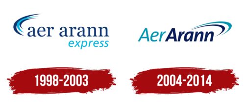
From 1998 to 2003, Aer Arann introduced a logo that captures the company’s essence. The logo features three sleek and energetic curved lines resembling a jet plane soaring into the sky, symbolizing rapid progress and the company’s ambition to reach higher goals.
The curves remind you of a stylized bird flying through the clouds, symbolizing freedom and the pursuit of ambitious goals. These images reflect Aer Arann’s spirit of continuous advancement.
The logo uses slim lowercase letters that align with Aer Arann’s image as a youthful, modern airline. Details on the letters mimic an airplane’s keel, reinforcing the aviation theme. The word “express” added to the company name emphasizes speed. Aer Arann stands out in a competitive market by offering quick and convenient travel. The smooth font and forward tilt of “express” suggest a fresh approach to service.
The logo’s use of two different fonts and colors demonstrates Aer Arann’s broad capabilities, covering passenger and cargo services. This distinction helps customers understand what the company offers and highlights its expertise.
2004 – 2014
When redesigning the Aer Arann logo, the designers moved the blue arcs to the right side to represent progress and forward motion. This adjustment signifies the company’s drive for continuous growth and improvement. The company name is styled as one word but split into two parts with different shades of blue, with “Aer” in a lighter tone than “Arann.” This choice of colors, common in the aviation sector, suggests the vastness of the sky and conveys a sense of harmony and professionalism.
The logo’s transition from light to dark blue separates the components of the name and adds depth, symbolizing the airline’s ascent from takeoff to reaching new heights. Using a bold, italic sans serif font brings dynamic energy to the logo, reflecting the fast-paced movement of airplanes in the sky.
These design elements—the repositioned arcs, the blue gradient, and the energetic typeface—present Aer Arann as a contemporary, progressive airline dedicated to providing outstanding and dependable service.
Font and Colors
The Aer Arann logo features a clean, modern, sans-serif font that is professional. The company name is divided into two colors, highlighting distinct yet connected aspects of the airline’s services or routes. The font in both words is the same style, but the first part is thinner, while the second is bolder, making them appear distinct.
The kerning is tight, creating a sense of unity in the brand name. Although “Aer” is smaller than “Arann,” this size difference establishes a visual hierarchy that naturally directs the viewer’s gaze across the logo.
The text color is dark blue, which conveys trust, reliability, and professionalism—essential qualities for an airline. Two arc elements above the letters accompany the text “nn,” transitioning from dark to light blue, which suggests movement and can be interpreted as the sky or a flight path, reinforcing the aviation theme.
The logo is legible, ensuring easy recognition from a distance or when scaled down, which is crucial for branding across various mediums like airplanes, signage, and digital platforms. The font and accompanying graphic elements make the logo memorable and convey a sense of innovation and efficiency.
FAQ
Is Aer Arann still operating?
Aer Arann stopped operating under its original name in 2014. However, its service still exists in a different form called Aer Arann Islands. This service connects the mainland to the Aran Islands.
Aer Arann Islands is based at Connemara Airport and runs between ten and thirty daily flights to the three Aran Islands. The average flight lasts about eight minutes. The airline mainly uses Britten-Norman Islander aircraft, which are ideal for short flights and can handle the islands’ challenging weather and short airstrips.
Aer Arann Islands continues Aer Arann’s work by serving regional routes, focusing on the island communities off Ireland’s west coast. This service is essential for the connectivity and economic support of the Aran Islands, keeping Aer Arann’s mission to support remote areas alive.
Who is the founder of Aer Arann?
Padraig O’Ceidigh founded Aer Arann. He is an Irish entrepreneur who showed a knack for business early on. Growing up in Connemara, he collected periwinkles on the beach in Spiddal as a child and sold them in Galway to fish exporters. This early business experience shaped his future.
O’Ceidigh started Aer Arann, which became an important airline in Ireland. It connected isolated areas with big cities, improving connectivity and economic growth in those regions. His innovative business methods and leadership helped make Aer Arann a key player in Irish aviation.


