The Aerojet Rocketdyne logo features a rocket silhouette, highlighting the company’s focus on aerospace technology and progress. The red color of the rocket adds energy and movement to the design. Aerojet Rocketdyne is dedicated to research, development, and innovation in engineering and technology, especially in creating rocket engines, flight control systems, and various aerospace and military components. The logo represents the company’s commitment to leading-edge technology and excellence in the aerospace field.
Aerojet Rocketdyne: Brand overview
Aerojet Rocketdyne, an esteemed player in the American aerospace sector, is renowned for its expertise in creating rocket and jet propulsion systems. The company’s establishment in 2013 resulted from a merger between prominent aerospace entities Aerojet and Pratt & Whitney Rocketdyne.
The company’s core products are rocket engines, solid rocket motors, and electrothermal thrusters, all used in diverse areas encompassing space exploration, defense, and commercial ventures. Aerojet Rocketdyne has an impressive portfolio of notable rocket engines, including the RS-25, a key component of the Space Shuttle; the RL10, used for upper-stage propulsion; and the AR1 engine.
Aerojet Rocketdyne’s influence extends to crucial launch vehicles like the Atlas V, Delta IV, and Boeing’s Starliner, all of which rely on the company’s high-quality propulsion systems. The company is crucial in national defense, supplying tactical missile systems to the U.S. military.
The company’s operations are widely distributed across the United States, with major facilities in California, Virginia, Arkansas, and Florida. Aerojet Rocketdyne is a subsidiary of Aerojet Rocketdyne Holdings and employs over 5,000 individuals.
With an annual revenue hovering around the $2 billion mark, Aerojet Rocketdyne’s clientele includes some of the biggest names in aerospace and defense, like NASA, Boeing, and Lockheed Martin. Despite strong competition from companies like Northrop Grumman, SpaceX, and Blue Origin in the rocket propulsion market, Aerojet Rocketdyne remains a significant contributor.
Meaning and History
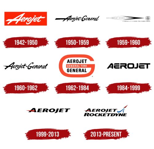
Aerojet Rocketdyne’s logos have evolved alongside the company, symbolizing its storied history in aerospace and defense. Each iteration reflects the brand’s innovation, precision, and technological advancement legacy. These emblems represent Aerojet Rocketdyne’s identity and commitment to exploring new space and defense technologies frontiers.
What is Aerojet Rocketdyne?
Aerojet Rocketdyne is a key player in the American aerospace and defense industry, known for making engines for spacecraft, rockets, and missiles. They’re a crucial NASA supplier, providing technology for the Atlas V and Delta IV rockets, the future SLS, and even engines that help explore other planets. Their efforts extend human exploration into space, firmly placing them at the heart of America’s space exploration missions.
1942 – 1950
Aerojet Rocketdyne’s first logo, created between 1942 and 1950, features a striking flame-red rectangle that draws attention and symbolizes the company’s focus on rocket and jet propulsion technology. The red logo represents the power and energy of Aerojet Rocketdyne’s products.
The company name is written in white, slanted uppercase letters, adding a sense of speed and movement. This design highlights the company’s expertise in creating fast and powerful propulsion systems. The white text also makes Aerojet Rocketdyne stand out as an independent leader in the aerospace industry.
A notable detail is the sharp point of the letter ‘A,’ which looks like a rocket’s nose cone shooting into the sky, representing the company’s drive for innovation and exploration in aerospace technology. This logo captures Aerojet Rocketdyne’s spirit of pushing the limits in rocketry and its dedication to advancing technology.
1950 – 1959
In 1950, Aerojet Rocketdyne’s rebranding dramatically changed its look, almost completely redoing its logo. Switching to black for the letters hinted at rocket fuel and oil, crucial parts of the aerospace world, showing the company’s serious and broad work in engine development and assembly.
A standout part of the new logo was the extra-long crossbar on the ‘A,’ designed to represent the stages of rocket engine development and the complexity of aerospace engineering. This detail underlined Aerojet Rocketdyne’s expertise and contribution to rocket technology advancement.
The logo also used uppercase letters that flowed together, reflecting fluid dynamics important in liquid rocket engines. This flowing design underscored the idea of fluidity, central to the propulsion systems Aerojet Rocketdyne builds.
1959 – 1960
In 1959, Aerojet Rocketdyne’s logo was completely redesigned to feature an abstract rocket and its flight path, capturing the speed and movement experienced during high-speed travel. With its sharp right edges, this design looks like it’s cutting through space, vividly representing speed and progress.
This change came as Aerojet Rocketdyne became a crucial partner for NASA, marking its rise in aerospace technology and production. The rebranding to Aerojet-General Corporation was reflected in the logo through an elongated diamond shape, symbolizing the company’s new phase and broader capabilities. This logo represents the company’s commitment to its mission and continuous drive for innovation and exploration.
The logo also acknowledged the support from its parent company, General Tire & Rubber, mentioned subtly around the rocket’s edge. This showed the financial and operational backing Aerojet Rocketdyne received and the teamwork behind its success. It reminded people of the larger corporate structure supporting the company’s ambitious space exploration and defense projects.
1960 – 1962
In 1960, Aerojet Rocketdyne chose to bring back its logo from the same year with some updates that gave it more depth and a clearer identity. This move symbolized a time of reflection and growth, helping to better match the company’s brand with its goals and progress in aerospace.
A key update was reshaping the ‘A’s crossbar, which used to be even in length but was made shorter and shaped into a sharp point. This change gave the logo a more directed and purposeful feel, suggesting a ship slicing through the sky and reflecting Aerojet Rocketdyne’s innovative spirit and exploration into space.
This adjustment to the logo emphasized Aerojet Rocketdyne’s ongoing mission and dedication to breaking new ground. The redesigned ‘A’ showcased the company’s focus on speed, precision, and the sleekness of its space ventures, echoing the dynamics of spacecraft launching into the universe.
1962 – 1984
The logo of Aerojet Rocketdyne was redesigned again after only two years, aiming to highlight the connection with its more famous parent company, General Tire. This version features a large red ‘G’ for “General Tire,” signifying General Tire’s full ownership and influence over Aerojet Rocketdyne. This prominent ‘G’ shows General Tire’s control and crucial support for the aerospace company’s operations and achievements.
The logo visually demonstrates General Tire’s comprehensive support and impact by incorporating the Aerojet Rocketdyne name inside the ‘G.’ It suggests that General Tire not only encompasses but also protects and fosters the aerospace company, indicating a relationship of mutual benefit and support.
This design approach reminds everyone of the strong foundation and resources General Tire provides to Aerojet Rocketdyne. The logo, resembling a capsule, symbolizes Aerojet Rocketdyne being within General Tire’s protective care, implying stewardship and a commitment to ensuring Aerojet Rocketdyne’s stability, growth, and innovation.
1984 – 1999
In 1984, a new digital logo introduced a significant shift for the company, aligning with the creation of GenCorp, Inc. and the sale of General Tire. This modern and forward-looking logo symbolizes the company’s broadening scope and leaps into future rocketry and technology possibilities. It represented the company’s role in pioneering innovations and technological progress.
This sleek, futuristic logo marked a move away from old aerospace symbols, placing the company at the digital age’s cutting edge. It showed GenCorp, Inc.’s intent to incorporate advanced technology into aerospace, pushing the limits of rocket and propulsion science.
The emblem highlighted the company’s flexibility and readiness to tackle the evolving tech landscape, reflecting its transformation from a traditional aerospace and tire maker into a diversified high-tech conglomerate.
Acting as a symbol of innovation, the logo announced GenCorp, Inc.’s ambition to lead in developing futuristic aerospace technologies. It emphasized the company’s dedication to exploring space’s new frontiers, confirming its crucial role in shaping the industry’s future.
1999 – 2013
When the parent company reorganized, Aerojet Rocketdyne updated its look with a new logo featuring a bright red ‘A’ with a triangular crossbar resembling a rocket. This design cleverly hints at the company’s focus on aerospace engineering. The crossbar’s angle suggests a rocket moving across the sky, reflecting Aerojet Rocketdyne’s significant role and continuous push for innovation in the aerospace industry.
Now a veteran in aerospace, Aerojet Rocketdyne’s logo sets it apart from major players. The dynamic rocket element contrasts with solid, bold lettering, showcasing the company’s progress and standout capabilities. The logo mirrors the company’s vast operations, rich history of success, and important position as a government contractor.
The logo, especially the red rocket crossbar, captures Aerojet Rocketdyne’s mission and forward-looking approach, symbolizing its passion for propulsion and space exploration. It represents the company’s drive, innovative spirit, and dedication to pushing the boundaries of space technology, highlighting its ambition and extensive experience as a leader in the aerospace and defense sectors.
2013 – today
In 2013, the merging of two aerospace leaders led to a new logo that combined Aerojet and Rocketdyne. Rocketdyne adopted Aerojet’s font to signify unity. The logo features Aerojet’s name in bold, with a red rocket accenting the ‘A,’ symbolizing the merged company’s focus.
Besides the name, an emblem of a rocket shooting up with two sky-blue streaks behind it illustrates aerospace exploration and the quest for innovation. The blue and red colors balance the excitement of launch with the expanse of space.
The logo cleverly incorporates the number ‘2’ to reflect the merger, showing the combined strength, resources, and commitment to push forward in space exploration and technology. This design underscores the partnership’s impact on aerospace, symbolizing a new era of collaboration and achievement.
Font and Colors
The Aerojet Rocketdyne logo combines its name with an iconic image to make a strong impression in the aerospace industry. The logo’s font is a custom-designed bold sans-serif with smooth, rounded edges that give it a futuristic and aerodynamic feel.
The logo’s black, blue, and red colors represent the vastness of space and the company’s role in advancing aviation and space exploration. The black in the brand name sets the stage for the company’s bold goals.
The blue and red colors create a vivid and unforgettable visual. Aerojet Rocketdyne’s logo goes beyond a simple name; it stands for the company’s drive for innovation, new technology, and leadership in the quest to explore the skies.
FAQ
What is the stock symbol for Aerojet Rocketdyne?
Aerojet Rocketdyne Holdings Inc.’s stock symbol is “AJRD” on the New York Stock Exchange. As of July 27, 2023, its share price was $57.99. This symbol helps investors and traders find, buy, or sell the company’s shares. Share prices change during the trading day due to market trends, investors’ feelings about the company, and any news about Aerojet Rocketdyne or its industry.
Aerojet Rocketdyne is known for making rocket propulsion systems and technology for aerospace and defense. People who invest in the aerospace and defense sectors pay close attention to how Aerojet Rocketdyne’s shares are doing because it tells them about the company’s financial health and potential for growth in the future.
Is Aerojet Rocketdyne owned by Lockheed?
Lockheed Martin had plans to buy Aerojet Rocketdyne for $4.4 billion, but in February 2022, the deal did not happen. Lockheed Martin decided not to go through with the purchase after the Federal Trade Commission (FTC) filed a lawsuit to prevent it. The FTC was worried about potential unfair competition. Their concern was that if Lockheed Martin owned Aerojet Rocketdyne, it might become difficult for other companies to access Aerojet Rocketdyne’s rocket propulsion products. These products are essential for the defense and aerospace industries. The FTC aimed to ensure that these technologies remained available and affordable for all companies in the industry.
What is Aerojet Rocketdyne known for?
Aerojet Rocketdyne stands out in the aerospace and defense industry for making propulsion systems used in space missions and defense. They focus on developing advanced propulsion systems critical for rockets, missiles, and spacecraft. These systems help launch, fly, and position satellites and support missions deeper into space.
Apart from working on space propulsion, Aerojet Rocketdyne also makes precision weapons and armament systems. Their work ranges from designing warheads to creating various munitions, playing a key role in defense strategies and national security.
What happens to Aerojet Rocketdyne?
Aerojet Rocketdyne is joining forces with L3Harris Technologies, marking a big shift for the company. Known for its work in aerospace and defense, Aerojet Rocketdyne will now go by “Aerojet Rocketdyne, an L3Harris Technologies company.”
A major sign of this change is Aerojet Rocketdyne’s new look. Its old logo, with a rocket soaring upwards, has been switched out for L3Harris’s buckyball logo. This new branding connects Aerojet Rocketdyne more closely with L3Harris, starting a fresh chapter for the company.
Also, Aerojet Rocketdyne’s websites, Aerojet.com and Rocket.com, now send visitors straight to L3Harris.com. This simplifies things for people looking up Aerojet Rocketdyne online and shows how the company is fully merging into L3Harris Technologies.


