 Aerolíneas Argentinas Logo PNG
The Aerolíneas Argentinas logo shows the airline’s modern approach and its connection to Argentina. It stands for the spirit of the country, mixing old traditions with new ideas. The simple design and lively look show the airline is all about moving forward. The colors from the Argentine flag in the logo honor the country and the airline’s place as its main carrier. The logo is a sign of the airline’s dedication to its roots in Argentina and to bringing people to and from the nation.
Aerolíneas Argentinas: Brand overview
Aerolíneas Argentinas, Argentina’s state-owned flagship air carrier, has a unique and fascinating history that dates back to its founding in 1949.
In December 1950, Aerolíneas Argentinas took to the air due to the merger of four prominent Argentine aviation companies. This merger combined the expertise and resources of Aeroposta Argentina (AA), Aviación del Litoral Fluvial Argentino (ALFA), Flota Aérea Mercante Argentina (FAMA) and Zonas Oeste y North de Aerolíneas Argentinas (ZONDA).
In 1990, a consortium led by Spanish airline Iberia gained control of Aerolíneas Argentinas, marking the beginning of a new era in the airline’s development. Despite initial optimism, the company faced financial difficulties that brought it to the brink of bankruptcy.
In 2001, Grupo Marsans, a prominent travel and transportation conglomerate, stepped in to rescue Aerolíneas Argentinas from financial difficulties. With an injection of capital and comprehensive modernization, Grupo Marsans revived the airline.
In 2008, the Argentine government took the bold step of renationalizing Aerolíneas Argentinas.
Headquartered in Buenos Aires and a member of the prestigious SkyTeam alliance since August 2012, Aerolíneas Argentinas has further strengthened its position in the global aviation industry. In November 2013, the airline’s cargo division became a member of the SkyTeam Cargo alliance, expanding its reach and cargo capabilities.
Meaning and History
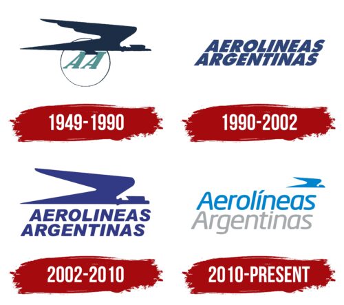
The logos of Aerolíneas Argentinas tell the story of the airline from when it started in 1950 to now. These logos show how the airline connects to Argentina’s culture and nature. The airline’s image has changed to show where it comes from and where it’s going. The logo has been updated repeatedly to match the airline’s current goals and ideas. New styles of writing, colors, and versions of the condor bird in the logo all show the airline’s journey. These updates reflect times of growth and challenges, showing how the airline keeps moving forward and adjusting.
What is Aerolineas Argentinas?
Aerolíneas Argentinas S.A. proudly serves as Argentina’s flag carrier and is the country’s largest airline. This large company emerged in 1949 from the merger of four unique companies: Aeroposta Argentina (AA), Aviación del Litoral Fluvial Argentino (ALFA), Flota Aérea Mercante Argentina (FAMA), and Zonas Oeste y North de Aerolíneas Argentinas (ZONDA). This conglomerate began its air transportation operations in December 1950, a turning point in the history of Argentine aviation.
1949 – 1990
Aerolíneas Argentinas has been Argentina’s top airline since it started in 1949. Its logo, featuring the Andean condor, is more than just a design; it represents the spirit of Argentina. The Andean condor is a very important bird in Argentina, much like the bald eagle is in the USA. It symbolizes the country’s essence and values.
The condor is a powerful symbol in Argentina’s history. It is seen as a divine creature linked to the sun and considered the ruler of the skies. The airline’s logo captures this respect and admiration, showing the condor as a commanding figure in the sky, which fits the airline’s goals and success.
The logo’s design highlights the condor’s vast wings, suggesting strength and a wide reach. It combines several important ideas: the large and diverse Argentine territory, the airline’s extensive route network, its strong fleet of planes, and Argentina’s proud national identity. The bird is flying over a Sun symbol, including the airline’s name, linking it to the national flag and the ancient reverence for cosmic and natural powers.
How the airline’s name is written in the logo is also meaningful. It uses a serif font that reminds us of old telegraph messages, emphasizing the importance of clear communication. The slanted text suggests speed and progress, showing Aerolíneas Argentinas’s commitment to moving forward and connecting people within Argentina and internationally. This logo neatly combines the airline’s history, cultural significance, and mission to unite people.
1990 – 2002
When new owners took over, they changed the company’s old logo, which featured a national symbol, to a simpler, more modern design. This wasn’t just for looks; it showed the company was ready to grow and keep up with the times.
The new logo uses a simple sans-serif font with thin, even capital letters. This choice reflects a move toward innovation and efficiency, showing the company wants to make things more straightforward. By picking a font without the extra details (serifs), the logo looks more modern and suggests the company is leaving the past behind for new beginnings.
This logo also aims to tell customers about the company’s main goals: to be well-organized, on time, and focused on flight safety. These important points are all wrapped up in the design, letting customers know they can expect a service that puts their needs and safety first.
Choosing a blue color for the logo wasn’t just about the look; it was a thoughtful decision. Blue makes people feel calm and trustful, which are exactly the feelings the company wants to inspire in its customers. This color choice promises a peaceful trip with the help of skilled professionals who plan everything carefully.
2002 – 2010
After facing bankruptcy, Marsans Group mostly bought the airline, and it needed a big change to recover. The redesign of its logo played a key part in this comeback. The new logo combined the condor, a meaningful symbol for the airline, with a clear, new inscription. This mix aimed to connect the airline’s rich history with a new beginning, showing a blend of respect for its past and a fresh look forward.
This decision to use elements from its successful past aimed to win back loyal customers and draw in new ones by sparking nostalgia and confidence in the airline’s longstanding quality. Bringing the condor into the logo was a way to show the airline’s roots and connection to the country’s culture and natural beauty.
The logo’s text was designed to be easy to read and see from far away, using a sleek font and spacing the letters out more. This design choice was about looking good and being practical, reflecting the airline’s focus on offering a top-notch, comfortable flying experience.
The logo’s new main color was a deep blue-violet, chosen because it looks good, stands out against the sky, and suggests creativity and uniqueness. This color helps make the airline easily recognizable. It conveys a sense of innovation and reliability, important traits for an airline working to improve its reputation and standing in the market.
2010 – today
The “AEROLÍNEAS ARGENTINAS” logo features the company name in blue and gray colors on two lines. Each word is in bold italics without serifs and has rounded corners, suggesting lightness, gliding, and flight. A blue figure in the upper right corner resembles a bird with long, sharp wings and a large head.
Blue and gray reflect the brand’s association with the sky and aviation. The bold italic font and rounded corners introduce movement and dynamism, highlighting the airline’s focus on flying and travel. The bird-like figure emphasizes freedom and speed, key qualities for the airline.
The logo’s two lines of text, blue and gray, add depth to the design. The bold, italicized font enhances the sense of movement, fitting with the idea of gliding through the air. The placement of the bird figure underscores the flight theme.
Font and Colors
The Aerolíneas Argentinas logo uses a simple, modern sans-serif font. The letters are bold and the same thickness, which makes the logo look neat and efficient. “Aerolíneas Argentinas” is written with the first letter of each word bigger to stand out.
The font is big enough to read from far away. The logo’s sky blue and grey colors make it feel light and related to flying. Above the text, a stylized bird in a darker blue adds a sense of movement and reflects the airline’s focus on flying.
FAQ
Which country is Aerolíneas Argentinas?
Aerolíneas Argentinas is Argentina’s main airline, flying to 58 destinations worldwide. It uses the codes AR and ARG and is known by the callsign “ARGENTINA.” This airline is owned by the Argentine government, showing its importance as a business and a symbol of the country.
Its main office is at Aeroparque Jorge Newbery in Buenos Aires, placing it at the center of Argentina’s air travel network. The airline is led by Fabian Lombardo, its president and CEO, who plays a crucial role in its success. Aerolíneas Argentinas offers flights within Argentina and internationally, helping boost tourism and business. Its mission to connect Argentina with other countries makes it vital for the nation’s global links.
What alliance is Aerolíneas Argentinas?
Aerolíneas Argentinas joined the SkyTeam airline alliance in August 2012, becoming the first airline from South America to do so. SkyTeam, established in 2000, aims to make flying smoother for travelers by connecting a large network of airlines.
Being part of SkyTeam has helped Aerolíneas Argentinas reach more destinations worldwide, making travel more convenient for its passengers. This includes better flight schedules, easier connections, and access to airport lounges around the globe. Joining SkyTeam shows Aerolíneas Argentinas’ dedication to better service and more connections for its travelers.
What is Argentina’s flag airline?
Aerolíneas Argentinas is the main airline of Argentina and the biggest one in the country. As the national flag carrier, it has a crucial job of showing Argentina to the world through aviation. Its main base is at Ezeiza Ministro Pistarini International Airport in Buenos Aires, the heart of Argentina.
This airline is responsible for sharing Argentine culture globally and connecting Argentina to many places worldwide. It handles flights within the country and internationally, playing a key role in making Argentina more connected and known worldwide.
How many planes does Aerolíneas Argentinas have?
Aerolíneas Argentinas started flying on December 7, 1950 and has grown to have a large fleet that flies both within Argentina and internationally. The airline operates mainly from Buenos Aires Aeroparque Jorge Newbery and Buenos Aires Ministro Pistarini (Ezeiza) Airport. It has 83 airplanes, with plans to add three more to its fleet.
This fleet helps Aerolíneas Argentinas cover a wide range of destinations, ensuring that passengers can travel easily within Argentina and abroad. The variety in their fleet supports different types of flights, from short local trips to long international journeys. The addition of more planes shows the airline’s plans to expand further and improve its services for travelers in the future.


