The Aeromexico Connect logo tells travelers this airline is more than just about flying from one place to another. It’s about connecting different spots on the map and offering an experience of more than just getting there. The logo stands for big dreams, a clear goal, and the endless possibilities of travel. It shows that Aeromexico Connect cares about doing a good job and ensuring its passengers are happy.
Aeroméxico Connect: Brand overview
Aeroméxico Connect, founded in 1988 as Aerolitoral, has been the epitome of air transportation excellence for over three decades. As the regional division of Aeroméxico, it operates a fleet of Embraer E-190 aircraft with crew bases in Mexico City and Monterrey. With a rich history, Aeroméxico Connect remains a trusted partner for travelers seeking comfort and efficiency.
Aerolitoral began its journey as an independent airline, quickly gaining popularity among Mexico’s regional travelers. Over time, its popularity and influence grew, and by the turn of the millennium, it ranked as one of the most popular carriers in the country.
A turning point in the company’s growth came in 2007 when it merged with Aeroméxico. This opened doors to uncharted markets and strengthened operational strength. Embracing the spirit of transformation, Aerolitoral renamed itself Aeroméxico Connect and began operating under the prestigious Aeroméxico label. This strategic decision was a turning point in the airline’s history, expanding its reach and increasing customer recognition.
The addition of new Embraer E-190 aircraft to the fleet allowed the airline to expand its portfolio of destinations and provide enhanced passenger comfort with modern seating.
Meaning and History
What is Aeroméxico Connect?
It is a regional subsidiary of Aeroméxico, flying within Mexico and select international destinations. It serves as a feeder airline, connecting smaller cities to the larger network, expanding the reach and connectivity of the main airline. The company uses its fleet of regional aircraft to provide efficient and frequent service, offering passengers seamless travel options and convenient connections across an extensive route network.
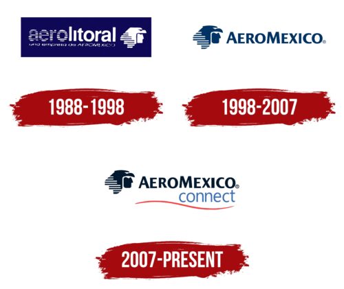
1988 – 1998
From 1988 to 1998, Aeroméxico Connect proved itself a reliable and professional airline, as evidenced by its logo and overall look. The logo featured white designs on a deep blue background, which wasn’t just for looks but also to show what the airline stood for. Thanks to its parent company’s vast experience, Aeroméxico Connect became known for offering comfort and safety on flights in Mexico and abroad.
The logo featured an eagle warrior, a symbol deeply connected to Mexico’s culture, chosen to reflect the nation’s spirit. This symbol wasn’t just about looking back at Mexico’s past; it was about showing qualities like strength, courage, and quickness, which the airline admired. By including an image of the warrior with a helmet, the logo combined human determination with the eagle’s natural power, making it a perfect mascot for an airline aiming high.
The airline’s name, short for its original “Servicios Aereos Litoral,” was cleverly designed to look like air currents and flight paths, tying into the aviation theme and the feeling of flying smoothly through the air. The design matched the style of the warrior’s helmet, creating a look of movement and travel. Aeroméxico Connect’s branding told a story of heritage, ambition, and striving for excellence in the skies, linking closely to its roots while looking forward to becoming a top player in the airline industry.
1998 – 2007
After growing a lot by adding new airplanes and places to fly, the company decided to update its logo. They moved the warrior’s head from the center to the side to show they honor their history but are ready to move forward. This change started a new phase for Aeroméxico, showing they’re open to changes and excited about the future.
They changed the logo to use capital letters and a new blue-green color, which makes it look strong and reliable. This new look was part of their comeback story, showing they’re ready for longer flights and looking to grow after overcoming tough times.
They ensured the logo looked good on planes, with clear lines and a modern take on the ancient eagle. This shows the airline respects its history but is also modern and ready for what’s next.
2007 – today
The Aeromexico Connect logo shows a bird in the left corner looking ahead, suggesting the airline’s aim to fly high. The bird seems still, but the pairs of lines around it show movement. These lines make the bird and the airline seem dynamic and forward-moving.
On the right, the airline’s name appears in two parts. “AeroMexico” is at the top, with each new word starting with a big letter to catch your eye and link the airline to Mexico. Below it, “connect” is written in small letters, showing the airline’s goal to link places and people worldwide. This mix of big and small letters makes the airline feel grand and friendly.
A red line at the bottom adds color and represents the airline’s routes across different places, suggesting it connects continents, cities, and cultures.
This logo mixes pictures and words to show that Aeromexico Connect is about moving forward, connecting people, and being proud of its Mexican roots. It’s designed to be clear and tell the story of an airline that makes the world smaller by bringing people together.
Font and Colors
The Aeroméxico Connect logo is simple and looks modern. The “AEROMEXICO” part is in big capital letters, making it seem strong and serious. The word “connect” is in small, lowercase letters, making it feel welcoming and easy to approach. The colors are dark blue, light blue, and red. Dark blue stands for trust and is used for “AEROMEXICO,” while light blue, used for “connect,” means clearness and talking. The red swoop under the text gives a feeling of action and ties to Mexico because red is an important color in the Mexican flag and shows excitement and life.
Next to the text, an eagle’s head is drawn in a simple style and dark blue. The eagle is an important symbol in Mexico, and it shows that the airline is about high quality, the joy of flying, and Mexican pride.
In short, the logo’s design—its letters and colors—shows that Aeroméxico Connect is about being new, dependable, and proudly Mexican.
FAQ
What does the Aeromexico logo mean?
Aeromexico’s logo showcases the Eagle Knight, a symbol full of meaning from Mexican history that stands for bravery, strength, and the pride of a nation. This figure comes from the Aztec warriors, who were celebrated for their fighting skills and wore feathered coats, linking them to the eagle—a symbol of power in Aztec culture.
It chose the Eagle Knight as its symbol to show Aeromexico’s deep connection to Mexico’s heritage and traditions. The logo ties the airline’s modern image to Mexico’s rich history, reflecting values like freedom and aiming high, which Aeromexico wants to mirror in its services. The logo also means Aeromexico wants to share Mexican culture with the world.
What is the difference between Aeromexico and Aeromexico Connect?
Aeromexico and Aeromexico Connect are parts of the same airline group but have different jobs. Aeromexico is the main airline of Mexico and flies big planes to many places in Mexico, the Americas, Europe, and Asia. It’s known for its good service on longer flights and for both business and vacation trips.
Aeromexico Connect is like a smaller partner to Aeromexico. It handles shorter flights within Mexico and some places in the United States and Central America. These flights help connect smaller cities to bigger airports. All Aeromexico Connect planes look the same as Aeromexico’s, so passengers get the same experience no matter which one they fly with.
The big difference between them is what they focus on. Aeromexico Connect mainly helps people in smaller cities get to bigger airports to catch Aeromexico flights to other countries. This setup makes it easier for travelers going both within Mexico and abroad.
Who operates Aeromexico Connect?
Aeromexico Connect is run by Aerolitoral, S.A. de C.V., which used to be known simply as Aerolitoral. They changed their name and image to better match Aeroméxico, the main airline of Mexico. This change helps Aeromexico Connect fit into the bigger picture of Aeroméxico’s flights within Mexico and to some international spots.
The airline’s main base is Monterrey, but it also has crews in Mexico City and Monterrey. It uses Embraer E-190 planes, which are great for shorter trips because they’re comfortable and efficient. This means passengers, whether flying for work or fun, get a good experience on these regional flights.
Is Aeromexico Connect safe?
Aeroméxico Connect and its previous version, Aerolitoral, have a strong safety history. They’ve never had an accident where someone died, showing they’re focused on keeping passengers safe. This is super important for people when deciding which airline to fly with.
Although there haven’t been any deadly accidents, there have been six in total, two of which were so bad that the planes couldn’t be fixed. However, no one died even in those serious accidents, so the airline must have good safety plans and emergency responses. The airline works hard to keep things safe by regularly checking its planes, following all the safety rules, and ensuring its crew knows what to do in emergencies.
