The Aetna logo focuses on the company’s mission. In the center of the emblem is health care. Just as the heart is the source of life, so is the insurance company a source of funds to increase its duration.
Aetna: Brand overview
| Founded: | May 28, 1853 |
| Founder: | Eliphalet Adams Bulkeley |
| Headquarters: | Hartford, Connecticut, U.S. |
| Website: | aetna.com |
Meaning and History
Aetna is a direct descendant of the insurance company of the same name that opened in the early 1800s. The foundation for the modern brand was laid in 1850 when the parent organization established a life insurance fund. In 1853, that division became independent. The executives decided not to change the name so as not to lose consumer confidence. It was inspired by the stratovolcano Aetna on the east coast of Sicily. It is the highest volcano in Europe, and in the 1800s, it was also the most active.
During the economic crisis, the company was wanted to be liquidated, but this was avoided. In 1856 its annual income exceeded one million dollars. Thanks to its financial stability, it changed its strategy and greatly expanded its services. In 1899 Aetna was one of the first to begin insuring not only people’s lives but also their health. Later it gave bonds to build the Manhattan Project, the United Nations headquarters, and to rebuild the Statue of Liberty.
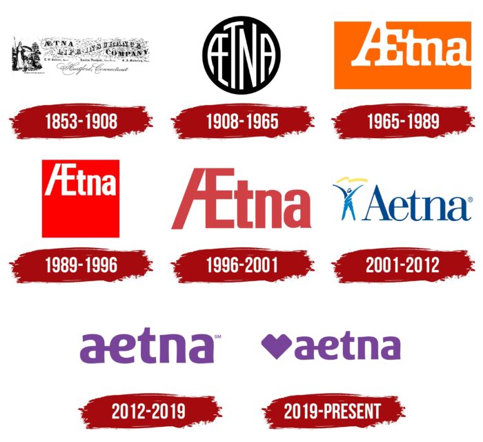
A company-wide reorganization helped it adjust to changing market standards. This process was accompanied by a constant renewal of its identity, which was also up-to-date. Thus, Aetna had no fewer than eight logos. They were used in different eras – from the middle of the century before last to the present time. Like all the others, the current version contains the name of the brand but differs in its original design.
1853 – 1908
In 1853, a division emerged from the original Aetna firm and became the basis for the same name’s life and health insurance company. The new organization used a logo that read “AETNA LIFE INSURANCE COMPANY” for advertising. The initial “A” and “E” in the first word were spliced together. The floral ornamentation depicted in the background echoed the figurative Old English letter design. At the bottom was additional text, including the name of the city and state where the insurance firm was established. The designers had the phrase “Hartford, Connecticut” in a fine calligraphic script.
On the left was an elaborate graphic composition. The central element was a woman with a lance and sword, presumably the Roman goddess Minerva, patroness of wisdom, doctors, artisans, and artists. She towered over a seated woman holding a child in her arms. Trees surrounded them.
1908 – 1965
Following the trends of minimalism, the designers simplified the structure of the emblem. The new version contained a black circle with an ” AETNA ” white inscription.” The shape of the letters was adapted to the size of the circle so that they occupied the entire inner space. The first “A” and “E” were joined by horizontal lines to form a monogram or, more precisely, a ligature.
1965 – 1989
In 1965, Lippincott & Margulies updated the corporate image of Aetna. As a result, the logo became rectangular in shape and orange. The white lettering remained, but the font was completely different from previous versions. Specialists converted the “t,” “n,” and the last “a” to lower case, using a custom bold font with massive serifs. The “A” and the “E” at the beginning remained uppercase. Only the ligature style was changed. At the same time, all the letters in the word merged with each other, as there were very narrow intervals between them. The brand’s name was not in the center of the rectangle but at the top, aligned to the right.
1989 – 1996
After another redesign, the base turned into a red square. The letters were disconnected, but the ligature did not disappear. The creators of the logo redesigned it by enlarging the “E” and removing the horizontal bar at the top of the “A.” They had to do this because the font was changed to a bold geometric grotesque with balanced proportions. As in the previous case, the lettering was at the top of the quadrangle, only this time it was center-aligned.
1996 – 2001
The square base disappeared, and the insurance company’s name was repainted in terracotta with a pink tint. The letters became more angular. The last “a” has a miniature triangular serif at the bottom.
2001 – 2012
For the first time in many years, the designers removed the ligature at the beginning of the word, separating the “A” and the “E.” They chose a font that combined thin and wide strokes. The ends of the letters were decorated with long serifs. To the left of the inscription was a schematic figure of a man with his hands in the air. A yellow ribbon waved above his head. Both the silhouette and the brand name were blue, but two different shades were used for the icon.
2012 – 2019
In 2012, Aetna reorganized to reflect the impact of health care reform on insurance services. To confirm its intentions, it revamped the logo, for which it enlisted the help of agency Siegel + Gale. The designers got rid of the human figure and focused only on the lettering:
- They made all of the letters lowercase and reunited the “a” and “e.”
- They created a custom sans serif typeface that combined wide lines, smooth rounding, and right angles.
- Navy blue was replaced by purple.
2019 – today
Aetna’s new corporate logo comes after the brand became part of CVS Health Corporation. A purple heart-shaped icon was added next to the lettering to mark the occasion. The exact same element, but in red, adorns the CVS Health logo.
Aetna: Interesting Facts
Aetna is a key figure in the healthcare and insurance industry, with a history highlighting its significant influence on health insurance in the United States.
- Early Days: Founded in 1853 in Hartford, Connecticut, Aetna was named after the active volcano Mt. Etna, symbolizing strength and endurance. It started by selling life insurance and grew into a leading healthcare insurer.
- Entering Health Insurance: In 1899, Aetna was one of the first to offer health insurance, starting with accident-related policies for workers, laying the groundwork for employer-based health insurance.
- Employee Benefits Innovator: Early in the 20th century, Aetna began offering group life insurance, setting the stage for the employee benefits industry and helping American workers secure financial well-being.
- Medical Standards: In the 1930s, Aetna helped set standards for cancer hospital care, improving treatment quality nationwide.
- Broadening Services: Aetna expanded beyond insurance to include pharmacy management, mental health services, and medical research, showing its versatility in healthcare services.
- Managed Care Pioneer: The company was at the forefront of managed care, a strategy to lower healthcare costs through case management and care guidelines, influencing health policy in the U.S.
- Embracing Digital Tools: Aetna has adopted technology to enhance care and services, developing mobile apps and online health management tools, including prescription and doctor searches.
- Community Involvement: Through its foundation, Aetna invests in health initiatives focusing on health equity, mental health, and access to care, showing its dedication to public health.
- Joining CVS Health: In 2018, CVS Health acquired Aetna to integrate insurance with pharmacy and clinic services, signaling a shift towards comprehensive health care focused on prevention and outcomes.
- Environmental Initiatives: Aetna is noted for its sustainability efforts, including waste reduction, energy conservation, and promoting environmental responsibility in healthcare.
From its beginnings as a life insurance company to becoming a healthcare powerhouse, Aetna’s story mirrors changes in the U.S. healthcare system and society’s attitudes toward health and wellness.
Font and Colors
Although the main symbol of Aetna is now the heart, it does not have as much significance as the ligature formed by the letters “a” and “e.” A crucial historical legacy reflects the insurance company’s commitment to cooperation and assistance. There is symmetry in the connected characters, which speaks to the harmony of the relationship between the organization and its clients.
The font was designed specifically for Aetna. It shares features with eSpectrum Extra Bold, and FF Signa Round Pro Condensed but differs in the smooth rounding of some fragments. All letters are lowercase, which corresponds to modern standards. Previously, the Bodoni variety was used for the inscription.
The color of the logo is atypical for insurance companies. As you know, financial institutions usually try to show their conservatism with dark colors. The Aetna brand decided to stand out against their background with a bright purple palette.
Aetna color codes
| Dark Lavender | Hex color: | #784499 |
|---|---|---|
| RGB: | 120 68 153 | |
| CMYK: | 22 56 0 40 | |
| Pantone: | PMS 258 C |


