The Air Inuit logo is a multifaceted emblem that skillfully blends cultural heritage and modern aviation service. It reflects the essence of the northern territories, emphasizing the airline’s authenticity and role as a lifeline for indigenous peoples. This combination of traditional and modern elements appeals to a wide audience, from locals to international travelers.
Air Inuit: Brand overview
Air Inuit, started in 1978 by the Northern Quebec Inuit Association, was set up to link the far-flung communities of Nunavik with the larger Quebec area. This effort was all about overcoming the vast distances to support the unique way of life in Northern Quebec.
During the 1980s, Air Inuit took its first steps with smaller planes and helicopters, handling people and cargo. This was the beginning of bringing the dispersed communities of Nunavik closer together.
In the 1990s, the airline grew its fleet with larger planes, serving more places in Nunavik and nearby areas. This growth answered the increasing needs of these communities, underlining Air Inuit’s dedication to its core mission.
In the 2000s, Air Inuit updated its service with modern planes like the Dash 8 and Boeing 737. This change made flights more comfortable and helped meet the growing demand for its services.
The 2010s focused on updating the fleet with versatile and dependable planes and diversifying services, including charter flights, medical evacuations, and search and rescue missions. This showed the airline’s commitment to serving the community in various ways.
In 2019, celebrating 40 years, Air Inuit reinforced its vital role in air transport for Nunavik and the Inuit communities in Northern Quebec. The airline has consistently been a lifeline for these remote communities, providing essential connections and services for their growth and well-being.
Today, Air Inuit remains crucial in making Nunavik’s remote communities accessible. Air Inuit offers various services to meet the needs and challenges of the Far North. It is a trusted and dependable partner for local communities, keeping them connected to the wider world despite the tough climate and infrastructure challenges.
Meaning and History
Air Inuit is a crucial link between remote communities and the rest of the world in Canada’s Arctic. Since its start in 1978, it has helped develop the North’s economy and society while honoring the Inuit culture. The company’s logos reflect its growth over time and respect for native traditions and the Arctic environment. Each design element of Air Inuit’s logo tells a story of connection with nature and traditions. The colors and shapes used in the logos tell a tale of struggle, adaptation, and progress at the heart of the brand. These symbols bridge the past and present, emphasizing the importance of preserving cultural heritage in today’s world.
What is Air Inuit?
Air Inuit, whose name in the Inuktitut language sounds “ᐃᓄᐃᑦ ᖃᖓᑦᑕᔪᖏᑦ,” hails from the Montreal neighborhood of Saint-Laurent, Quebec, Canada. The airline, deeply rooted in the history and culture of the Inuit people, provides a vital link between the northern and southern regions of Quebec.
1978 – 2014
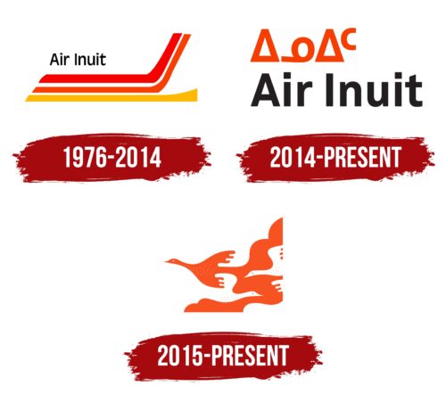
Since 1978 and up to 2014, Air Inuit has played a crucial role in connecting the vast northern regions of Canada, becoming a symbol of the culture in these areas. The airline’s significant changes, including its rebranding from Air Schefferville to Air Inuit in 1988, reflect its deep connection with the Inuit communities.
The logo captures the spirit of flight and the dynamic cultures of the communities Air Inuit serves. At the heart of the logo is a plane ready to take off, designed with red, orange, and yellow stripes. These colors do more than just look good; they tell a story of hope, community strength, and prosperity.
The colors create a beautiful gradient that looks like a flame reaching up to the sun. Yellow at the bottom represents the wealth of Inuit culture and resources. Orange stands for community effort and support, which is vital to Air Inuit and the regions it connects. The red at the top signifies blessings and prosperity, highlighting Air Inuit’s dedication to improving the lives of the Inuit people.
2014 – today
Air Inuit’s new logo beautifully mixes modern design with true cultural representation, connecting both lands and cultures. Changed to Air Inuit in 1988; this name reflects the airline’s commitment to the Inuit communities’ culture and heritage.
The logo includes Inuktitut, the Inuit language, showing respect and recognition for all Inuit groups. This move respects the culture and makes Air Inuit a favored airline in northern Quebec.
The orange-red logo tells a story of unity and warmth among Canada’s northern peoples. This color doesn’t just catch the eye; it represents the Inuit’s warm community spirit and ability to thrive in cold environments. Essentially, the logo celebrates the rich heritage and strong connections among the communities in Quebec’s vast northern areas.
2015 – today
Air Inuit has carved out a distinct visual identity that embeds Inuktitut syllabics within its logo. This choice showcases a profound respect for the indigenous Inuit culture and sets the airline apart in the corporate landscape. This design choice reflects a deep-rooted connection to its heritage, offering a visual narrative that is both authentic and closely linked to the regions it serves.
The logo is structured in two layers, aligned on the left, for a tidy and structured look. At the top, Inuktitut syllabics draw the eye, resembling a collection of geometric shapes that come together to express meanings in the Inuktitut language. This aspect pays homage to the cultural richness of Canada’s Arctic, acting as a conduit between the airline and its community of service.
Transitioning below to the airline’s English name, “Air Inuit,” the logo maintains its appeal to a broad audience, balancing modernity with accessibility. The typography in both Inuktitut and English boasts sleek, contemporary lines with a harmony of angles and curves, ensuring legibility while keeping its aesthetic appeal.
A novel twist on the lowercase “I,” where a square replaces the traditional dot, mirrors the geometric theme of the Inuktitut syllabics above. The “t” also presents a unique slant at its top, enhancing the logo’s distinct look and underscoring a commitment to cultural reverence and meticulous design.
By weaving together Inuktitut syllabics and English lettering, Air Inuit’s logo articulates its dedication to its origins, honor for the Inuit culture, and goal to bridge northern communities with the wider world. Emblematic of unity, heritage, and a forward-thinking ethos, the logo encapsulates Air Inuit’s essence in a visually engaging and significant manner.
Font and Colors
The logo of Air Inuit features a distinctive font that blends elements of sans-serif with stylized letters. The name is written in two parts: “Air” in a bold, sans-serif type and “Inuit” in a more stylized, sleek font. The standout “A” and “C” graphics above the text likely represent the Arctic Circle, connecting the airline to its northern Canadian operations. This icon, made of triangles and a circle, abstractly represents the Arctic environment and the Inuit community’s bond with it.
The logo’s color palette is a vivid contrast of orange and black. The orange color brings energy and warmth, suggesting adventure and excitement about travel. The black color grounds the logo, ensuring the text stands out against different backgrounds for readability. This combination draws attention while keeping a professional look.
FAQ
Where is Air Inuit from?
Air Inuit is a Quebec, Canada, airline with its main office in Montreal’s Saint-Laurent area. It is crucial to link remote areas of Canada, focusing on Nunavik in Northern Quebec, Southern Quebec, and Nunavut. The airline provides regular passenger flights, charter flights, and cargo services.
For people living in these isolated regions, Air Inuit is essential. It enables them to travel to other parts of Quebec and Canada and ensures access to necessities like food and medical supplies. The airline significantly benefits these communities and boosts their economies by facilitating quicker and easier travel. Air Inuit is also unique in Canada’s aviation industry due to its Inuit cultural ties.
What is the IATA code for Air Inuit?
Air Inuit’s IATA code is 3H, and its ICAO code is AIE, which was updated in 2024. IATA codes are two letters that help identify airlines all over the world. They are important for booking flights and managing baggage. ICAO codes have four letters and are used more for air traffic control and the operations of an airline, giving a more detailed way to identify airlines. These codes are very important for Air Inuit, which flies to far-off and northern places in Quebec, Canada. They help ensure that flights, baggage, and air traffic are handled well and in a standard way across the world.
How many planes does Air Inuit have?
Air Inuit has a fleet of 34 planes and is not waiting on any new ones. Their planes are chosen to fit the tough job of flying to hard-to-reach places in Quebec, Canada, and beyond. Here’s what they have:
- 3 Boeing 737 Next Generation planes are good for long flights and can carry many passengers. They’re mainly used to connect big cities and sometimes for special charter flights.
- Seven de Havilland Canada DHC-6 Twin Otters are tough, flexible, and can land on rough surfaces. This makes them perfect for getting to remote areas without big airports.
- There are 15 De Havilland Canada Dash 8 planes. They are good for short flights and can land on shorter runways, so they’re great for reaching smaller communities.
This mix of planes helps Air Inuit provide essential air services to the north of Quebec. They carry passengers and cargo and even conduct emergency medical flights.
Where does Air Inuit fly to?
Air Inuit flies to many places within Canada, mainly in Quebec but also to Nunavut, Newfoundland, and Labrador. The airline connects far-off and less-visited communities to big cities, playing an essential role in these areas’ transport systems.
In Quebec, Air Inuit flies to important places like Inukjuak, Akulivik, Kangiqsujuaq, and Radisson, as well as big cities such as Montreal and Quebec City. This makes it easier for people to travel between the north and south of the province for personal, business, or health reasons.
The airline also flies to Nunavut, including destinations like Sanikiluaq, keeping these remote communities connected. In Newfoundland and Labrador, places like Wabush are on Air Inuit’s flight list, helping to move people and goods to and from Quebec.
Air Inuit also serves the Nunavik region, flying to places like Schefferville, Tasiujaq, and Quaqtaq. These flights are crucial for these communities, often cut off by harsh weather and difficult terrain.
