


 Airbus Helicopters Logo PNG
The Airbus Helicopters logo underscores the company’s leading position in the global helicopter market and its commitment to providing advanced, reliable solutions for diverse needs. Airbus Helicopters is dedicated to developing technologically advanced helicopters that meet the highest safety and efficiency standards through its design. The company is a dependable partner for operators worldwide, supporting civilian missions, including offshore operations, medical evacuations, and military and law enforcement operations.
Airbus Helicopters traces its history to January 1, 1992, when Eurocopter was created through the merger of the helicopter divisions of Germany’s MBB and France’s Aérospatiale. The merger aimed to consolidate the European helicopter market and create a stronger competitor to American manufacturers. The new company combined the German and French engineering bases into a single aviation structure.
In 1994, Eurocopter introduced the EC135, its first fully redesigned helicopter. The light twin-engine model became widely used in law enforcement and medical evacuation. In 1996, the company became involved in the NH90 program, developed by Italy’s Agusta and the Netherlands’ Fokker, which became one of the largest European military helicopter projects.
In 2000, Eurocopter introduced the EC120 Colibri, a light single-engine aircraft developed in partnership with companies in China and Singapore. In 2005, it announced a partnership with China’s AVIC on the EC175, later renamed the H175, to meet demand in the Asian market. In 2010, the X3 technology demonstrator made its first flight, reaching 293 knots (542 km/h) with a hybrid helicopter layout.
In 2012, Eurocopter marked its 20th anniversary as the world’s largest helicopter manufacturer by deliveries. In 2014, it was renamed Airbus Helicopters as part of Airbus Group’s reorganization of EADS. In 2015, the H160 made its first flight as a new medium twin-engine model designed to replace the Dauphin. In 2017, the Racer program followed the X3 concept, and in 2019, the VSR700 naval unmanned demonstrator made its first flight. In 2020, the company adjusted its operations in response to changing market conditions, technological developments, and production optimization.
Meaning and History
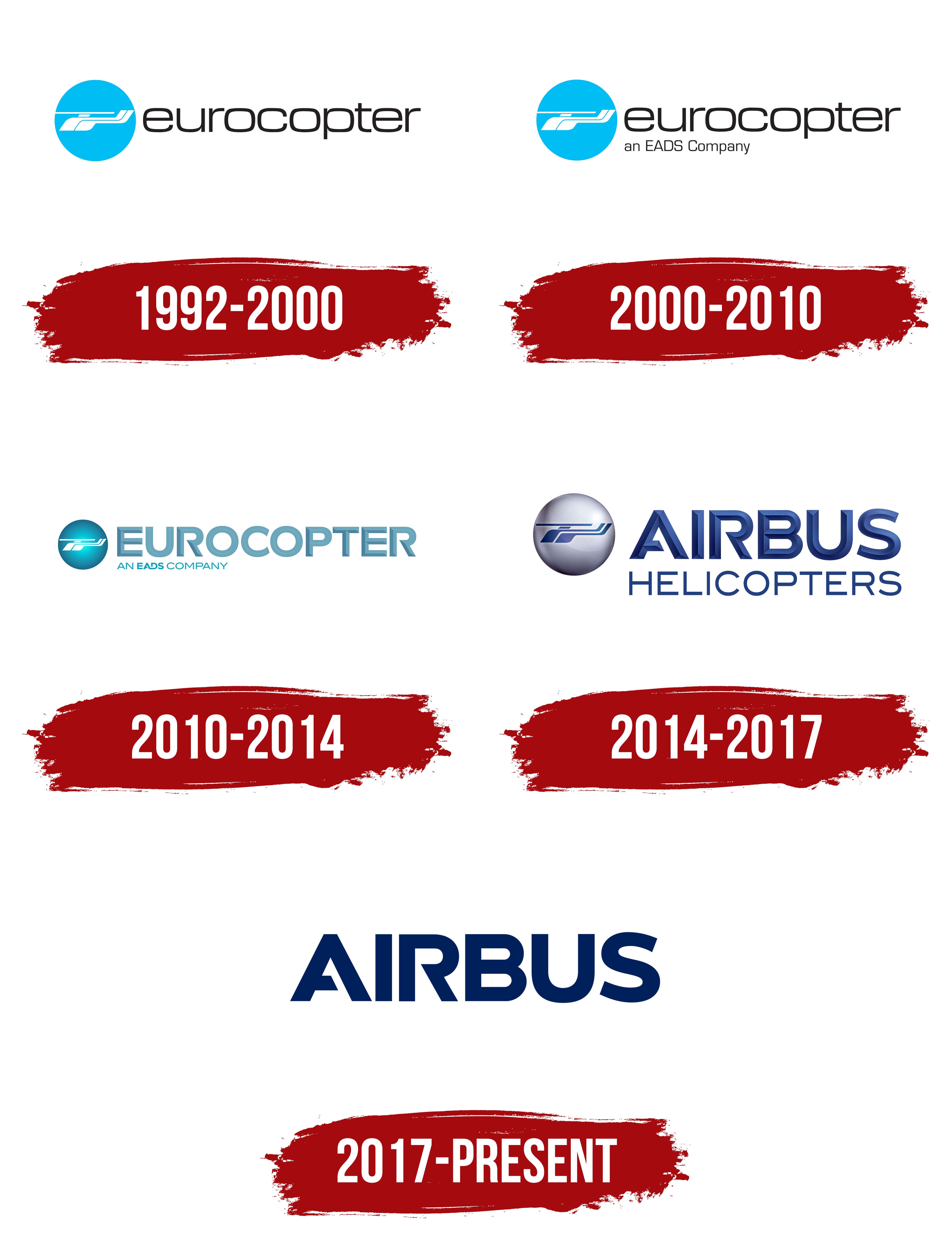
Airbus Helicopters’ logos have evolved to reflect the company’s significant achievements, dedication to leading-edge technology, and position as an industry leader. These logos have consistently showcased innovation, reliability, and sophisticated engineering, trademarks of Airbus Helicopters’ offerings. The logos often feature a stylized helicopter or key parts of one, such as the rotor or body, highlighting the company’s focus and deep knowledge in designing and building helicopters. This imagery symbolizes the high quality and innovation that clients and helicopter operators expect from Airbus helicopters. The logo is now widely recognized as a mark of excellence, safety, and technological advancement, core values that have driven the company’s success.
What is Airbus Helicopters?
Airbus Helicopters, formerly known as Eurocopter Group, holds an important place in the aviation industry as Airbus’s helicopter division. The company is headquartered at the Marseille Provence Airport in Marignan, France. The company’s history has been characterized by growth and expansion, with major plants in Marignan, France, and Donauwörth, Germany, and additional manufacturing facilities in Canada, Brazil, Australia, Spain, Romania, the United Kingdom, and the United States. On January 2, 2014, the company rebranded, renaming Eurocopter to Airbus Helicopters.
1992 – 2000

From 1992 to 2000, Airbus Helicopters, then known as Eurocopter, used a logo that reflected its commitment to technology and environmental stewardship. The logo featured a circle that resembled Earth, highlighting the company’s global reach. This circle was light blue, suggesting clear skies and the brand’s commitment to keeping the air clean with environmentally safe technologies.
Within this circle, a white helicopter symbolized the company’s focus on using environmentally friendly materials and underscored safety and efficiency, essential aspects of the brand’s philosophy. This design reflected the company’s technical expertise and high-quality manufacturing processes.
The company’s name, Eurocopter, was written in a sleek, elegant font, representing the collaboration of three European countries in its creation. The letters’ square shapes and rounded edges emphasized the helicopters’ technical sophistication, agility, and efficiency compared to airplanes.
2000 – 2010

The logo has the same basic design but now includes “EADS” under the company name. This change shows that the helicopter maker is now part of the “European Aeronautic Defence and Space Company” (EADS), the largest aerospace group at the time.
Adding “EADS” to the logo does more than just change its look. This means that the company has grown and now covers more areas. Being part of EADS shows that the helicopter company is involved in various aerospace activities, making helicopters and working on many other aerospace and defense projects.
2010 – 2014
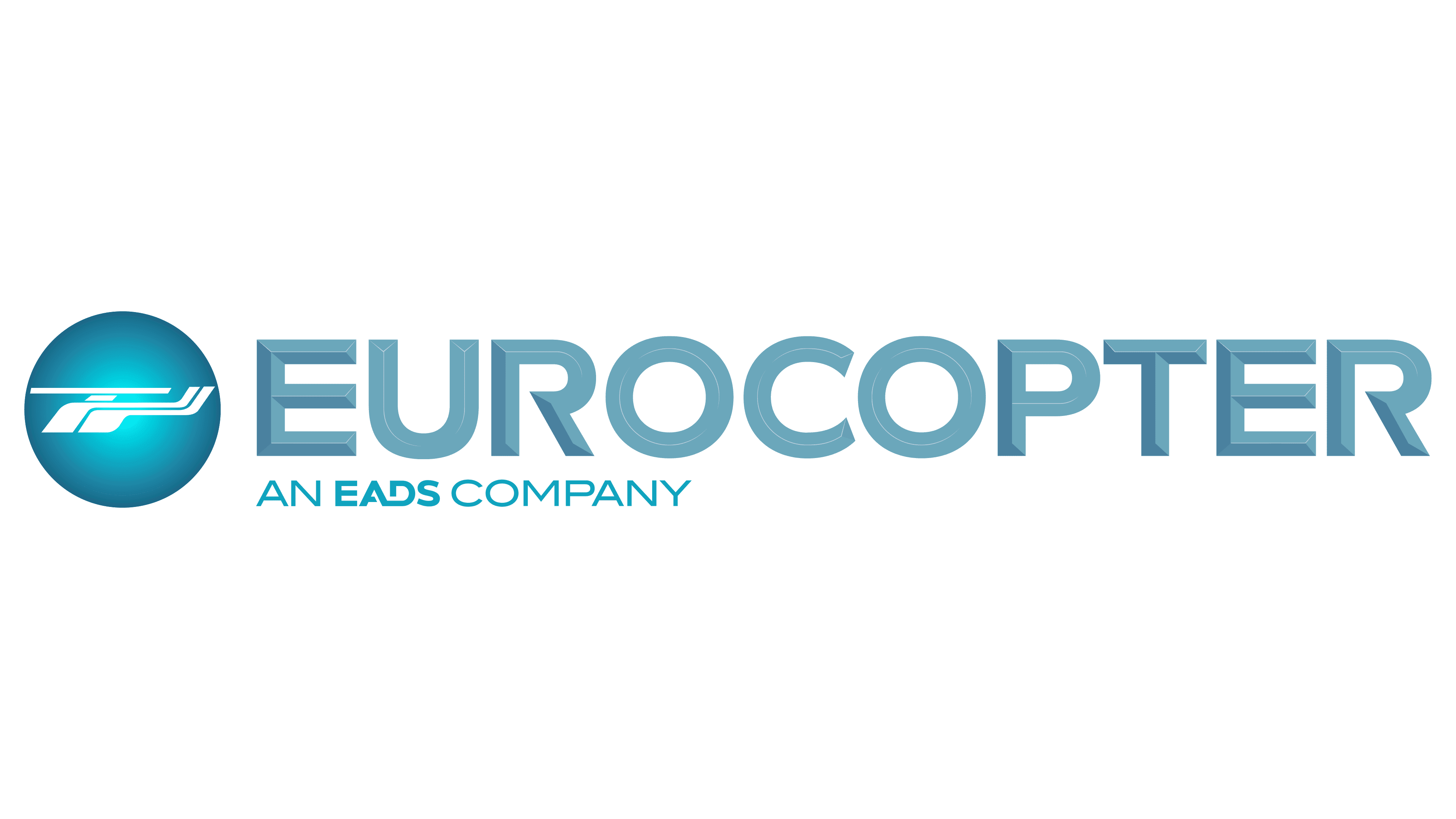
The company’s logo changed to look more three-dimensional, giving it a lively, dynamic feel compared to its old flat design. This change, turning a circle into a sphere, shows the company is reaching out globally, not just within the European Union. Making the letters in the logo uppercase highlights the company’s faster production and broader sales, underscoring its growing role in the aerospace industry.
A new design trick made the start and end of the company’s name in the logo stand out, making the company more noticeable and well-known in the industry. The design, especially the thicker parts of the logo, evokes helicopter rotor blades, the company’s main product. This clever hint strengthens the company’s image as a leading helicopter manufacturer and underscores its dynamic, progressive approach.
2014 – 2017
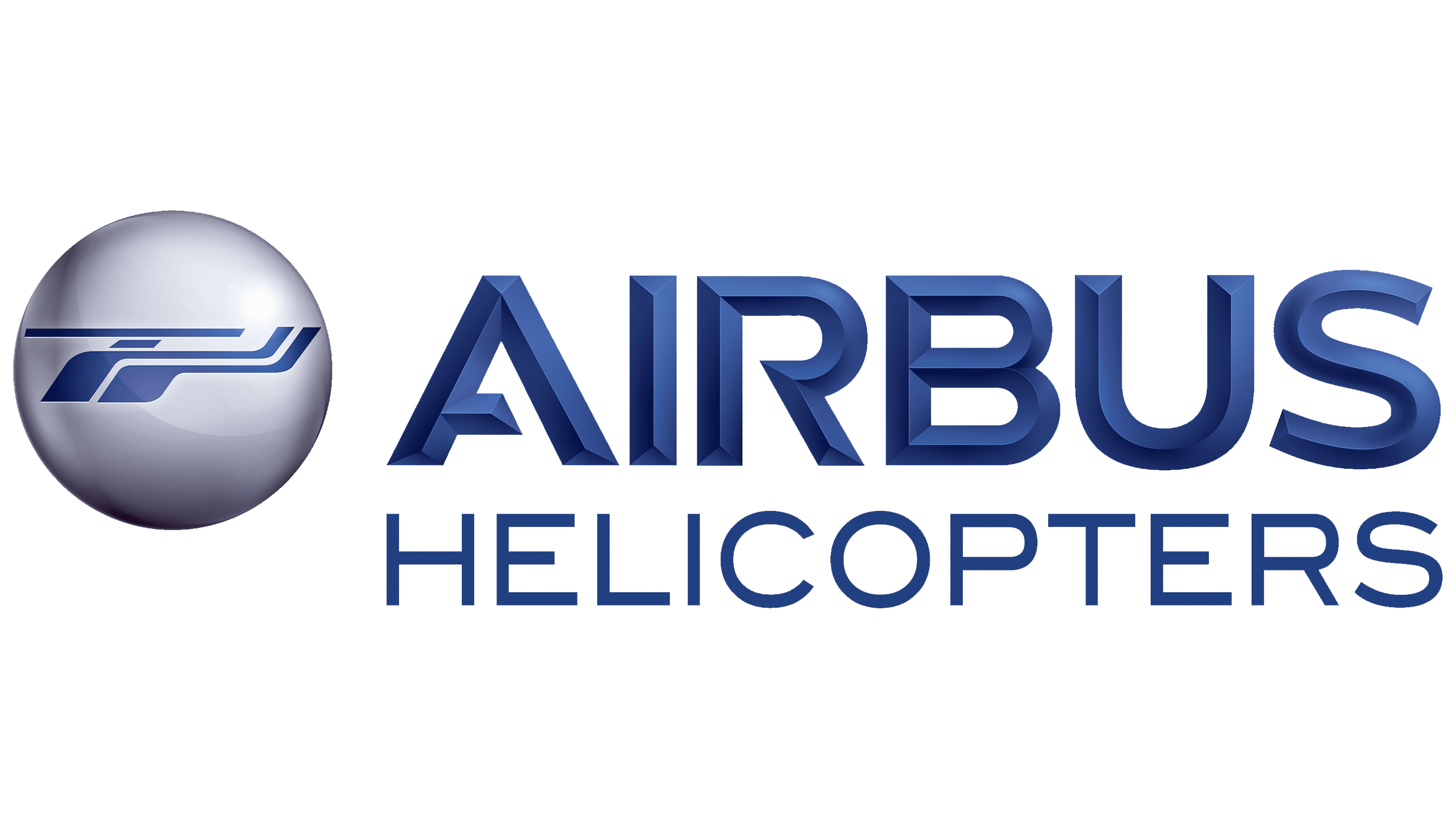
EADS underwent big changes, leading Airbus to create a new, memorable logo. This logo features a white sphere with a blue helicopter emerging from it, much like a pearl. It shows how valuable, high-quality, and good-looking Airbus’s helicopters are, putting them at the top of aviation technology.
The name “Airbus” in the logo looks like metal, suggesting their products are strong, long-lasting, agile, and easy to handle. Using the name Airbus Group in the logo boosts the company’s market position by leveraging Airbus’s reputation for quality and innovation.
The word “Helicopters” is written in a lighter style, highlighting the company’s focus on building helicopters, especially for city use. The font hints at Airbus Helicopters’ special skills and push to improve helicopter technology.
The logo’s deep royal blue with iridescent tones conveys sophistication, prestige, and exclusivity, which are well-suited to Airbus Helicopters’ customers. This blue color is often linked with innovation and a forward-thinking approach in the tech world, highlighting Airbus Helicopters’ commitment to leading the way in aerospace advancements.
2017 – today
Previously known as Eurocopter, the company rebranded in 2014, adopting “AIRBUS” as its new emblem. This shift was more than a name change; it signified a deeper integration with the Airbus brand, celebrated for its aviation prowess. The logo’s dark blue text is a deliberate nod to the sky’s expanse, embodying safety and dependability, which are crucial in aerospace.
The design uses uppercase letters to ensure visibility across contexts, from the sleek exteriors of helicopters to official documents. This choice enhances legibility from afar and fosters immediate brand recognition across different helicopter models and company assets.
The “AIRBUS” logo employs a bespoke font characterized by bold characters, with a unique feature: the “A” and “R” are designed with open spaces by intentionally leaving some lines unclosed. This design strategy lightens the visual heaviness of the boldface, infusing a touch of grace and agility into the logo’s appearance. These subtle design elements allude to innovation and meticulousness, reflecting Airbus’s ethos. Despite the logo’s boldness, it conveys the company’s dynamic, versatile approach.
The rebranding to “AIRBUS” and the thoughtful design of the logo illustrate the company’s transition to a more cohesive part of the Airbus family. This evolution mirrors a dedication to aerospace excellence, portraying a vision that honors its roots while looking ahead to innovations in aviation technology. Airbus’s logo thus conveys its commitment to leading in safe, advanced, and innovative air travel, capturing the essence of skyward exploration and the ongoing pursuit of excellence.