The Alaska Airlines logo soars up like an airplane. Each element reaches for the heavens and demonstrates movement. The emblem conveys love for the blue sky and travel. And on the ground, there remains a base that monitors the safety of the flight.
Alaska Airlines: Brand overview
With a history spanning more than 85 years, Alaska Airlines is among the biggest carriers in the US. The business was established in Anchorage, Alaska, on May 6, 1932, under McGee Airways. Its founder, Linious “Mac” McGee, started utilizing a single-engine aircraft to fly mail between Anchorage and Bristol Bay.
Star Air Lines was created in 1934 after the merger of McGee Airways and Star Air Service. The airline rebranded as Alaska Star Airlines in 1937 before adopting its current name in 1944.
The airline was instrumental in developing air travel in the state throughout the 1940s and 1950s, operating mail, cargo, and passenger flights between isolated villages and larger cities. The airline operated various aircraft, such as the Lockheed Constellation, Douglas DC-3, and Curtiss C-46, designed to withstand Alaska’s harsh climate.
The company started adding destinations outside of Alaska in the 1960s when it started operating flights to Seattle, Washington. The airline provided passengers with speedier and more pleasant flights after acquiring its first jet aircraft, a Boeing 727, in 1967.
The airline resumed service to Portland, Oregon, and other Pacific Northwest locations in the 1970s as part of its ongoing continental US expansion. The airline added new aircraft, such as the Boeing 720 and 707, to modernize its fleet.
In the 1980s, the airline faced fierce rivalry with other airlines that served Alaska and the Pacific Northwest. In response, the airline launched a reorganization plan to cut expenses and boost operational effectiveness. Passenger service procedures were improved, staffing levels were lowered, and unprofitable routes were canceled.
The airline continued expanding its route network throughout the 1990s, adding flights to Mexico, Nevada, California, and Arizona. The airline partnered with other airlines, such as American Airlines and Continental Airlines, to provide customers with more travel options.
As one of the biggest airlines on the West Coast, the company consolidated its position in the American aviation industry in the 2000s. The airline modernized its fleet by purchasing new Boeing 737 Next Generation airplanes and gradually retiring older types.
During the 2010s, the airline aggressively increased the number of destinations it served in the United States, Mexico, Costa Rica, and Cuba. 2016, the airline said it would pay $2.6 billion to acquire Virgin America, another significant West Coast carrier. This agreement greatly enhanced the airline’s position at important regional airports like San Francisco and Los Angeles.
Following its acquisition of Virgin America, the company started merging the two businesses, bringing the aircraft, route network, reservation systems, and reward programs under one roof. This procedure was finished in 2018, and the combined airline continued under the Alaska Airlines name.
The company redesigned its logo and brand in 2018, showcasing the airline’s dedication to excellence in customer service and innovation. The airline made a significant order for the newest Boeing 737 MAX aircraft as part of its ongoing fleet modernization efforts.
The company celebrated its 88th anniversary in 2019, solidifying its position as one of the top U.S. carriers. With a more than 300 aircraft fleet, the airline served more than 115 locations in the United States, Canada, Mexico, Costa Rica, and Cuba.
In 2020, the airline prioritized its workers’ and customers’ health and safety. To maintain social distancing, the company reduced the number of flight passengers, enforced mask wear in airports, and improved cleaning and disinfection procedures for its aircraft.
The company continued running flights on important routes in its network despite a noticeable drop in the number of people who needed to travel by air. The airline provided more flexible booking and ticket exchange alternatives to accommodate customers’ evolving needs.
In late 2020, the airline announced that it would be adding routes from Seattle to the Midwest and South United States, including Raleigh, Cincinnati, Columbus, and Miami. With these new routes, the airline hopes to improve its standing in important areas and provide customers with more options for where to go.
The company restored its operations in 2021, progressively expanding its flight schedule and adding new destinations. To provide passengers with more comfortable flight conditions, the airline recently started renovating the interiors of its aircraft, adding new seats and entertainment systems.
When it joined formally in March 2021, the airline became the 14th full member of the worldwide Oneworld alliance. With the achievement of this milestone, the airline embarked on a new chapter. It began offering its passengers access to the vast Oneworld route network, which spans over 1,000 destinations globally, along with many benefits and services tailored for frequent fliers.
The airline continued its aggressive development in 2022, adjusting to meet the sluggish but steady rebound in air travel demand. The company expanded its network of destinations, boosted flight frequencies on well-traveled routes, and fortified its position at West Coast airports.
Meaning and History
We can say that ASA originated in 1932, during the Great Depression. Then, Indiana native Linious McGee began piloting a small, three-seater aircraft with “McGee Airways” written on the side. In the same year, three Seattle pilots borrowed money to found Star Air Service. The adventure grew into something more when the two companies merged. As a result of several more mergers, the business expanded. Alaska Airlines, Inc. (this name was adopted on May 2, 1944), many routes and modern air transport appeared.
The airline expanded significantly in subsequent years, becoming the most influential charter operator globally. But her financial situation remained very precarious. The situation was saved by the new leader – Charlie Willis. As a born marketer, he focused on developing the ASA brand to focus on logos and liveries.
What is Alaska Airlines?
It is an airline that operates on US mainline airlines. It appeared in 1932 and became the largest air carrier on the Pacific coast. Its route network covers about a hundred cities in Mexico, Canada, and the United States.
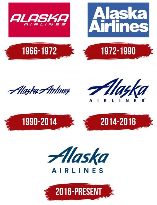
1966 – 1972
In the mid-1960s, the name Alaska Airlines was the logo, written in oblique capital letters. The typeface’s characteristic feature was the rounded shape and the absence of top corners on the “A.” The white inscription was on a red rectangle in the main version, but everything looked slightly different: the red word “ALASKA” stood out as a bright spot on the aircraft’s whiteboard.
The new design became part of an advertising project that made the airline famous worldwide. As part of the marketing campaign, the aircraft’s interior was covered with red-orange velvet wallpaper, and all ASA employees wore Cossack suits. The passengers were offered dishes of Russian cuisine, caviar was served on silver trays, and vodka and tea were served in gold samovars.
1972 – 1990
In 1972, Charlie Willis was replaced by Ron Cosgrave. He launched another ad campaign to solve the financial problems of attracting new customers. This is how another logo appeared with the inscription “ALASKA AIRLINES,” divided into two lines. In this version, a straight sans-serif font was used for the phrase. Only the first “A” was capitalized. The background turned blue, and the title remained white.
The main fuselage color matched the emblem’s design: the air transport hull was white with turquoise and blue stripes. The artists also decorated the aircraft’s tail section with unusual liveries. The first is a totem pole, a characteristic of Alaskan culture. The second is the face of an Eskimo dressed in the national kulittak. The third is a gold miner. The fourth is the domes of Russian churches, reminiscent of 49 US states’ historical heritage.
1990 – 2014
In 1990, another redesign took place, which changed the perception of the ASA brand. The phrase “ALASKA AIRLINES” was no longer divided into two lines and was on a blank white background without a rectangle. The logo’s authors chose an oblique serif font for the inscription. The blue icicle letters looked like handwritten letters, although it was a nice stylization.
2014 – 2016
To attract new customers, management ordered a change in the logo. Now, the word “ALASKA” was the main one: the designers enlarged it and placed it in the middle. The title’s second half was at the bottom, consisting of small block letters sans serif.
2016 – today
Focus group pilots called the old designs “cool” and “corporate,” which was one reason for the font update. The airline, led by CEO Brad Tilden, has entrusted this work to the Hornall Anderson branding firm. The improved logo was first introduced onboard the newly painted Boeing 737-800. It has also appeared on Alaska Airlines signage, website, and promotional material.
Alaska Airlines: Interesting Facts
Alaska Airlines, founded in 1932, has evolved from a small regional airline into one of the biggest in the U.S., known for great customer service, innovative ideas, and a wide network, especially in the Pacific Northwest and Alaska.
- Alaska Roots: In 1932, McGee Airways opened in Anchorage, Alaska. After several mergers, it became the Alaska Airlines we know today, deeply tied to Alaska’s heritage.
- Flights to Russia: In the late ’80s, Alaska Airlines was the first U.S. airline to fly charters to the Soviet Union, showcasing its trailblazing spirit and effort to connect far-off places.
- Satellite Navigation: In the ’90s, it was among the first to use satellite navigation, making flights safer and more efficient, especially in tough places like Alaska.
- Baggage Promise: Since 2009, Alaska Airlines has made it right if your checked bags don’t arrive in 20 minutes. This was one of the first guarantees of its kind.
- First with Inflight Internet: In 2009, it offered inflight internet across all flights, keeping passengers in the air.
- Green Efforts: Alaska Airlines is working hard to lower its environmental impact, using sustainable fuels and recycling in-flight, to have no carbon emissions by 2040.
- Growing Network: Buying Virgin America in 2016 expanded its reach, especially on the West Coast, making it a bigger name in American air travel.
- Companion Fare: With its co-branded credit card, you can get a companion fare deal yearly, making flying with a buddy much cheaper.
- Top Loyalty Program: Its Mileage Plan wins awards for being generous and easy to use. It has many partner airlines, making it a favorite among frequent flyers.
- Safety First: During the COVID-19 pandemic, Alaska Airlines stepped up with more cleaning, required masks, and touch-free tech, showing its dedication to keeping passengers safe.
From its early days in Alaska to becoming a leader in the airline industry, Alaska Airlines has shown a commitment to innovation, customer care, and environmental responsibility, earning it a loyal following and respect in the aviation world.
Font and Colors
The wordmark changes as the company grows so that customers can see its evolution and the desire for progressive solutions. So far, this strategy has been continued by all the executives who, one by one, have proposed a new vision for ASA. The current brand logo seems more friendly than the previous one: it has no sharp lines or corners.
Twelve months of continuous operation of Hornall Anderson led to a global change in Alaska Airlines’ identity. The italic font and clear lines of the word “ALASKA” symbolize precision and diligence. Simultaneously, the capital “A” with its characteristic horizontal stroke reminds us of the text sign’s past versions.
The word “AIRLINES” looks the same as in 2014-2016, only the letters have become larger and have shifted slightly. Both parts of the lettering are un-serifed and colored blue. The selected shade, Dark Midnight Blue (# 00385F), is associated with the snowy Pacific Northwest region, where many airline destinations are located.
FAQ
What is the emblem for Alaska Airlines?
The emblem of Alaska Airlines features a smiling Inuit man. This logo was chosen to show a welcoming and friendly image, celebrating the culture of Alaska’s indigenous people. The face in the logo aims to show the warmth and hospitality of the Inuit culture.
People are not sure who exactly the man in the logo is. Some think it might be Chester Seveck, a reindeer herder from Kotzebue, or Oliver Amouak, an Inupiat man. Both are from Alaska, showing the airline’s strong connection to the local culture.
This emblem connects to the airline’s beginnings in Alaska, which started by flying across vast areas and helping remote communities. The smiling face on the logo is meant to make passengers feel good about flying with Alaska Airlines and show the airline’s commitment to service and reliability.
What is Alaska Airlines’ slogan?
Alaska Airlines’ slogan, “Fly smart. Land happy,” highlights the airline’s dedication to a smart, efficient, and enjoyable travel experience. It focuses on ensuring passengers are satisfied and well taken care of from the beginning to the end of their journey.
The slogan underlines Alaska Airlines’ commitment to safety and customer care. This is evident in how they handle emergencies and everyday operations. The slogan promotes a positive and seamless flying experience, strengthening its image as a reliable and friendly airline.
How many planes does Alaska Airlines have?
Alaska Airlines has a fleet of 231 Boeing 737 aircraft, including 65 newer 737-9 MAX models. Horizon Air, a regional carrier, supports the airline. Horizon Air flies some routes using the 737-9 MAX planes, helping Alaska Airlines serve its customers more effectively. This cooperation ensures that flights run smoothly and on time.
Who started Alaska Airlines?
Linious “Mac” McGee started Alaska Airlines in 1932. He first launched McGee Airways with just one small aircraft that could carry three passengers. McGee realized the importance of air service in Alaska, where most travel was by boat or dog sled.
McGee did not work alone. He was quickly joined by Oscar Winchell, Steve Mills, Charlie Ruttan, and Harvey Barnhill. These pilots were vital in the early days, especially Winchell, who knew how to handle Alaska’s tough weather conditions. Their combined skills helped Alaska Airlines grow from a small operation into a key part of Alaska’s transport system. The airline linked remote spots to major cities, aiding the area’s growth. As time passed, Alaska Airlines grew by joining with other regional airlines. This expansion spread its service across the United States.
Who is the guy on the Alaska plane?
The face on the tail of Alaska Airlines planes is a composite image representing an Alaskan Eskimo. It symbolizes the airline’s respect for the culture and traditions of Alaska’s indigenous people. The image might have been inspired by Chester Seveck, a reindeer herder, or Oliver Amouak, an artist connected to the airline. This well-known emblem highlights the airline’s strong relationship with Alaska, where it primarily operates.
When did Alaska Airlines start?
Alaska Airlines started in 1932 as McGee Airways, a small airline. Over the years, it grew significantly. In 1944, the airline changed its name to Alaska Airlines, which marked a key point in its growth. This change reflected its expansion and the wider range of places it served. Today, Alaska Airlines is the largest airline on the West Coast, serving many destinations across the United States and beyond.
What is the name of the Alaska Airlines Eskimo?
The Eskimo on the tail of Alaska Airlines planes does not have a name. The image represents the people of the Arctic region as a whole, not any individual. It symbolizes the spirit and culture of Arctic communities and reflects the airline’s strong ties to the region. This emblem honors the heritage and traditions of the indigenous populations of the Arctic.
