The logo of Albatros Airlines embodies freedom and the vastness of the sky, symbolizing the connection between various regions within Venezuela and beyond. The albatross, a bird known for its ability to glide long distances over oceans, represents the airline’s efforts to cover large distances efficiently, emphasizing its role in enhancing connectivity in a geographically diverse country. This bird, a symbol of good luck and hope in maritime traditions, reflects the airline’s commitment to safety and a positive travel experience.
Albatros Airlines: Brand overview
In the mid-2000s, Venezuela’s economy was on the rise, and a group of businessmen led by Mariano Amador established the company. They officially launched the company on December 27, 2007, backed by an initial investment of approximately 50 million Venezuelan bolivars, roughly $23 million. Amador’s Nella Linhas Aéreas and a consortium of private investors co-founded the airline. They chose the Sindoni Tower in Maracay for their headquarters.
The company’s main operations hub was Simón Bolívar International Airport in Caracas, focusing on domestic and regional international flights. Following comprehensive preparations, including hiring staff and securing the necessary licenses and certifications, the company initiated its first flight from Caracas to Las Rocas Islands on May 13, 2010. Initially, the fleet consisted of two leased 50-seat Fokker 50 turboprops, serving major Venezuelan cities such as Porlamar, Maracaibo, and Barcelona.
Between 2011 and 2012, the company expanded to international flights, leasing four Boeing 737-300 jets and opening routes to Aruba, Curaçao, Panama, Haiti, and Brazil. By 2013, the airline had six Boeing 737-300s and served 22 destinations across Venezuela, the Caribbean, and South America.
The downturn in Venezuela’s economy, which started in 2016, led to significant challenges for the company. The company halted international flights and, by 2017, had reduced its fleet to three Boeing 737s, focusing only on domestic routes. The situation worsened due to rising costs and a foreign currency shortage, leading to the impoundment of a Boeing 737 in Panama in December 2019 over unpaid debts. The company ceased all operations and filed for bankruptcy on January 27, 2020, overwhelmed by the severe economic conditions in Venezuela.
Mariano Amador blamed the government for not adequately supporting the aviation industry. After the company liquidated, other Venezuelan carriers such as Conviasa and Avior took over some of its domestic routes, marking the end of an airline that had hoped to improve Venezuela’s global connectivity.
Meaning and History
What is Albatros Airlines?
This regional airline based in Venezuela operates domestic and international flights, primarily serving destinations in the Caribbean and Latin America. Known for providing reliable and affordable air travel, it serves leisure and business travelers. The airline’s fleet comprises various aircraft types suitable for short and medium-haul routes, offering convenient travel options.
2007 – 2021
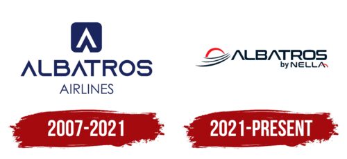
Albatros Airlines, operational from 2007 to 2021, entered the market with a unique emblem that carried deep symbolic meaning and reflected its geographic location and scope of operations. The company’s initial emblem was styled after a road sign but incorporated aviation themes to symbolize the company’s aspiration for continuous upward and forward movement.
The main element of the emblem is a blue square, representing vast water bodies. This choice of blue is deliberate, associating with the seas and oceans around the Venezuelan islands where the company conducted most of its flights. This color emphasizes the region’s maritime connection and suggests vast opportunities for travel by water and air.
The logo’s central feature is a white checkmark shaped like an airplane soaring between land masses. This design perfectly fits the company’s air transport concept, highlighting its primary air travel service between islands. The elegant design of the checkmark conveys a sense of lightness and freedom, key flying attributes.
The font used for the company’s name, where the letter “A” lacks crossbars, adds a modern and stylistic uniqueness to the logo. This design makes the text more dynamic and visually connected to the aviation theme.
The logo’s three-tier structure creates an image of an albatross with spread wings. This bird, known for its long flights over oceanic expanses, is an ideal symbol for an airline whose operations are closely linked with journeys through air and water. The albatross image emphasizes freedom, endurance, and grace, which the company aims to offer its clients.
2021 – today
The logo of the Venezuelan airline Albatros features three abstract waves and a red arc representing the sun. This design symbolizes dawn, hard work, focus, and hope. The name “ALBATROS” is displayed in a geometric font with a square shape. The capital letter “A” lacks horizontal strokes, giving it a futuristic look. Below the main logo, the phrase “by NELLA” marks the airline’s acquisition by NELLA Linhas Aéreas in 2021. The final letter, “A,” is enhanced with a small red arc, adding a unique touch.
The omission of horizontal strokes in the letters “A” gives the logo a modern and distinct character. The three abstract waves represent the sea and sky, linking to the seabird name and symbolizing the airline’s aviation path. The phrase “by NELLA” reflects the airline’s growth and potential under new ownership. The small red arc on the final “A” mirrors the larger red arc of the sun, creating visual harmony.
The geometric font for “ALBATROS” enhances the logo’s contemporary look, while the square text block adds structure and stability. The red arc, signifying the sun, and the abstract waves portray a new beginning filled with promise and determination. The phrase “by NELLA” acknowledges the new ownership and conveys a message of heritage and continuity.


