The Alitalia logo, crafted in a contemporary design, symbolizes assurance of flight safety and excellent service standards. The emblem’s design and precision highlight the brand’s distinctive traits and showcase elements of national symbolism.
Alitalia: Brand overview
Italy’s primary airline, Alitalia, was founded on September 16, 1946. Ala Littoria and Linee Aeree Italiane, two already-existing Italian carriers, merged to form the airline, which was first known as Aerolinee Italiane Internazionali. After World War II, the establishment of this airline aimed to grow and revive Italy’s civil aviation industry.
Using a Fiat G.12, the airline launched its maiden commercial trip from Turin to Rome on May 5, 1947. Using Savoia-Marchetti SM.95 aircraft, the company started running regular trips from Rome to Milan, Venice, Brussels, Paris, and South America the same year.
The company started vigorous international growth in the 1950s, establishing lines to Tehran, Cairo, New York, and other significant cities worldwide. In 1957, the airline was among the first to use the new Douglas DC-8 jet aircraft, which enabled it to provide longer-haul flights that were more swiftly and comfortably completed.
In the 1960s, the airline launched flights to Tokyo, Johannesburg, and other cities in Asia and Africa, further broadening its network of routes. In 1960, the airline was changed to Alitalia—Linee Aeree Italiane.
Due to the worldwide economic crisis and heightened rivalry in the airline industry, the company encountered several financial and operational difficulties in the 1970s. As a result, the Italian government acquired the airline’s primary shareholder and partially nationalized it.
The company updated its fleet in the 1980s, bringing in new planes, including the Boeing 747 and McDonnell Douglas MD-80. Additionally, the airline aggressively grew its network of European routes, starting service to numerous additional locations throughout the continent.
The airline continued modernizing its fleet in the 1990s, acquiring its first Airbus A320 and Boeing 777 aircraft. In 1997, it became a member of the global SkyTeam alliance, allowing it to increase its international route network and provide customers with more travel alternatives worldwide.
The company encountered serious financial difficulties in the 2000s due to growing fuel costs, heightened competition from low-cost carriers, and an ineffective business strategy. After privatizing it in 2008, the airline was sold to a group of Italian businessmen called CAI (Compagnia Aerea Italiana).
Following its privatization, the company reorganized its operations, cutting personnel and the size of its fleet while streamlining its route system. Despite these actions, the airline lost money and had financial difficulties.
The national airline of the United Arab Emirates, Etihad Airways, invested €1.76 billion in the company in 2014, acquiring a 49% share in the Italian airline. The objective of this transaction was to strengthen the airline’s financial position and make it a successful, competitive airline.
Even after making investments and attempting to restructure, the airline still lost money. In 2017, it filed for bankruptcy and was placed under special administration. The company received a €600 million bridge loan from the Italian government to continue operating and look for investors.
There were unsuccessful attempts in 2018 and 2019 to sell the airline to other investors, such as the Italian railway corporation Ferrovie dello Stato and the German airline Lufthansa.
In 2020, the worldwide pandemic worsened the company’s dire financial circumstances, prompting the Italian government to nationalize the company. It was revealed that the airline’s assets would be used to establish a new state-owned airline, which would start flying in 2021.
After 75 years of service, the company formally stopped operations on October 14, 2021. It was succeeded by ITA Airways (Italia Trasporto Aereo), the country’s newest airline, which started operating the day after, on October 15, 2021.
While ITA Airways began operations with a smaller fleet and a more condensed route network, it inherited some of the previous company’s workforce, routes, and assets. The fledgling airline wants to create a profitable and effective business plan that will enable it to compete in the ever-changing aviation industry.
Meaning and History
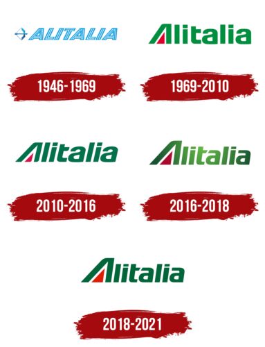
The aviation giant used a shortened name for its logo, which it received some time after its establishment. The word “Alitalia” is a shortened version of AeroLinee ITALIAne, reflected in the logo. Throughout the brand’s history, five logo updates have been known.
What is Alitalia?
Alitalia was an airline that existed from 1946 to 2021. Previously, it was Italy’s largest carrier, operating both domestic and international flights and serving over 50 countries. In 2021, the company was closed, and its brand transferred to ITA Airways.
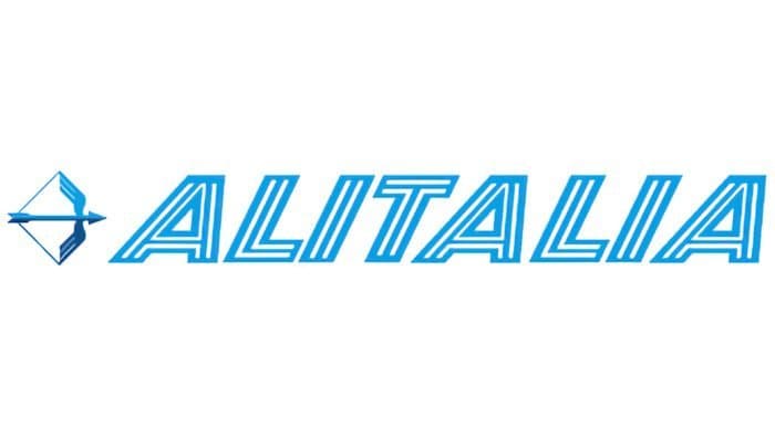
1946 – 1969
The debut version of the Alitalia logo consists of a winged arrow – a symbol of unparalleled speed. The symbol is a figurative expression of “flying like an arrow,” which means very fast. The graphic symbol is in front of the name, written in a special font – slightly slanted, with uppercase letters in short, straight lines.
1969 – 2010
Landor Associates developed this version of the Alitalia logo. Designers made green the primary color, replaced uppercase letters with lowercase, and used a red triangle instead of a horizontal bar in the letter “A.”
2010 – 2016
Representatives of the Saatchi & Saatchi agency, commissioned to update the logo, decided not to change the already stylish and popular emblem. Designers chose darker shades of red and green, reduced the triangle, and made the letter “A” slanted.
2016 – 2018
This emblem version changes the font color to a lighter shade with a slight sparkle in the center. The size of the first letter was also increased, making it taller than all the other letters.
2018 – 2021
Designers reverted the emblem to the look of eight years ago, preserving the large letter “A” but eliminating the logo’s gradient fill.
Alitalia: Interesting Facts
Alitalia was Italy’s main airline for many years, known for its style and innovation, but it faced tough times and stopped flying in 2021.
- How It Started: Alitalia began in 1946 and made its first flight in 1947. It started small but grew into a big name in flying.
- Early to Jets: Alitalia was one of the first airlines to use jet planes in 1957, making trips faster and starting more flights to faraway places.
- Flying All Over: In the 60s and 70s, Alitalia flew to many countries, showing off Italian style and using modern planes.
- Fashionable Crews: The airline collaborated with famous Italian designers to create crew uniforms, which added to its stylish image.
- Rewards for Flying: Alitalia had a program called Mille Miglia that gave people points for flying, which they could swap for free flights or upgrades.
- Teamwork: Alitalia joined forces with other airlines worldwide, making it easier to travel far.
- Money Troubles: Despite being well-known, Alitalia had many financial problems and needed help from the Italian government.
- Saying Goodbye: Alitalia had to stop flying in 2021 after many years of money problems. Its last flight was from Cagliari to Rome.
- A New Start: After Alitalia stopped operating, Italy started a new airline called ITA Airways to keep Italian flying with a new plan.
- Italian Pride: Alitalia was more than just an airline; it helped spread Italian culture and made people worldwide feel welcome.
Alitalia’s story is about the ups and downs of being an airline, from showing Italian style across the globe to facing tough challenges. Even though it’s gone, Alitalia is remembered for its contributions to flying and Italian culture.
FAQ
Is Alitalia same as Ita?
Although Alitalia and ITA (Italia Trasporto Aereo) are not the same airline, they share a common heritage. After long-term financial difficulties, the former Italian flag carrier, which began in 1946, stopped operating in late 2021.
After the company shut down, ITA started as a new state-owned Italian airline. ITA aims to avoid the financial problems that affected the former company and has taken over some of its assets, routes, and market positions. The company operates independently to maintain Italy’s role in the global aviation market as the national carrier. While the new company continues some of the former company’s functions, it seeks to establish its own identity in the aviation world.
Who designed the Alitalia logo?
In 2005, the advertising agency Saatchi & Saatchi redesigned the Alitalia logo. This update refreshed the company’s image and brought it closer to Italy’s national identity. The logo adopted the Italian flag’s green, white, and red colors, underscoring the company’s status as the national airline. These colors were chosen to highlight the company’s pride in its Italian heritage and strengthen its connection to Italy.
The new design in 2005 introduced a modern look while keeping elements showcasing its Italian origins. The logo underwent another update in 2015, focusing on a modern and national look. Each version of the logo kept the Italian tricolor, making it easily recognizable as Italy’s national carrier. This approach in branding helped the company stay well-known among Italians and global travelers, representing both tradition and modernity.
What is the code for Alitalia?
The former Italian national airline used the airline code “AZ” for booking, ticketing, and other tasks in aviation and travel. The company operated with this code until it stopped services in October 2021. After the company stopped, ITA Airways became Italy’s main airline and used “AZ” to connect with the former company’s past. The switch from the former company to ITA Airways is an important part of Italian aviation history.
What is the new name for Alitalia?
ITA Airways is the new name for the former Italian airline Alitalia. It operates as Italia Trasporto Aereo S.p.A. and is Italy’s national airline. The Italian government owns ITA Airways through the Ministry of Economy and Finance. The airline was created in 2020 after the former company went bankrupt and stopped operating. ITA Airways aims to keep the well-known traditions of its predecessor while updating its operations and services to be more modern and efficient.

