Allegro: Brand overview
In the late 1990s, specifically in 1999, Allegro emerged in Poland as an e-commerce company under Allegro Sp. However, the very next year it caught the attention of QXL Ricardo plc, a company known for its online auctions, which led to its acquisition. In 2007, this company went through a rebranding phase, becoming Tradus plc. However, a year later, in 2008, it and Allegro became part of the portfolio of South African-based media conglomerate Naspers.
Allegro’s notable transition came in 2016 when Naspers handed over the reins of the company to a trio of private equity giants – Cinven, Permira, and Mid Europa Partners. Further cementing its importance in the world of e-commerce, Allegro decided to go public in 2020, debuting on the Warsaw Stock Exchange. This was not just another IPO, but the most significant in Polish history.
Today, more than two decades after its founding, Allegro is the leading e-commerce hub in Poland, bringing together a diverse group of buyers and sellers. Although the company is expanding and growing, its roots remain in Poznan, the city where it originated.
Meaning and History
What is Allegro?
Allegro is a Polish e-commerce platform. It was founded in 1999, and its production base is in Poznan. The creation of Allegro is linked to the strategic vision of three large investment companies, Cinven, Permira, and Mid Europa Partners. They recognized the growing e-commerce market in Poland and founded the company to take advantage of this growth opportunity. The result is a platform that provides a secure and intuitive user experience, incorporating buyer protection mechanisms and multiple payment options that inspire trust in shoppers.
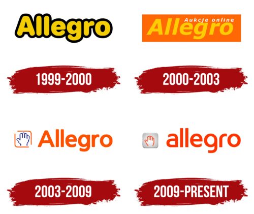
1999 – 2000
2000 – 2003
2003 – 2009
2009 – today
The Polish online shopping site relies on positivity to quickly attract attention and demonstrate friendliness to visitors. To do so, it has colored its name orange and placed an open palm in front of it as a sign of trust and welcome to all who enter the site. The writing consists of rounded letters; even the letter “ll” has no sharp corners; it is smooth and rounded. The hand (left) is drawn with an orange outline. The background for it is a gray square with a gradient, which makes it look three-dimensional. The thin black border also gives the square a slightly embossed look.
The orange color and open palm make it feel like the site is friendly, saying, “Hey, come on in!”. The gray square looks like it sticks out like a hand reaching out to the screen to greet you. The whole design is very calm and makes you feel like you’ve already befriended the site before you even start shopping.
Allegro color codes
| Mystic Red | Hex color: | #ff5a00 |
|---|---|---|
| RGB: | 255 90 0 | |
| CMYK: | 0 65 100 0 | |
| Pantone: | PMS Orange 021 C |
