For a Chinese company, the Shein logo is standard, similar to most other companies, despite the fact that it belongs to the fashion industry. This contrast is due to the fact that the brand falls into the category of so-called fast fashion, where the main emphasis is on wide availability and the quick appearance of novelties.
Shein: Brand overview
Shein is a Chinese fashion clothing company and its online store. It is based in Nanjing, where it was founded in 2008 by entrepreneur Chris Xu. The company specializes in low-cost goods, offering its products and supplies from the Guangzhou wholesale market. The parent company is Nanjing Lingtian Information Technology Co.
The principle of fast fashion implies a constant circulation of goods despite the money spent on production. Therefore, Shein initially focused on retailing low-cost fabric products from the domestic Chinese market. However, over time, the business switched to developing and sewing its own clothes, which, in a short time, dispersed among customers. That is, the company is a direct supplier of products. At the same time, it still retains the fame of the cheapest online store, as it sells inexpensive goods. Now, the brand is engaged in supplying fashionable clothing and accessories to more than 220 countries around the world.
Meaning and History
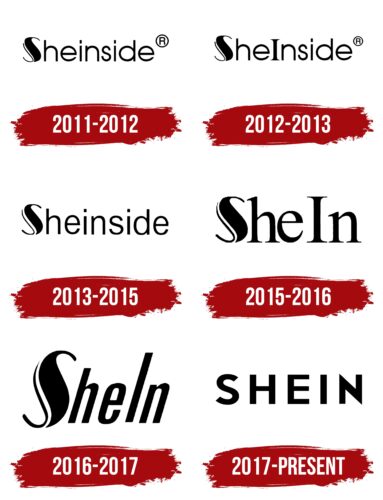
The current name of the company did not appear immediately: since 2008, it has changed several names and forms of spelling. In addition, the name of this retailer is associated with many scandals, including those related to trademarks. Judging by the lawsuits of international firms, famous designers, and artists, Shein has a very tarnished reputation. The authenticity of everything from the look and style of items to the design and identity of the brand itself is questioned. The company has a total of seven individual emblems.
What is Shein?
Shein is a Chinese company that sells inexpensive fashion clothing. It sells it in the eponymous online store and makes direct deliveries to 220 countries around the world. The time of its emergence is 2008, and the founder is Chris Xu. The head office is located in Nanjing.
2008 – 2011
The company started out by supplying fashion apparel from other manufacturers, so it did not yet have a visual identity. It appeared in later stages when the company switched to designing and sewing textiles under its own brand.
2011 – 2012
In the early years, the word “Sheinside” was written in lowercase letters, except for the initial “S.” The designers turned it into a graphic element. To do this, they made the right part of the glyph thick and added a thin stripe on the left. Thus, the result was a double sign. Both of its sides were curved and resembled miniature hooks on clothes. The other signs were rounded.
2012 – 2013
The form of the name spelling also changed. Therefore, in addition to the capital “Sh,” another capital letter, “I,” was added. As a result, the word “Sheinside” was split into two fragments: “She” and “Inside”. It is in this form that it was introduced into the logo.
2013 – 2015
In 2013, the company again switched to lowercase letters, so the capital “I” from the logo disappeared. The letters became elongated and taller, but the fluidity of the lines was retained, so the glyphs remained rounded.
2015 – 2016
After the rebranding, the name of the fashion company was halved. Only half of the word “Sheinside” remained, which formed the basis of the new emblem. In addition, the capital letter “I” was returned. The letters have sharp serifs.
2016 – 2017
Another redesign focused on changing the font, which received a right-handed slant and narrower glyphs. The elongated cursive letters were stripped of serifs.
2017 – today
The modern Shein logo is a strict inscription with a wide inter-character space and geometrically even signs. Thanks to its minimalism, such a label fits perfectly into the concept of fashion brands. It is stylish, simple, but at the same time individual. Its main feature is the sharp ends of the letter “N.” All glyphs are translated into upper case.
Font and Colors
The evolution of the Shein logo is related to two factors: renaming the brand name and avoiding plagiarism. Therefore, the Chinese fashion apparel and accessories retailer, despite its short existence, has changed its identity frequently. However, the latest result was worth it, as the current symbol has a high style and beautiful design suitable for representatives of the fashion industry.
The lettering in the logo changed several fonts. If, at first, the letters were round, low, and lowercase, now they became flat, high, and uppercase. Serifs were rarely used – only in the 2015-2016 version. The color palette, on the other hand, is monotonous. Officially, it consists of the classic combination of black (title) and white (background).
Shein color codes
| Black | Hex color: | #000000 |
|---|---|---|
| RGB: | 0 0 0 | |
| CMYK: | 0 0 0 100 | |
| Pantone: | PMS Process Black C |


