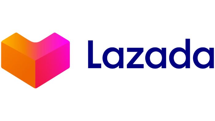
The Lazada logo is not just part of a marketing campaign. It is also an expression of love, the store’s love for its customers, and the feelings that customers have towards the products they buy. The gentle orange-pink gradient shows the intensity of the emotions, and the lettering next to the heart looks friendly thanks to the rounded letters.
Lazada: Brand overview
Lazada is an international online store that sells products all over the world. It is most popular in Southeast Asia. The marketplace was created with the support of Rocket Internet and the direct participation of Maximilian Bittner, Raphael Strauch, Stefan Bruun, and Mads Faurholt. The year of its appearance is 2012. Belongs to the largest representative of e-commerce – Alibaba Group. The head office is located in Singapore (Downtown Core).
Meaning and History
Lazada websites were launched in the spring of 2012 to sell goods from the company’s warehouses. A year later, another model of commercial relationship emerged, where retailers were able to sell their goods by sending them directly to customers. The web resource became a virtual store for them. At the same time, he created and launched mobile applications for this purpose, adapted for iOS and Android systems. Thus, the brand became widely known, and at the end of 2014, it accounted for almost 65% of sales.
The transition to the Alibaba Group took place in 2016 when it decided to implement its international expansion plan and acquired a controlling stake in Lazada. This was also preceded by the rapid growth of the young online platform, which had achieved huge profits in all six Southeast Asian markets by the beginning of that year. As part of an experienced virtual commerce representative, its success has multiplied manifold. For example, in 2018, the online retailer introduced the Lazmall service, which encourages the purchase of goods from authentic brands. It also introduced an instant delivery service and the return of goods within 15 days of purchase.
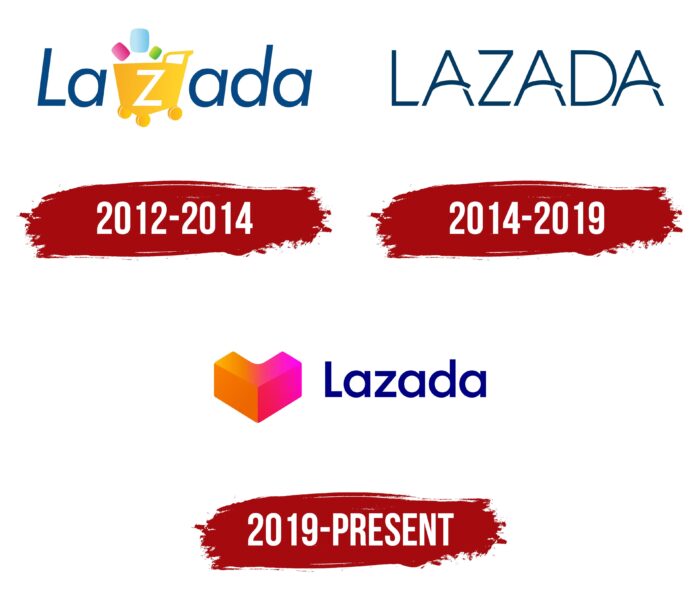
All of this is directly reflected in the visual style of the company, which aims to become a leader in the e-commerce market. Its “heart in a box” is well known to more than 50 million active shoppers. By 2019, it will be the leading virtual marketplace in Southeast Asia. It has changed its logo twice before its success; as of 2022, it has three. They are quite different in style but the same in ideological content because they carry the same message: shopping for everyone with love and effortlessly.
What is Lazada?
Lazada is an international Internet corporation that operates virtual commerce sites in several countries around the world. Its priority service region is Southeast Asia. The company has been operating since 2012, when it was founded by Maximilian Bittner, Raphael Strauch, Stefan Bruun, and Mads Faurholt. Since 2016, it has been owned by Alibaba Group.
2012 – 2014
The original logo of the commercial web conglomerate was a harmonious combination of text and graphics. In the italicized word “Lazada,” the designers depicted a shopping cart. In contrast to the surrounding blue lettering, it was colored yellow, so it stood out clearly against the contrasting background. The wheeled cart was located on the side. It was marked with the letter “z” in white – like the neighboring characters, lowercase, sans-serif. In accordance with the spelling, the exception was the letter “L” because it came first and was in upper case. Above the basket were hypothetical “purchases” in the form of miniature rectangles in dark pink, blue, and green.
2014 – 2019
Having established itself in the Southeast Asian market, Lazada redesigned its emblem. To do so, it finally removed the shopping cart and focused on the name of the web shopping service. To add visual originality to the logo, the authors made all the letters capitalized and stylized three “A “s. To the left of these glyphs appeared a triangular element on a long leg, resembling a slingshot. The rest of the signs were flat and thin, with well-defined corners.
2019 – today
The current logo is a symbiosis of a heart (a sign of special disposition and love for customers) and the capital letter “L” (the first letter of the name of the online store). That’s why the updated logo is popularly nicknamed “Heartgram.” But before becoming official, it was used in commercials. This happened in 2018. After a while, the Lazada brand decided to transfer the marketing symbol to the status of a corporate logo. The work was entrusted to the Singapore studio Superunion. The result was a massive letter “L” slanting downward and forming a voluminous heart.
Font and Colors
The modern logo looks like two connected rectangles. Visually, they are divided into two fragments, highlighted in color. The line of their delimitation forms a downward angle. Due to the rounded recess, the inner part has the shape of a boomerang. To the right of the graphic mark is the name of the Asian e-commerce representative. It is made in the same design as the debut logo.
The current version of the logo uses Moskau Grotesk Medium, a typeface designed by graphic artist Björn Gogalla and first introduced by Letter Edit. In the first logo, the text is italicized, similar to SoftMaker’s Montreal Serial Medium. In the second logo, the typeface is customized and created in accordance with the original concept. Now, the corporate palette has become bright and memorable. It is a combination of orange and pink colors with a slight gradient from light to dark tones.
Lazada color codes
| Navy Blue | Hex color: | #000083 |
|---|---|---|
| RGB: | 0 0 131 | |
| CMYK: | 100 100 0 49 | |
| Pantone: | PMS 2738 C |
| Chrome Yellow | Hex color: | #fca800 |
|---|---|---|
| RGB: | 252 168 0 | |
| CMYK: | 0 33 100 1 | |
| Pantone: | PMS 137 C |
| Spanish Orange | Hex color: | #ed6600 |
|---|---|---|
| RGB: | 237 102 0 | |
| CMYK: | 0 57 100 7 | |
| Pantone: | PMS Bright Orange C |
| Hot Magenta | Hex color: | #fd0fd0 |
|---|---|---|
| RGB: | 253 15 208 | |
| CMYK: | 0 94 18 1 | |
| Pantone: | PMS 807 C |
| Amaranth | Hex color: | #f1184e |
|---|---|---|
| RGB: | 241 24 78 | |
| CMYK: | 0 90 68 5 | |
| Pantone: | PMS 1787 C |
