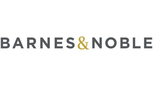
The Barnes and Noble logo is simple in design and easy to remember. The emblem evokes associations with a visit to an old bookstore of the XIX century, where the enchanting world of paper books unites different generations.
Barnes & Noble: Brand overview
Barnes and Noble is a famous American bookstore founded in 1886 under the name of Arthur Hinds & Company. The store’s assortment includes magazines, comics, greeting cards, and books, including those from its own publishing house, founded in 1931. It operates about 600 stores in the United States. The company also offers e-books and the Nook reading tablet. As of 2019, it is owned by Elliott Management Corporation.
Meaning and History
Over the more than 100 years of the company’s existence, its emblem has remained unchanged, with minor changes in fonts and color schemes. The emblem reflects the company’s commitment to books as its core product. The logo is moderately conservative, referencing the company’s past. Just as a small emblem preserves a store’s history, books convey stories and tales of the past through the ages.
Barnes and Noble is actively developing its online platforms and audiobooks to keep up with current needs and trends in the book industry. This allows the company to stay connected to tradition while adapting to the changing world of reading.
What is Barnes and Noble?
Barnes and Noble is the largest bookstore chain in the United States, with the largest number of locations in every state and $38 million in revenue. The Riggio family played a key role in the formation and growth of the company, running it from 1971 to 2010. In addition to printed books, the stores offer e-books, audiobooks, stationery, and toys. The company is headquartered in New York City.
Barnes and Noble is active in the community and organizes events such as author meet-and-greets, literary clubs, and children’s programs, supporting and promoting reading as a valued pastime and cultural heritage.
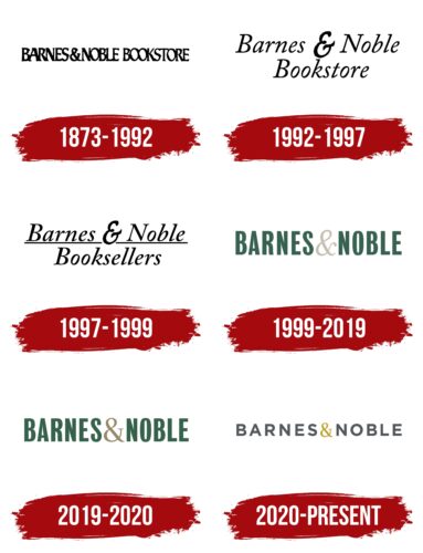
1873 – 1992
Not surprisingly, the bookstore chose a word emblem logo for its identity. The emblem contains the name of the company and an explanation: ‘bookstore.’ As a result, the emblem turned out to be quite long, and the letters had to be placed close to each other.
The name Barnes & Noble is associated with the surnames of the founders, although they were not actually the founders of the business. The store was originally opened by Arthur Hinds. In 1886, Hinds was joined by Gilbert Noble, who managed to buy the store in 1917. It was then that William Barnes stepped in, occupying the first place in the logo. The beginning of their cooperation was marked by the renaming of the store to Barnes & Noble, a name that has survived to this day and is present on all logos.
It is interesting to note that the year of foundation indicated by the company – 1873 – is not quite accurate. In that year, a book printing firm owned by Barnes’ father was founded, which was not directly related to Barnes & Noble. The original placement of the Barnes surname on the emblem is due to the fact that Noble eventually sold his share to his son William, and the store became fully owned by the Barnes family.
At the time of the Barnes & Noble merger, despite the store’s nearly 30-year history, retailing was not yet widely known and popular, so the emblem needed to indicate what was being sold. Therefore, the word “bookstore” appeared in the emblem. The black letters in the name associated the company with the printed type of books.
The black color of the emblem also emphasizes the seriousness and stability of the company, proclaiming its reliability and dedication to literature for decades. It reflects respect for books and their authors, as well as for readers and their preferences.
1992 – 1997
1997 – 1999
1999 – 2019
2019 – 2020
2020 – today
The 2020 update is due to the revitalization of the retailer, which was on the verge of bankruptcy just a few years ago. However, there have been no significant changes to the logo – it is still a word logo.
Noble sold his stake in 1930, and the Barnes family ended ownership of the company in 1964, but the founders’ names remained in the emblem. The explanation “bookstore” was removed as the company name became common and well-known throughout America.
The new emblem is strict, even capital letters without serifs in gray. Each of them resembles a separate book on a shelf. There is ample space between the elements, symbolizing the diversity of book categories.
The logo shows elegance and order, indicating a well-organized online store. The golden “&” symbol has several meanings:
Reflects the birth of a popular retail chain through the union of two partners. Noble originally only sold academic literature, but they partnered with Barnes to create a store with a variety of offerings.
- Symbolizes renewal and transformation. Due to the COVID pandemic, 2/3 of the company’s stores were closed, which were then renovated and remodeled.
- Embolizes a “gold mine”. Between 2020 and 2022, sales of picture books grew 500%.
- Signifies the development of a new version of the Nook 10″ HD e-book, released in 2021.
The gold symbol also emphasizes the enduring value of printed books, preserved through the ages. It emphasizes the company’s respect for literature and its commitment to keeping the tradition of reading alive in today’s world, overcoming the challenges of the times.
Font and Colors
The logo’s color palette includes gray and gold, symbolizing the company’s best-selling books and rich history.
- Gray represents constancy, persistence, and hard work. In the logo, it is associated with book bindings and covers, loyalty to tradition, and the continuous process of reading.
- Gold – emphasizes value, significance, and rarity. Compares books to precious metals, emphasizing that knowledge extracted from books is as valuable as gold.
Organetto Bold font is used in the logo. Its smooth lettering reflects the dedication to the simple pleasure of reading.
Barnes & Noble color codes
| Davy’s Gray | Hex color: | #54575a |
|---|---|---|
| RGB: | 84 87 90 | |
| CMYK: | 7 3 0 65 | |
| Pantone: | PMS Cool Gray 11 C |
| Satin Sheen Gold | Hex color: | #c0a02e |
|---|---|---|
| RGB: | 192 160 46 | |
| CMYK: | 0 17 76 25 | |
| Pantone: | PMS 7555 C |
