The Zalando logo symbolizes modernity, versatility, and accessibility, reflecting the brand’s desire to offer a wide range of fashion clothing, shoes, and accessories for everyone. The emblem’s design, with its recognizable orange drop, conveys energy and dynamism, highlighting the company’s focus on meeting the needs of a diverse audience.
Zalando: Brand overview
Zalando’s story began in Berlin, Germany, in 2008 when two students, David Schneider and Robert Goenitz, decided to start an online shoe store. Inspired by the American online retailer Zappos, they initially called the project Ifansho. Later on, they changed the name to “Zalando” because it sounded “hip and Italian,” according to the founders. In the early days, Schneider and Goenitz personally packed and shipped orders from their first apartment in Berlin.
The company received its first major investment in 2009 from the Samwer brothers through their investment firm, Rocket Internet. This funding allowed the business to expand rapidly and actively promote its brand. That same year, the company aired its first TV commercial, quickly becoming popular and increasing brand awareness.
2010 was a year of international expansion. The company entered the Austrian and Dutch markets by localizing its website and marketing strategies. In addition to shoes, the platform began offering clothing and accessories.
In 2011, the rapid growth continued when the company entered the French and UK markets. The company also launched its first mobile app, recognizing the rise in mobile shopping. By the end of the year, revenue surpassed €500 million.
Further expansion occurred in 2012, entering the Scandinavian, Spanish, and Italian markets. The first large logistics center was opened in Erfurt, Germany, to improve delivery speed and efficiency.
A significant milestone was reached in 2013 when the business became profitable in its German-speaking markets, including Germany, Austria, and Switzerland. This was a remarkable achievement for a young company in the competitive e-commerce industry. The company launched its partner program the same year, allowing other brands and retailers to sell their products on the platform.
2014 marked a major turning point. On October 1, the company completed its initial public offering (IPO) on the Frankfurt Stock Exchange, making it one of the largest tech IPOs in Europe. The funds raised from the IPO enabled continued growth and innovation.
In 2015, the company’s focus shifted to enhancing personalization and the customer experience. It launched a membership service offering exclusive discounts to club members and began experimenting with virtual try-on technology.
2016, a new logistics service was introduced, allowing partner sellers to use the company’s infrastructure for product storage and shipping. This attracted new partners and significantly expanded the platform’s capabilities.
In 2017, a platform strategy was unveiled to transform the business into a multifaceted marketplace. This included expanding its partner network and introducing new services for brands and retailers. A department dedicated to cosmetics and beauty products was launched that same year.
In 2018, the company continued to innovate, introducing a premium membership service offering exclusive benefits to loyal customers and opening a state-of-the-art logistics facility with advanced automation in Laach, Germany.
In 2019, the company strengthened its sustainability efforts by launching a Pre-owned section featuring second-hand clothing and expanding the range of eco-friendly products. It also introduced a marketing service, providing brands with tools to advertise on the platform.
Despite global challenges, 2020 was a year of significant growth. The company quickly adapted to the changing environment by enhancing its digital presence and optimizing logistics processes. A new initiative was launched, allowing physical stores to sell their products on the platform.
The European expansion continued in 2021, entering markets in Croatia, Slovenia, Lithuania, Latvia, and Estonia. The company also increased its focus on sustainability by launching waste reduction initiatives and expanding its range of environmentally friendly products.
In 2022, the company continued to invest in technological innovation, including virtual fitting rooms, AI-powered warehousing, and improved personalization algorithms. Brand partnerships were expanded, and the loyalty program grew.
As of early 2023, the company is one of Europe’s largest online fashion retailers, serving millions of customers across more than 20 countries. The focus remains on innovation, enhancing user experience, and expanding the ecosystem to become the leading “entry point for fashion” in Europe.
Meaning and History
What is Zalando?
Founded in 2008 by Robert Gentz and David Schneider, Zalando is a German multinational fashion e-commerce giant. The company’s name came from the combination of American shoe retailer Zappos and German online marketplace Alando. Zalando was created to bring the latest fashion trends to its customers. The company’s extensive portfolio now includes apparel, accessories, and home goods, spans 23 countries, and serves more than 14 million active customers.
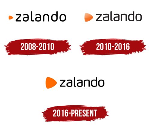
2008 – 2010
2010 – 2016
2016 – today
The Zalando logo demonstrates how simplicity and expressiveness can be combined in one design. This element has become essential to the brand’s identity, reflecting its modern approach to selling clothing and footwear online. The core idea—versatility and accessibility—is evident in the visual design.
The graphic element features a shape resembling a triangle with rounded edges. It is positioned to the left of the text and rendered in a bright orange color. This color is associated with energy and positivity. The smooth lines and absence of sharp corners make the element visually appealing, while its shape, similar to a guitar pick, conveys a sense of movement and dynamism.
The text portion is written in a lowercase font with soft, rounded lines, adding a contemporary feel. The distinctive feature of the letter “z” is its sharp internal angles, which make it stand out against the smoother and more harmonious appearance of the other letters. This detail balances the design by combining structured elements with the overall softness of the text.
The logo’s color palette is limited to two tones: bright orange for the graphic symbol and black for the text. This combination highlights key elements without overcomplicating the design. The orange adds energy, while the black provides a sense of restraint and a solid foundation for readability.
The emblem perfectly suits an online store, simplifying the shopping process and emphasizing style. The smooth shapes, thoughtful color palette, and minimalist design underline the brand’s commitment to making the shopping experience convenient and enjoyable for everyone.