![]()
The Swedish esports organization Alliance has launched a revamped visual identity, introducing a new logo and updated design language. This modernization reflects the brand’s growth while staying true to its legacy in the esports community.
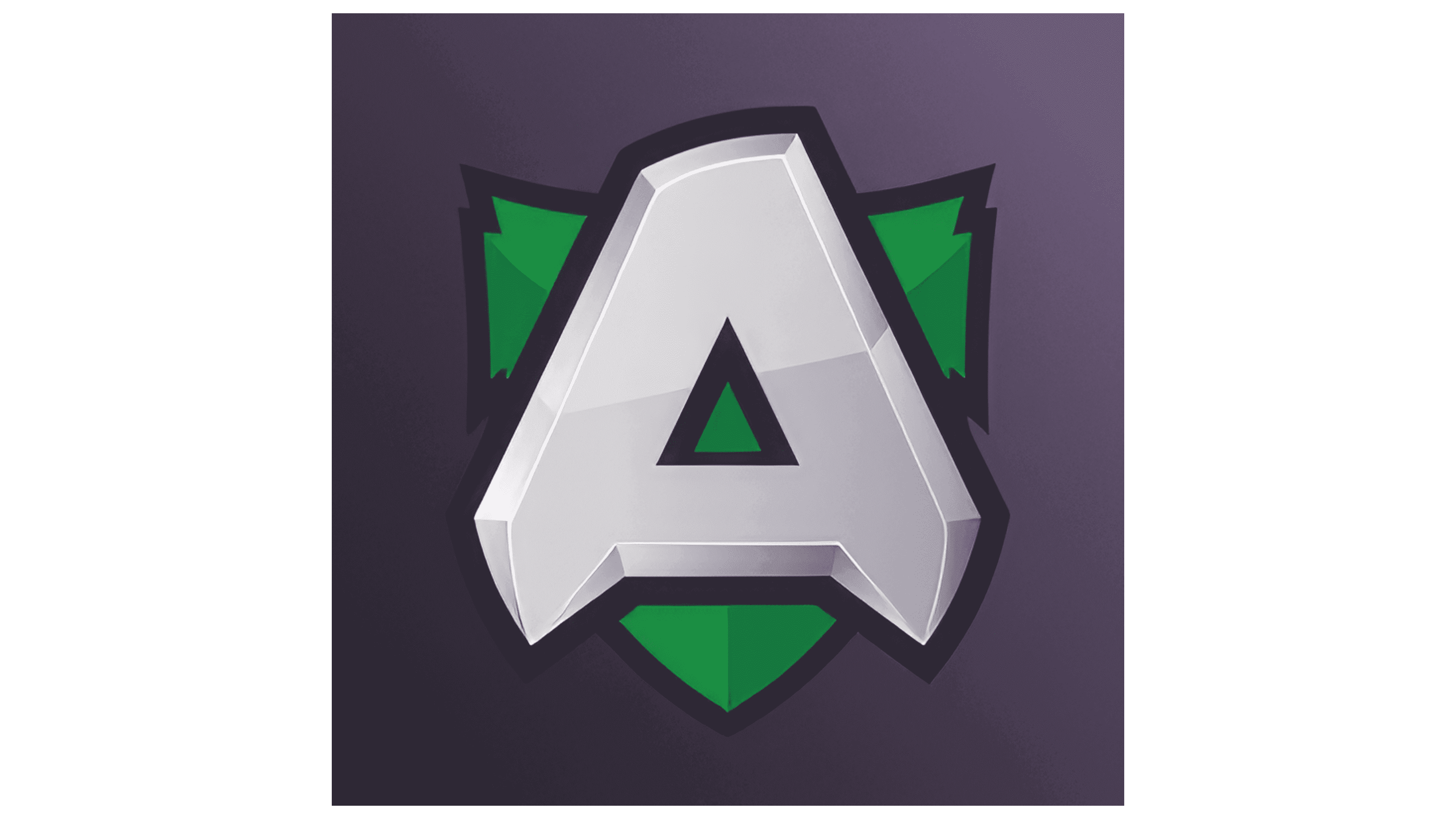
The new logo retains the iconic “A” but adopts a minimalist and contemporary style. The primary color is vibrant green, complemented by white and grey. This new look will be rolled out across all assets in various regions.
Known for its success in Dota 2, including winning The International in 2013, Alliance has competed in games like PUBG Mobile and VALORANT. The organization now focuses on CS2 and Apex Legends. The rebrand marks a significant change from the previous logo, which had a cartoonish, comic book-inspired design. The new logo is flatter, more abstract, and uses a bolder color scheme.
The color palette mirrors trends in other esports organizations, such as Ninjas in Pyjamas, EXCEL ESPORTS, and LOUD, using bright green in their branding. The new identity, designed in collaboration with Kurppa Hosk, is “a bridge between East and West,” reflecting the diverse cultures integrated into Alliance’s work and play over the last decade. The new logo symbolizes a new chapter focused on curiosity, growth, and success.
The new design extends beyond the logo, incorporating clean lines, modern typography, and a cohesive color scheme across all platforms, including social media, websites, merchandise, and team jerseys. The bright green color is prominent, with white and grey providing balance and contrast, ensuring versatility across various mediums.
Alliance’s rebrand comes at a time of new growth and opportunities in the esports industry. The updated visual identity reflects the company’s commitment to staying at the scene’s forefront, appealing to long-time fans and new audiences.
The new visual identity, designed by Kurppa Hosk, represents a significant evolution for the organization. The new minimalist logo and bold green color signify a modern, forward-thinking brand. The comprehensive design language ensures consistency and coherence across all touchpoints, reinforcing Alliance’s position as a leading esports organization. The rebrand signifies a new look and a renewed commitment to excellence, innovation, and inclusivity in the esports community.