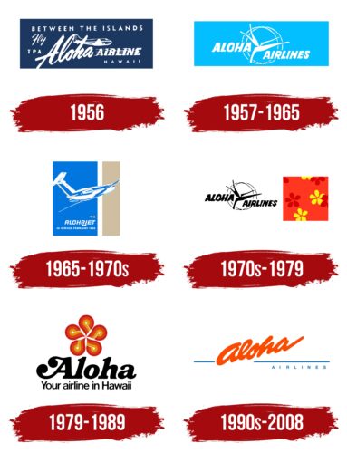
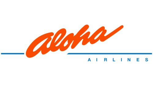
The Aloha Airlines logo recalls Hawaii’s beautiful and vibrant colors. The airline wanted to give people flying with it the fun and warmth of Hawaii. Even though the airline no longer exists, the logo reminds people of the good times in Hawaii.
Aloha Airlines: Brand overview
Aloha Airlines started on July 26, 1946, when Ruddy Tongg and his brother Richard, both entrepreneurs and former military pilots, founded Trans-Pacific Airlines in Hawaii. They aimed to create the first local airline to connect the Hawaiian Islands effectively. With just $83,500, they bought a 10-seat Sikorsky S-43 seaplane and hired five employees. That same day, the airline flew its first route between Oahu and Maui, starting regular air service across the islands.
In the following years, the company expanded its fleet with Convair 340s, Douglas DC-3s, and Douglas DC-4s, enabling flights to additional islands like Kauai, Hawaii, and Molokai. 1958, it was rebranded as “Aloha Airlines” to reflect its Hawaiian heritage better.
The 1960s and 1970s saw significant growth as the company added Boeing 737-200 jets and launched long-haul flights to cities such as Los Angeles, San Francisco, Seattle, and Las Vegas. By the early 1980s, it was the largest airline in Hawaii, serving over 20 destinations.
The 1990s brought challenges with increased competition and higher fuel costs post-Gulf War. Although the fleet was modernized to Boeing 737-800s in the 2000s, by 2008, a severe financial crisis forced the company to stop all passenger flights and file for bankruptcy. The last flight was from Hawaii to Oklahoma City on March 28, 2008.
The cargo division, Aloha Air Cargo, became independent and continued operations. The airline’s closure after 62 years was a major loss for the region. At its peak, the company employed 3,700 people and had 26 planes.
Meaning and History
What is Aloha Airlines?
It was a Hawaiian airline based in Honolulu, Hawaii. It operated inter-island flights within the Hawaiian Islands, connecting major destinations such as Honolulu, Maui, Kauai, and the Big Island. Known for its friendly service, the company was important in providing Hawaii residents and tourists with essential air transportation services. The airline’s fleet consisted mainly of Boeing 737 airplanes suitable for short flights between the islands. Despite its popularity and long presence in the Hawaiian aviation market, it ceased operations due to financial difficulties.
1956
Aloha Airlines, founded in 1956, aimed to convey important information about its services effectively and accurately in its first logo. The logo was designed to represent the company visually, styled like a business card to attract attention and be memorable immediately.
The design’s foundation was a blue rectangular background that symbolized Hawaii’s beautiful sea and sky, highlighting the airline’s regional attachment and the uniqueness of its location. Above, in white letters, the company’s flight routes between the islands were indicated, emphasizing its main operational focus.
On the next level of the logo was the word “fly,” next to which an airplane image was placed. This element was gracefully executed, depicting an airplane performing intricate maneuvers, symbolizing the grace and ease of the flights. Below, a welcoming greeting that served as the brand name ascended, a technique aimed at creating a friendly and hospitable image of the company in the eyes of tourists.
However, attempting to transmit such extensive information through numerous elements and techniques made the logo cumbersome. The abundance of details could complicate perception as the viewer’s gaze tried to encompass all elements. Despite the company’s intention to present its offerings vividly, the emblem was unsuccessful due to its overloaded nature and the loss of focus on key aspects.
1957 – 1965
The company undertook significant steps to create a more modern and appealing design to address previous deficiencies in its logo. The new logo features a soft blue background that immediately brings to mind a clear sky and a festive mood, perfectly capturing the essence of the Hawaiian Islands. This choice of color makes the image fresh and inviting.
The revised logo retains only the large company name, arranged on two levels to create a tiered effect. This design choice enhances the name’s visibility and memorability. Central to the logo are two circles that come together to form an image of a rotating airplane propeller, adding a dynamic quality to the design and symbolizing forward movement and progress.
The logo’s central image combines elements resembling a bird in flight and a traditional Hawaiian welcome garland flower. This imagery reinforces the brand’s connection to local culture and deepens its symbolism, reflecting the destination’s welcoming and hospitable nature.
The use of white fonts and designs that appear slightly blurred, as if viewed against bright sunlight, contributes to the logo’s airy and light appearance. This effect highlights the brightness and warmth of the Hawaiian climate.
The company has greatly enhanced the logo’s perception with these design modifications. The logo now conveys speed and flight, incorporating elements distinctly associated with Hawaii, making it more effective in communicating the brand’s unique attributes and ties to this captivating region.
1965 – 1970s
The 1965 emblem vividly showcases the airline’s aspirations and achievements, marking a new phase in its development. The logo seems divided into two parts, creating a dynamic and visually appealing image. The logo’s foundation is a square background dominated by two stripes: a large blue and a dark sandy color, separated by a thin white line. This color choice is deliberate, reflecting the company’s corporate colors and enhancing the logo’s recognizability.
At the logo’s center is a large, modern airplane transitioning from one part to another, symbolizing the company’s shift to new technologies and opportunities. This element highlights the company’s dynamics and innovative approach. This is particularly relevant as the airline has completely updated its fleet, moving from turboprop airplanes to more modern and efficient jets. This transition signifies the beginning of a new era in the company’s operations, making air travel between the islands much easier and faster.
To emphasize this new era in its operations and draw attention to the accelerated and simplified flight capabilities, the company has chosen a new brand name: Alohajet. This name reflects the company’s geographic focus on the Hawaiian Islands and highlights the speed and comfort that have now become integral to the service.
1970s – 1979
The emblem from the 1970s truly stands out for its uniqueness and the dual nature of its visual execution. It consists of two parts, each carrying its special meaning and emotional response. On the left is a black image of the company’s 1957 logo, executed in a classic style. This element symbolizes the company’s past: the bygone era of old airplanes, traditional service approaches, and other distinctive features now becoming history. The black color of the logo intensifies the sense of a past era, emphasizing the closure of one of the main stages of brand development.
On the right is a bright and colorful part of the emblem, rendered in rich orange tones that evoke the warm sun of tropical islands. This part of the logo symbolizes a new beginning, fresh ideas, and the company’s aspiration for renewal. Against this vibrant background, red and yellow Plumeria flowers are depicted, which are used to create wreaths and necklaces that welcome tourists to the islands. This image is meant to remind us of the hospitality with which the islands greet each visitor and underscores the brand’s aim to create a festive, joyful atmosphere on every flight.
However, despite the creativity and symbolic richness, the combination of two halves distinctly different in style and color creates an impression of some inconsistency and disharmony. This design approach evokes mixed feelings in the viewer, as the contrast between the past and the future is presented in a very striking and conspicuous form.
1979 – 1989
The company successfully achieved its goal of creating a unified visual image that synthesizes its brand’s key ideas and messages. The central element of the logo is a large five-petaled Plumeria flower, a symbol deeply rooted in the culture and traditions of the region where the company operates. Each petal of this flower is crafted from three smoothly spiraling stripes, giving the image dynamism and elegance.
These stripes are not merely decorative; they represent airplanes’ airstrips and landing points, symbolically linking them to travels between individual islands. This metaphor highlights the connection of the parts of the archipelago, among which the company provides regular flights, making them an important part of its mission.
The logo’s brightness and variety of colors convey a theme of festivity and enjoyment created aboard the liners. These colors are chosen deliberately to evoke associations with fun, warmth, and hospitality, which the company aims to provide to every passenger.
Beneath the central image is a large black inscription, “Aloha,” in a stylistically expressive font. Round elements on the ends of the glyphs echo the shape of the flower petals, creating visual unity in the composition. This word, a traditional Hawaiian greeting, strengthens the brand’s connection to local culture and emphasizes the company’s hospitable nature.
The logo is completed with a slogan conveying a sense of warmth and care—core values the brand strives to communicate to its customers. This slogan serves as a reminder that every journey with the company is not merely a trip from point A to point B but a celebration filled with joy and warm memories.
1990s – 2008
The vibrant Aloha Airlines logo reflects optimism and aims to capture customer attention. The hand-drawn text slants upward, suggesting an effortless take-off. The word “Aloha” is in bold, lowercase, and italicized font, giving a casual yet strong impression. A distinctive blue line interrupts this text. Below this line, the second part of the airline’s name appears in small capital letters with wide spacing.
The blue line adds a splash of color and can be seen as a visual representation of the horizon, reinforcing the airline’s focus on aviation. The wide spacing between the small capital letters creates a modern, airy aesthetic, highlighting the brand’s commitment to a positive customer experience.
The main text’s hand-drawn style gives the logo a unique and approachable look, reinforcing the theme of friendliness and warmth. The slanted, italicized letters add a dynamic feel, suggesting movement and progress, key elements in the aviation industry.
The blue line introduces contrast, making the logo more engaging and symbolizing the sky or horizon, central to the airline’s identity. This design choice ensures the logo remains memorable and distinctive, capturing the essence of Aloha Airlines.
The wide letter spacing in the second part of the name enhances readability. It imparts a sense of openness and space, reflecting the airline’s dedication to providing an open, welcoming experience. This also aligns the logo with contemporary design trends.
FAQ
Does Aloha Airlines still exist?
The company ceased operations in 2008 and no longer exists. Due to high fuel prices and intense competition, it faced severe financial problems, which led to its filing for bankruptcy. The last passenger flight took place on March 28, 2008. Although passenger service ceased, the cargo division survived as Aloha Air Cargo and is still operating today.
Where does Aloha Airlines fly to?
Before the company stopped carrying passengers in 2008, it had numerous routes in Hawaii and the US mainland. Now, as Aloha Air Cargo, it specializes in cargo flights but maintains a strong presence in air transport.
The airline was known for its flights connecting major Hawaii airports, including Honolulu International Airport on Oahu, Kahului Airport on Maui, and Lihue Airport on Kauai. These flights have helped tourists and locals travel between islands for personal and business reasons. They flew to the US mainland from Honolulu to Los Angeles and Seattle. After ceasing passenger flights, the company became Aloha Air Cargo, which still flies between Hawaii airports and the mainland but now carries only cargo.
Who started Aloha Airlines?
Ruddy F. Tongg founded the company in 1946, initially calling it Trans-Pacific Airlines in Honolulu, Hawaii. Tongg started the airline to provide more competition in Hawaiian air travel, mainly controlled by a few large companies. Over time, it changed its name to “Aloha Airlines” and became popular for connecting the Hawaiian Islands with the US mainland.
What is the prefix for Aloha Airlines?
Aloha Airlines, now known as Aloha Air Cargo, has the IATA code “KH” and the ICAO code “AAH.” These codes help identify the company on flight schedules and in aviation systems. It was re-established in 2008, so it’s fairly new. These codes are important for organizing flights, handling tickets, and managing operations worldwide.

