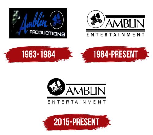
The Amblin Entertainment logo is iconic and creative. It demonstrates a flight of imagination, a pursuit of a dream, and vividly characterizes the film company’s founder and the films’ orientation, which are always captivating and unusual.
Amblin Entertainment: Brand overview
| Founded: | 1980 |
| Founder: | Steven Spielberg, Kathleen Kennedy, Frank Marshall |
| Headquarters: | Universal City, California, U.S. |
| Website: | amblin.com |
Amblin Entertainment is a film company by Steven Spielberg, located within Universal Pictures in Los Angeles and founded in 1969 to implement the director and producer’s ideas. It brings in $1 billion in revenue. The highest-grossing film was Jurassic Park (2015).
Meaning and History
Despite the company’s foundation in 1969 and registration in 1970, the logo only appeared in 1983, two years after the release of the first film shot by the film studio (1981). The producer chose the logo and the company’s name based on significant events in his career to reflect Steven Spielberg’s path to the top. Only a person familiar with the director’s filmography can understand the meaning and significance of each element. In all rebranding, both the unique name and the boy on the bicycle were always preserved. The changes were related to the color scheme and its use.
What is Amblin Entertainment?
A film company that has brought to life such famous films as Back to the Future, Men in Black, Schindler’s List, A Beautiful Mind, The Terminal, How to Train Your Dragon 3, and many others. It is owned by the Comcast Corporation through Universal Pictures.
1983 – 1984
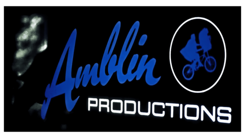
The first emblem is a black rectangle, with the name Amblin written in large blue letters, a white subtitle Productions, and an image of a circle with a cyclist inside. The logo was first used on the set of the Gremlins movie.
Spielberg chose the company’s name from the first film shot in 1968 and shown to Universal Studios. This 26-minute film brought a young lad a seven-year contract with a well-known film studio, marking the start of his career. The themes of freedom, travel, and love are close to the director. He lives his exciting journey year after year, moving towards his goal like the film’s characters, and enjoys the freedom of creation.
The cyclist on the emblem is a shot from the next cult film of the screenwriter – E.T. the Extra-Terrestrial. The boy Elliott soars upward on a bicycle with the alien E.T. on the handlebar thanks to telekinesis. According to the film’s plot, this helps them escape from the authorities trying to capture the alien guest.
The frame from the film in the logo reflects the themes of freedom, friendship, love for all living things, and science fiction, which is integral to Spielberg’s movies.
The white border of the circle, in which a cyclist is depicted in the emblem, is a symbol of the Moon, against which Elliott rides with E.T. The Moon is a planet of dreams, fantasies, sleep, and fantastic films. The theme of extraterrestrial intelligence and time travel is evident in most films shot later at Amblin Entertainment’s studios.
The black background represents the night during which the events in the film took place.
The word “Productions” was used because the studio was originally called Amblin Productions.
1984 – today
In addition to producing films, the film company began to release cartoons. The expansion of activities led to a change in the name to Amblin Entertainment and a slight logo transformation.
The sign has lost the black color of the rectangle, making it brighter and clearer. Black color on a white background was chosen for inscriptions. The approach hints at the theme of black-and-white cinema. It suggests that Spielberg started creating his movies many years ago. It hints at the genre of animation-drawn figures.
The studio’s name is highlighted in bold capital letters and no longer reminds one of amateur films. It represents a large company. The change from Productions to Entertainment speaks to creating entertainment content of different genres, from movies to cartoons and shows.
2015 – today
In 2015, the Amblin Partners coalition was created, which includes the Amblin, DreamWorks Pictures, and Participant brands. The newly formed association entered into a long-term partnership with Universal Pictures (extended in 2020), which will promote the coalition’s films.
The film company reflected the opening of new horizons with small changes to the logo. The white background of the Moon’s circle was replaced with black, and the figure of the cyclist turned white. The studio brought back the theme of night, dreams, and fantasies into the emblem, highlighting the figure of the traveler.
Additional lines and inscriptions have become thinner, showing that Amblin has precisely defined its mission, tasks, and partners for future generations.
Font and Colors
The black and white palette is the main one in the Amblin Entertainment logo. The range shows:
- A combination of favorite themes of love, friendship, help, and heroism with the addition of novelty,
- The union of reality and fantasy,
- Filming during the day and at night,
- Black and white filming for greater effect,
- A change in tension, a mystery, a clarification of the situation, resolution of the problem.
It’s hard to divide the real world into black and white. However, in movies, you can make special accents, highlighting positive and negative characters, the main and secondary ones. The contrast of colors shows the studio’s special capabilities and the directors’ professionalism.
The font of the inscription is Ahoura-Bold, with extensions at the ends of the letters. The characters hint at the consistent development of events in the picture and a gradual movement toward the essence of the movie. Capital letters speak of the significance and popularity of films, many of which are nominated for an Oscar.
Amblin Entertainment color codes
| Black | Hex color: | #000000 |
|---|---|---|
| RGB: | 0 0 0 | |
| CMYK: | 0 0 0 100 | |
| Pantone: | PMS Process Black C |


