With the rollout of its latest version, Android 13, the mobile operating system Android has unveiled a sweeping brand redesign. Developed mainly by Google, Android maintains its status as the mobile operating system with the largest global installed base, and this redesign underscores its adaptability and continued evolution.
The new Android logo has moved from an all-lowercase wordmark to one with proper capitalization. This nuanced shift eradicates the stylistic irregularities of the past, ushering in a wordmark that achieves a modern, refined aesthetic.
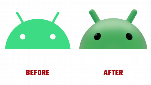
Another remarkable update comes from Android’s “bugdroid” icon, which has transitioned from a two-dimensional figure to a more intricate 3D design. The newly detailed icon features a matte finish and contrasting darker eyes. The modifications add depth and sophistication while ensuring the icon remains instantly identifiable with the long-standing Android logo.
The visual refresh extends beyond the icon and wordmark to overhaul the brand’s identity. Given Android’s reach across various electronic devices—from mobile phones to game consoles and even digital TVs—the rebrand aspires to deliver a unified visual narrative across diverse platforms.
The redesign is not merely cosmetic. As of January 2021, Android’s ecosystem had grown to include over three million apps, marking a colossal expansion. The updated brand is a strategic repositioning intended to make Android universally attractive while arming it to meet future technological challenges. With this new design, Android seems well-equipped to maintain its industry leadership in a fast-paced digital world.


