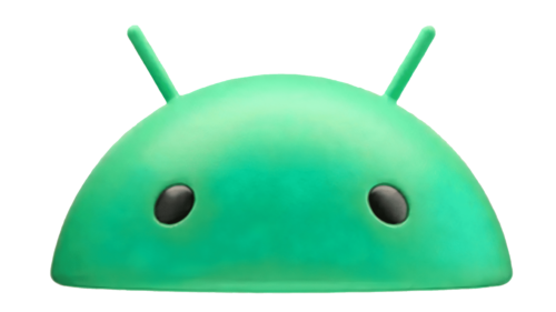
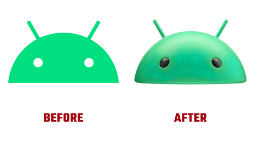
Google’s signature mobile operating system, Android, is bracing itself for its first major rebrand since 2019. The brand’s transformation introduces a cutting-edge logo and a revamped typeface. Four years have passed since Google unveiled its celebrated operating system to the world, and this comprehensive rebrand signifies a significant shift from the longstanding tradition of using a lowercase “android” in the wordmark. The redesigned logo and wordmark are poised to emerge more prominently across Google’s vast ecosystem.
The public first saw the expected 3D Android logo and updated wordmark at CES in January 2023. Since then, the reimagined brand elements have been spotted in an Android advertisement featuring first-party apps on the Samsung Galaxy S23 Ultra. Google has maintained an air of mystery around these changes, remaining silent without releasing official statements.
The novel design has made its way exclusively into the brand’s YouTube ads and presentations. It is a reasonable conjecture that this refreshed design will grace boot screens alongside the launch of Android 14 in the next few months.
The new design is a study in contrast. The sharp uppercase ‘A’ breaks away from Google’s affinity for rounded designs, while the ‘n’ and ‘r’ have reverted to their rounded shape, reminiscent of their form between 2014 and 2019. As app icons persist with the flat design trend, the Android robot is transitioning into a 3D rendering.
The rebrand implies more than just a simple adjustment in capitalization. It gives us a glimpse into Google’s vision for how the mobile operating system should be perceived. Lowercase letters in branding often suggest approachability and friendliness, while uppercase letters lend an air of solidity and endurance. In its pursuit of the best of both worlds, Android’s new brand incorporates highly rounded letters under the dominating, sharp-edged ‘A.’ Though unconventional, the design effectively conveys a mature, modern, and expressive brand persona.
The older logo and wordmark remain in use on the official Android website and in Google’s press materials, with the brand guidelines still referring exclusively to the previous designs. As the rebrand gains more exposure, users can expect to see the new Android branding on their device splash screens after system updates. Until that point, users will continue to be greeted by familiar branding during the device boot-up process.


