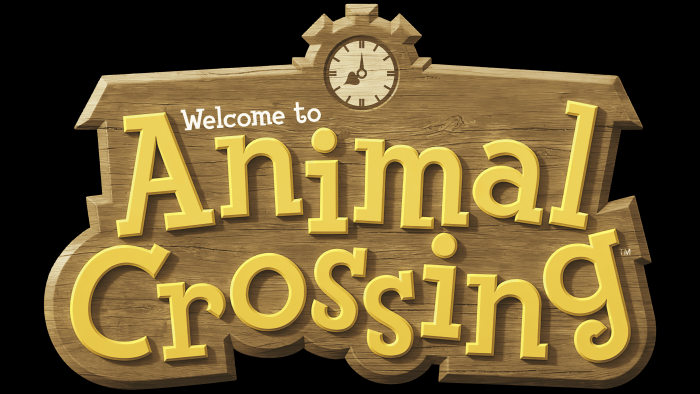
The Animal Crossing logo takes the user to a rural world. In the symbols of the emblem, there is a connection with wooden buildings, paddocks, and green gardens. It will take time to create your ideal world, but construction will be a lot of fun.
Animal Crossing: Brand overview
| Founded: | April 14, 2001 |
| Founder: | Nintendo |
| Headquarters: | Japan |
Meaning and History
The gameplay is associated not only with gathering but also with the study of the area. The character moves from one settlement to another and stays in them for an unlimited period. But the game heroes have no specific goals – they live in a parallel world because all events take place in real-time.
At the same time, the gamer is engaged in a variety of work:
- Planting trees and plants.
- Contacting residents.
- Collecting items, which is the basic factor of the series.
He can collect anything: fossils, tree fruits, discarded things, shells, and much more. The character sells the mined items for the local currency – Bells. And with the proceeds, he buys clothes, furniture, pays off the loan, invests in stocks, and purchases special tools. With their help, the hero can collect even more things to sell and earn money.
At the same time, during the game, the appearance of the gamer, like his home, can change. He does a different hairstyle, buys or sews new clothes for himself, uses accessories, furnishes the house, expands it, repairs it, re-glues wallpaper, and so on. At the same time, the type of terrain, the image of the inhabitants, the points of the location of the buildings, other locations are generated randomly at the moment of starting the game.
But there are exceptions in some versions of the simulator: the main character chooses the place where his “life” will take place (out of 4 planned locations). In any case, all the noted aspects resonate well with the Animal Crossing logo. They are harmoniously conveyed in it in the form of a calm “home” design. There are two types of logos used for international editions, while in Japanese, they have a different format.
What is Animal Crossing?
Animal Crossing is a series of video games with non-linear gameplay developed by the Japanese company Nintendo. It has been released since 2001. The game is a life simulator in a village where players engage in everyday activities: interacting with neighbors, hunting, fishing, and purchasing necessary items. Anthropomorphic animal characters, soothing music, and beautiful graphics create a whimsical atmosphere.
2002 – today
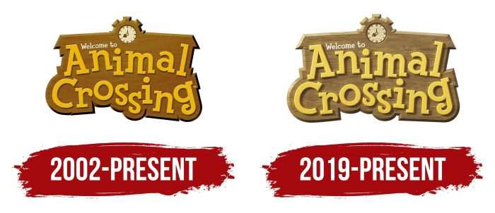
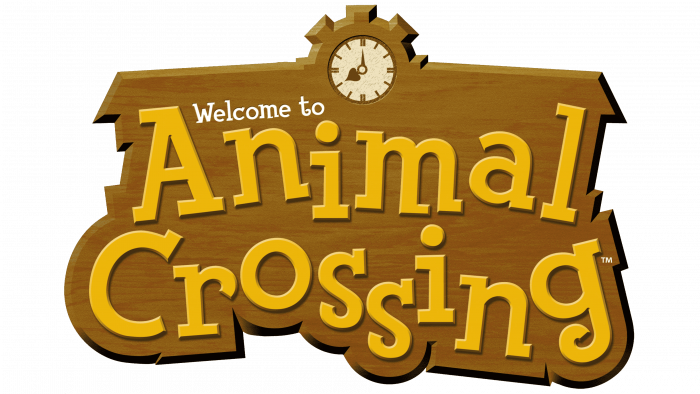
The game got an interesting logo style from the very start. He breathes peace, peace, confidence, which perfectly resonates with the main concept. The title of the series is written on something that resembles a wooden surface. This is evidenced by the texture of the background and its color. It imitates a door sign. The “Welcome reinforces this impression to” greeting in a thin serif typeface.
The figured plaque looks like it was carved from wood, and its upper outline is shaped like the roof of a long building with a clock in the center. They say that the time spent with the life simulator is infinite and moves in parallel with the outside world. Black shadows are drawn below and on the right of the logo, which makes it volumetric.
2019 – today
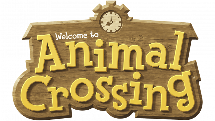
The updated emblem was first used in the Nintendo Switch release of Animal Crossing: The New Horizons. It looks pretty much the same with minor changes. The woody texture is enhanced by horizontal lines, cracks, visual roughness. The yellow letters are complemented by dark beige shadows, which makes the inscription appear convex. The mechanical clock in gear remained the same. The designers lightened the color of the logo.
Animal Crossing: Interesting Facts
“Animal Crossing” is a beloved video game by Nintendo that simulates life in a village with anthropomorphic animals.
- Beginnings: It started in 2001 on the Nintendo 64 in Japan and reached international players on the GameCube. The series has grown, reaching platforms like the DS, Wii, 3DS, and the Switch.
- Real-Time Play: The game aligns with real-world time, with days and seasons changing just like outside your window, making the gameplay experience dynamic.
- Villager Dynamics: Villagers have unique personalities and schedules. Players can befriend them by helping or giving gifts, making each game experience unique.
- Secrets to Find: The game packs many details and secrets, from item interactions to mysterious visitors, ensuring there’s always something new to discover.
- Unlimited Customization: Players can customize their characters, homes, and village landscapes, encouraging a community of players to share their creations online.
- A Cultural Hit: Released in 2020, “Animal Crossing: New Horizons” became especially popular during the COVID-19 pandemic. It offered a virtual space for players to socialize and celebrate together.
- Trade and Economy: The game includes a trading system and a fluctuating market for items like turnips, adding a layer of economic strategy to the village life simulation.
- Museum Collections: Players can donate to the in-game museum, which aims to collect various items, learn about them, and encourage exploration.
- Music and Ambience: The game’s soundtrack and sound design are widely praised. The music changes by the hour and ambient sounds vary with the seasons, enhancing immersion.
- Global Acclaim: “Animal Crossing” has earned international awards and recognition, including accolades for its design and positive mental health effects. These accolades showcase its broad appeal and the comfort it offers players.
“Animal Crossing” is celebrated for its relaxed pace, focus on creativity and community, and the meaningful interactions it enables, continuing to charm players worldwide with its gentle escapism.
Font and Colors
The individual mark of the simulation game remained almost unchanged. In the second version, some adjustments were made, but they are so minor that, at first glance, they do not even catch the eye. Most of the fixes are related to enhancing wood texture and color adjustments.
The emblem uses a typeface reminiscent of Fink Heavy, a comic book font designed by House Industries. It is part of the RatFink family and consists of “jumping” letters with large serifs.
The color palette is calm, restrained, with a predominance of beige tones, as close as possible to the woody scale. These include brown, olive, yellow, and black or gray for outlines.
Animal Crossing color codes
| Crayellow | Hex color: | #eed25a |
|---|---|---|
| RGB: | 238 210 90 | |
| CMYK: | 0 12 62 7 | |
| Pantone: | PMS 128 C |
| Metallic Gold | Hex color: | #d7af3a |
|---|---|---|
| RGB: | 215 175 58 | |
| CMYK: | 0 19 73 16 | |
| Pantone: | PMS 7555 C |
| Lion | Hex color: | #d5c394 |
|---|---|---|
| RGB: | 213 195 148 | |
| CMYK: | 0 8 31 16 | |
| Pantone: | PMS 467 C |
| Raw Umber | Hex color: | #7c5d35 |
|---|---|---|
| RGB: | 124 93 53 | |
| CMYK: | 0 25 57 61 | |
| Pantone: | PMS 7575 C |
| Bistre | Hex color: | #3c2e20 |
|---|---|---|
| RGB: | 60 46 32 | |
| CMYK: | 0 23 47 76 | |
| Pantone: | PMS 7533 C |
