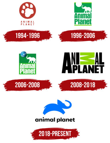
The Animal Planet logo is playful and graceful. It conveys a love for animals and admiration for their abilities. The emblem represents the channel with an unusual perspective and mission.
Animal Planet: Brand overview
| Founded: | June 1, 1996 |
| Founder: | Warner Bros. Discovery |
| Headquarters: | Silver Spring, Maryland, United States |
| Website: | animalplanet.com |
Animal Planet is an immensely popular television channel about the fauna of Earth, launched in 1996 in the United States and broadcast in 70 countries. The channel has 11 million subscribers on social media and ranks 36th in popularity in the United States. Warner Bros own it through Discovery Inc.
Meaning and History
Animal Planet always sets global and important goals for itself, which is reflected in the channel’s logos. The emblems convey a love for animals, concern for their safety, and a desire to tell people about the magical world around them. That’s why almost all of the logos feature images of animals. Preference in logos is given to the elephant, a large endangered species which has walked alongside humans for many centuries, serving them and yet subject to undeserved attacks for profit. Globality is represented by the choice of the planet as a symbol.
What is Animal Planet?
A cable television channel about animals, broadcasting adventure films, reality shows, and programs dedicated to nature. It is famous for its documentaries about the life of wild fauna. In the US alone, the channel is subscribed to by 91 million families.
1994 – 1996
The emblem was presented during marketing research conducted before the channel’s launch. The idea was mulled over for two years.
The first Animal Planet logo is bright and expressive. It is filled with love and passion for the topic. It is a red circle with a white paw print and a thin inscription in capital letters on two levels.
The red color conveyed global reach. The project began in partnership with the British BBC Worldwide and gradually spread to 70 countries.
The shade refers to the pressing issue of wildlife extinction. The channel’s team actively collaborates with various animal protection organizations, supports their work, and talks about rare and endangered species.
The palette promises spectacular views. Filming in the wild is unique. People can see moments that are inaccessible to the eye, unknown to city dwellers.
The paw print represents:
- Animals’ attempt to greet. A “high five” and a “Hello! We’re here, nearby”.
- A plaster cast that remains from the species that are disappearing from the face of the Earth.
- “We’re following animal tracks.” Operators follow animals for months at a time, remaining unnoticed.
White color is a symbol of novelty. People learn something new. After watching the programs, a person’s understanding of fauna will never be the same.
The capital letters of the inscription indicate the realization of the importance of the chosen mission.
1996 – 2006
By the time of the channel’s launch in 1996, the emblem was completely revised, choosing more calm, “natural” colors for it and replacing the paw print with an image of an elephant.
The logo changed its shape from a circle to a green rectangle. The choice is associated with indicating the mission. The harmonious circle hardly corresponded to the scientific films and acute problems highlighted in the broadcasts.
The lower part of the rectangle contains a white stripe on which the name of the television channel is written in two levels with green letters. In the upper part, there’s a white silhouette of a walking elephant, raising its trunk towards a white circle.
The elephant is associated with exoticism, Africa, and the savannah. These concepts trigger most people to think of wild nature. However, elephants are not predators, so there’s no feeling of fear. These animals are giants, resonating with the theme of the planet belonging to them. Humans are a small part of the fauna. This thought entirely corresponds to the channel’s motto about 2 million species of living creatures, among which are humans.
The white circle symbolizes the Sun or the Moon. Possibly, both celestial bodies indicate the filming of animals at different times of the day. The overall appearance of the logo is reminiscent of a magazine cover. The first shows were more journalistic and encyclopedic in nature. The emblem reflects this feature and is prophetic: starting from 2011, the Animal Planet magazine has been published, sponsored by Discovery, Inc and DC Thomson.
2006 – 2008
In 2006, Discovery became the full owner of the channel, as BBC Worldwide sold its share to them. One of the consequences was a minor rebranding conducted by the Troika Design Group. The color of the letters in the title changed to white, and the circle of the Moon/Sun turned into a picture of the Earth, showing that the elephant is not merely walking but seemingly juggling the planet.
2008 – 2018
Starting in 2008, the channel changed its policy. It expanded its documentaries with various reality shows, stories about people involved in the study and breeding of animals, and more aggressive documentary work to regain viewer interest. They also carried out a rebranding, altering the familiar image of the elephant. The designer Dunning Eley Jones was invited to create a new visual identity.
The emblem consisted of the name on two levels with a large capital letter A spanning “two floors” and the letter M toppled over. The rotation of M transformed it into an image of:
- A winding road. The green color complemented the impression, creating a sense of grass, a path, and nature. The emphasis indicated that the channel prefers to show animals in their natural habitat and favors true stories. It announced the appearance of shows about the life paths of individual fauna representatives.
- An inverted Greek letter sigma, which signifies the sum. The channel tries to show general trends and tell about all kinds of animals.
The “fall” of the letter also demonstrates the complication of environmental conditions leading to species extinction and global mistakes humanity makes in relation to our smaller brethren that depend on us.
The large A indicates the enormous significance that animals have for Earth’s life. The channel shows their contribution to the ecosystem and their value. This technique demonstrates that the shows are dedicated to the animal world.
2018 – today
The new rebranding marked a new strategy for the channel – to bring people closer to the world of animals and to elicit joy and wonder from observing animals. A corresponding emblem was chosen – a leaping baby elephant with the channel’s name written in lowercase letters below. After viewers negatively received the previous symbol, Chermayeff & Geismar & Haviv agency managed to create a more positive logo.
The sight of a jumping animal provokes a sense of surprise, as people perceive elephants to be heavy and cumbersome. The TV channel’s mission is to present species from a new perspective, revealing the hidden qualities that make living creatures unique.
Font and Colors
The main shades of the logo are green, white, and blue.
- White represents the novelty, the establishment of the channel.
- Green highlights the focus on nature.
- Blue is a shade of sky, dreams, and purity. It demonstrates the existence of a mission, a global goal in all Animal Planet programs.
Smooth small letters in the font are a symbol of harmony. The channel makes its modest contribution to enlightening people and the future of the Earth.
Animal Planet color codes
| Deep Electric Blue | Hex color: | #4173fb |
|---|---|---|
| RGB: | 65 115 251 | |
| CMYK: | 74 54 0 2 | |
| Pantone: | PMS 2726 C |
| Black | Hex color: | #000000 |
|---|---|---|
| RGB: | 0 0 0 | |
| CMYK: | 0 0 0 100 | |
| Pantone: | PMS Process Black C |


