The Anthem logo is like a message from the distant future, which appeared on the white wall. The emblem encourages the user to fill in all the gaps so that the puzzle of letters forms into a coherent picture and the message of the descendants is understood and read.
Anthem: Brand overview
| Founded: | February 22, 2019 |
| Founder: | BioWare |
Meaning and History
The developers liked the original idea that they named the project Dylan after the musical “revolutionary” Bob Dylan. In their opinion, the novelty was supposed to make the same revolution, only in the world of computer games. This was expected because Casey Hudson and his team had just finished creating the third part of the acclaimed Mass Effect series.
Anthem is marketed as a third-person shooter, although it has elements from other genres. It goes beyond the usual framework and sometimes looks very contradictory. But that’s not the only thing that sets it apart from other games. The action RPG has a striking and memorable logo that results from a collaboration between Electronic Arts and BioWare.
What is Anthem?
Anthem is a third-person action RPG developed by BioWare Edmonton. Its sci-fi storyline is based on the theme of the eternal struggle between the forces of evil and good in a world that is not adapted for survival. The game is adapted for various platforms, including Windows, Xbox One, and PlayStation 4.
She was designed by professionals who can turn simple lettering into a piece of art. To do this, they used a complex color transition, clear geometry, and unusual cutouts. They managed to create the right logo for a sci-fi shooter and made the word “ANTHEM” stand out from a thousand others.
The developers did not rely on the symbol. They used only a wordmark, so the inscription indicates the game’s name and conveys the post-apocalyptic atmosphere of the universe. The design is very simple: the designers did not add anything superfluous and even removed several important elements. Six letters, four rounded corners, three cutouts, and an unusual gradient are what make Anthem’s logo unique. This minimalism makes it more memorable, like the famous McDonald’s arches.
Anthem: Interesting Facts
Anthem was a big leap for BioWare Edmonton, known for its story-rich games like Mass Effect and Dragon Age. It was their attempt at a “live service” action RPG, blending their narrative skills with ongoing multiplayer gameplay.
- The Idea: BioWare wanted to mix their knack for stories with a game that kept players coming back through multiplayer action.
- The World: Set on a planet left unfinished by its creators, Anthem promised a world full of giant creatures, ancient tech, and mysteries ripe for exploration.
- Javelins: Players use customizable exosuits, called Javelins, for flying, diving, and fighting. These suits offered unique abilities and made moving around the game’s world a unique experience.
- Weather Effects: The game featured a dynamic weather system that could change gameplay, making storms and weather changes more than just visual but impactful on how you play.
- Tough Development: Anthem’s creation was rough, with changes in leadership and direction and technical challenges. This behind-the-scenes drama showed how hard making big games can be.
- Reception: When Anthem came out in February 2019, opinions were mixed. Its visuals and flying were liked, but many found it repetitive and buggy.
- Rework and Cancellation: BioWare planned to fix and improve Anthem in a big update called “Anthem NEXT.” But in February 2021, they stopped these plans to focus on other projects.
- Fan Base: Despite problems, Anthem had fans who liked the game, shared ideas, and joined BioWare’s events, showing a strong community connection.
- Lessons for BioWare: Anthem’s issues made BioWare rethink how it makes games, pushing it to focus more on story-driven single-player games.
- A Learning Curve: Anthem is viewed as a lesson for the gaming world on the risks and necessities of clear planning and communication in creating live service games.
Anthem stands out in BioWare’s portfolio as a mix of ambition and challenge, reflecting the complexities of game development today.
Font and Colors
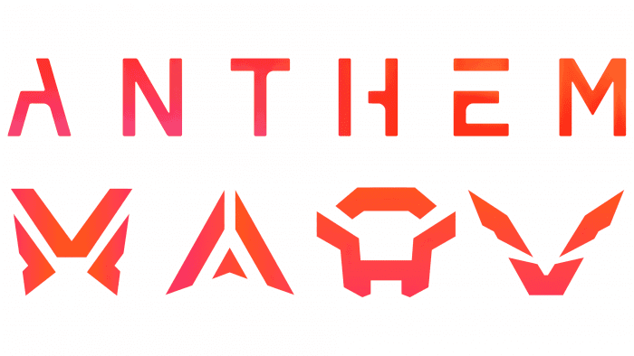
The creative teams at Electronic Arts and BioWare have taken a standard sans-serif font as their basis. They changed the look of the letters to give them a personal touch. The first thing that catches your eye is the voids in the place of some elements. A is missing half of the left diagonal, H is missing a portion of the horizontal stroke, and E is missing the vertical line’s top. But the human brain fills in the gaps and perceives the word as if everything is fine with it. Psychologists have given this phenomenon a separate term: gestalt. A similar technique is used in the Electronic Arts logo.
To make Anthem’s name legible, the designers increased the space between the letters and evenly spaced. They also rounded off the inner corners of the first, third, fourth, and fifth letters. This small detail emphasized the uniqueness of the lettering.
The color scheme of the logo matches a video game’s palette and contrasts sharply with other post-apocalyptic shooters’ familiar colors. The wordmark reflects the brightness of the adventure universe. The combination of orange, pink, and red hues makes the word stand out. The gradient looks appropriate because Anthem’s world is also quite colorful; also, the Electronic Arts team has connected microsites and trailers using color transitions. And since the logo is only used digitally, the designers didn’t have to adapt it for print.
FAQ
Is it still possible to play Anthem?
Yes, you can still play. Anthem is an online game, so you need an active internet connection. The game includes both single-player and multiplayer modes, allowing you to team up with others for missions and exploration.
The game has received updates and patches to improve gameplay and fix bugs. The servers are still running, letting players continue their adventures in the game’s sci-fi world.
To play, need the game installed on a supported platform like PlayStation 4, Xbox One, or PC. You need a PlayStation Plus or Xbox Live Gold subscription for consoles for online multiplayer.
Is Anthem online only?
Yes, it is an online-only game. Players need to be connected to the internet at all times to play. The game focuses on multiplayer gameplay, so you must connect to game servers continuously.
An active Xbox Live Gold or PlayStation Plus subscription is required for online multiplayer gaming and access to Anthem’s console features for Xbox and PlayStation players.
Anthem’s always-online requirement ensures seamless multiplayer interactions. Players can team up for missions and explore the game’s world together. This constant connection keeps the game world dynamic and full of other players, making the experience more engaging.
What does the fire represent in Anthem?
Fire in the game has both positive and negative meanings. It represents destruction and warmth, which ties into the game’s plot. A character named Prometheus found electricity and tried to return it to society. He was expelled for his efforts. This story mirrors the ancient Greek myth of Prometheus, who gave fire to humans.
Fire represents resilience and courage. Like the mythological Prometheus, who suffered to help humanity, characters in the game face dangers to make progress and protect their world. This makes fire a key symbol, showing the struggle between growth and potential harm.
What does the color white symbolize in Anthem?
In Anthem’s world, the color white is a deep symbol. It stands for purity and represents facelessness, lack of individuality, and the right to choose.
White symbolizes purity, reflecting order and harmony in the society shown in the game. This suggests a world where everyone is equal and there is peace.
At the same time, white highlights a darker aspect of the game’s world. It symbolizes facelessness and lack of individuality. In this society, people lose their identity and freedom. They are part of a collective whole without the ability to express unique personalities or make individual choices. This dual meaning of white shows the contrast within the game’s narrative.
