A&P’s logo is quite concise. This grocery supermarket decided not to experiment with its visual identity, limiting itself to a simple set of elements that made its logo recognizable. But the unique design, evident in the small details, gives it a certain zest.
A&P: Brand overview
A&P was an American grocery supermarket chain that went bankrupt in 2015, having stores in the United States and Canada. The full name of the company sounds grand enough – The Great Atlantic & Pacific Tea Company. But the company reached such a level under the leadership of J. Harford and his sons (1878-1917), who created a network of 16 thousand stores. In 1859, the history began with the sale of tea and coffee by mail (Gilman & Company), then 70 stores of George Gilman (Great American Tea Co.). The company got its current name in 1970, gradually shifting from selling tea to a wide range of products.
Meaning and History
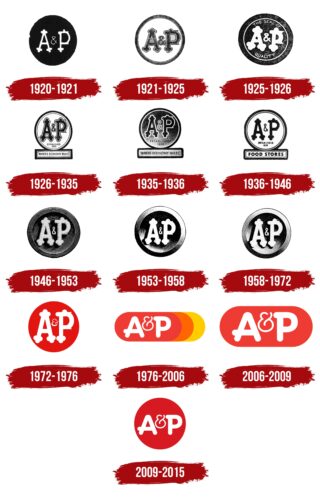
Over the years, the company has used many different emblems, each containing the A&P symbol in various interpretations, fonts, and elements that express the company’s values and goals. But despite the many updates over the years, the A&P emblem is fairly constant and concise. It is two letters with an ampersand on a rounded background.
What is A&P?
A major American food retailer that flourished from 1915-1975. One of the first grocery supermarkets in the country. Ceased to exist in 2015.
1920 – 1921
Great Atlantic & Pacific Tea Company used the A&P brand for some of its products. The packages of these products featured a logo in the form of a dark circle with light-colored lettering. The designers decorated the letters with semicircular elements resembling maces, and the letter “P” was supplemented with two protruding spikes. The ampersand had the form of a figure eight with crossing lines at the bottom. The stylish badge symbolized progressiveness, modernity, and innovation, which was important to A&P at the time.
1921 – 1925
This emblem appeared supposedly on September 1, 1921. The company’s initials were in a white circle with a layered ring border. The letters were dark with light outlines, and the black color was not uniform but with chaotic gray flecks. The designers balanced the thickness of all the elements of the inscription, adhering to the Art Nouveau style, which was popular from the late nineteenth century until World War I. It was characterized by elegance, organic forms, roundness of lines, and patterns inspired by nature. Semicircular protrusions and spikes, like the “A” and “P” glyphs, were one of the hallmarks of this design.
1925 – 1926
The company’s white initials were complemented by the phrase “THE SEAL OF QUALITY,” divided into two parts. The Great Atlantic & Pacific Tea Company was one of the first in the United States (as early as 1906) to use such a seal to show customers that its products were trustworthy. The lettering was in a dark circle and surrounded by a thin white ring.
1926 – 1935
The black inscription “A&P” inside a white circle with a dark outline was complemented by the phrase “ESTABLISHED 1859”. At the bottom was a rectangle with the phrase “WHERE ECONOMY RULES,” reflecting the company’s marketing strategy of selling goods at low prices. After all, A&P was one of the first retailers in the U.S. to use technological innovation to reduce the cost of goods without sacrificing quality.
1935 – 1936
The inside of the circle and rectangle became dark. The black brand name stood out only due to the wide white outlines. The year of the company’s foundation was increased.
1936 – 1946
Inside the white circle, the inscriptions “A&P” and “ESTABLISHED 1859” still remained. But in the lower rectangle appeared the phrase “FOOD STORES,” consisting of bold black letters without serifs.
1946 – 1953
The emblem resembled a copper seal. The circle had an interesting texture in the form of many concentric rings. At the same time, black shadows created the effect of three-dimensionality: it seemed that the figure had a three-dimensional rim, and the inscription inside was slightly raised above the plane. The twisted glyphs were simple, elegant, and easily recognizable.
1953 – 1958
The designers made the logo more contrasting: they carefully whitened the letters and darkened the shadows inside the circle. Such changes allowed to strengthen the visual depth and emphasize the effect of metallic shine. It gave the impression that the emblem falls on the bright light. This version appeared on April 23, 1953.
1958 – 1972
In July 1957, A&P buyers saw a new emblem. It differed from the previous one only by having fewer shadows and changing the gradient. This made the concentric rings more distinct.
1972 – 1976
The founder of the company passed away. Up to this point, Hartford had been running A&P under a partnership agreement. He purchased the chain and, six years later, at the age of 74, passed the business to his sons.
The new management wanted to bring a touch of freshness to the logo. The gloomy black background was removed and replaced with a bright and eye-catching red. It conveyed the idea of large-scale development and distribution and the desire for significance (from 1600 stores of his father’s Hartford Brothers grew to 16,000 outlets, taking a leading position among American stores and beginning to conquer Canada).
A round red sign was prominently displayed, encouraging shoppers to stop by the store.
1976 – 2006
By the 1970s, A&P had many more modern competitors, and the stores were losing customers. So, in 1975, the owners brought in outside help (Booz Allen Hamilton) and revamped the stores. This gave a temporary boost to growth.
The company’s management rebranded the company. The visual mark expanded the color scheme, got rid of the circle, a symbol of completeness, and got the idea of movement.
The new emblem is a triple oval (red, orange, yellow) with the same inscription but in a modern font. The figures were placed one after another, sequentially moving forward: orange – further than red, yellow – further than orange. This composition symbolized the renewal of the network:
- A bygone past with an aggressive distribution policy (red).
- Renovation of the chain’s premises made it friendlier and closer to customers (orange).
- New stores with Family Mart pharmacies (yellow).
Ampersand” has changed a bit and become reminiscent of a half-open kettle, from which steam comes out. This creates a sense of home and is an homage to the name of the Great Atlantic & Pacific Tea Company.
The company referred to the visual sign as a “sunrise.” But the change for the better was short-lived. Hartward’s descendants sold a stake in the company to the German retailer Tengelmann Group (1981).
2006 – 2009
A brief improvement under the new owner ended in decline. Hoping to save the brand, the Tengelmann Group (38.5%) shared ownership of the chain with Yucaipa (27.5%). The arrival of a major shareholder was reflected in the logo.
The sunrise idea was dropped. The logo was reduced to a single red oval, symbolizing the fervent desire to stay afloat and move forward. However, the color saturation was reduced to reflect the divestiture, the reduction in the number of stores nationwide, and the move from number one in the US to number 28.
2009 – 2015
In 2009, after the sale of the entire Canadian business, the visual mark was refreshed. The logo reverted back to its previous circular shape in hopes of replicating the heyday experienced by the Hartford family. The reduction in diameter symbolized the reduction in the number of stores. The deep red color, on the other hand, showed the concentration of forces for the future “spurt.”
However, there was an economic downturn in the country, and instead of development, A&P went bankrupt a year later (in 2010). Further ownership changes and little movement culminated in a second bankruptcy in 2015. All stores were closed and sold.
Font and Colors
Throughout its history, the company has stuck to the basic classic combinations:
- White and black. White sugar and black tea. Honest “white” prices without big markups and a wide selection of products worldwide. A powerful, reliable company.
- White and red. This combination was reminiscent of a road sign. As interpreted by supermarkets, it communicated, “Attention, fresh and safe products.” Love for what you do. Rapid development.
The first versions of the font used very interesting decorations in the form of trefoils at the ends of the letters. They resembled a Christian cross and foreshadowed the existence of the company for centuries, as it was believed that they denote the past, present, and future. Another interpretation of the three semicircles is the sides of the world. The United States is washed by three oceans: the Atlantic, Pacific, and Arctic. Two of them are crossed by ships delivering tea, coffee, and other products to the company’s stores.
Over time, the font of the logo became more modern. It began to resemble the Banda Nova XBold typeface with unusual protrusions on the left side, indicating the company’s significant past and symbolizing the trail that leads forward.
A&P Logo Color Codes:
- Red: Hex Code: #D71921; RGB: (215, 25, 33); CMYK: (0, 88, 85, 16); Pantone: PMS 185 C
FAQ
What does the acronym A&E stand for?
A&E stands for Arts & Entertainment Network. Founded in 1984, it was a joint effort between ABC, Hearst Corporation, and NBC.
Is A&P based in the United States?
The Great Atlantic & Pacific Tea Company, often abbreviated as A&P, was a food retailer with a presence in the United States and Canada. Formed in 1859, the company was originally called Great American Tea Co. and was the brainchild of George F. Gilman and George Huntington Hartford.
What industry does A&P belong to?
Great Atlantic & Pacific Tea Company primarily operated various grocery store chains. It was one of the leading grocery retailers in the United States and had additional operations in Ontario, Canada. The company operated stores under various names, such as A&P, Waldbaum’s, and Food Emporium.
