Founded in 2007 by Eddy Pintacsi in Pleasanton, CA, Apex Wheels has become a leader in lightweight performance wheels. Originally focused on BMW race cars, Apex now offers products for a range of performance cars, including Acura, Alfa Romeo, Honda, Nissan, and Porsche. Apex is dedicated to providing genuine performance products with a team of over 30 members across nine states and a warehouse with over 15,000 wheels. Recently, the company introduced a new brand identity, designed by San Francisco-based Gold Front, to reflect its commitment to real performance and stand out in a crowded market.
Apex Wheels’ challenge was to address the market’s “Great Knowledge Void,” where many brands made false performance claims and sold subpar products. Apex aimed to reinforce its promise of delivering “Real Performance” by educating customers about the true value of high-quality performance wheels.
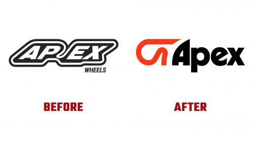
The new logo departs from the old design, which had a race track incorporated into the name with a slanted style that divided the letters awkwardly. The new logo features a modern icon mirroring the “A” in the wordmark, inspired by 1970s typography like ITC typefaces. The wordmark has bold, arching curves that evoke speed and performance.
Though not prominently featured, the icon blends with the wordmark’s aesthetic. Some may find the combination slightly awkward, but it adds a unique element to the overall design. The wordmark is visually appealing and has a textured look that fits together.
The color palette uses high-contrast colors that catch the eye, particularly on the race track. It includes deep blacks, rich oranges, and tans, enhancing the vintage aesthetic while maintaining a modern edge. These colors are used consistently across various brand materials, creating a cohesive visual identity.
Typography plays a significant role in the new brand identity. Eliott Grunewald’s Herbus typeface is used, which pays homage to Herb Lubalin’s iconic typefaces. This 1970s vintage aesthetic gives the brand a unique look. The typography is integrated with dynamic motion elements, making it feel contemporary while retaining its retro charm.
The new identity is versatile, impactful, and used across in-store displays, packaging, digital media, and marketing materials. The logo and typography look strong in advertising mock-ups with moody black, orange, and tan themes. However, the vintage aesthetic can sometimes appear mismatched when applied to standard car photography, highlighting the need for a stronger art direction.
Supporting graphics and tiny type add an interesting element to the design, reminiscent of the late 1990s and early 2000s aesthetics. However, the new brand identity struggles to consistently use the race track icon versus the wordmark alone, pointing to a need for clearer guidelines.
Apex Wheels’ new brand identity communicates its commitment to real performance and sets it apart from competitors. The bold logo, dynamic typography, and vibrant color palette create a strong brand presence. This rebrand enhances Apex’s market position and reinforces its dedication to providing genuine, high-quality performance wheels. As the company continues to grow and innovate, its new identity will shape customer perceptions and drive the brand forward in the performance wheel industry.


