ArcelorMittal: Brand overview
ArcelorMittal, a renowned global steel manufacturer, has a rich history. This multinational corporation, created in 2006 through the merger of Arcelor and Mittal Steel Company, is based in Luxembourg. In 2021, its annual production exceeded 97 million tons of crude steel, confirming ArcelorMittal’s influential role in the global steel sector.
ArcelorMittal’s history dates back to the 18th century when the first steel mills appeared in Europe. By the 19th century, large-scale industrialization led to an extraordinary growth in steel production. By the twentieth century, steel had become one of the main components of construction, used to make bridges, buildings, and various critical infrastructure facilities.
The beginning of the 21st century saw a significant shift in the steel sector, with large corporations absorbing smaller companies. The formation of ArcelorMittal in 2006 as a result of the merger of Arcelor and Mittal Steel Company marked the birth of the world’s largest steel producer and symbolized a new stage in the development of the steel industry.
ArcelorMittal, one of the world’s leading steel companies, has a broad reach, impacting millions of people in more than 60 countries. Its more than 60,000 employees produce steel for a variety of applications, including construction, automotive, and infrastructure. ArcelorMittal has a prominent position in the global steel sector, offering innovative products and services to consumers around the world.
The establishment of steelworks in Europe in the 18th century marked the beginning of a watershed in industrial production.
In the 19th century, the massive industrialization of steel production fundamentally changed the functionality of society, enabling significant infrastructure projects and the emergence of powerful technologies.
In the early 1900s, steel became an integral part of the construction of buildings, bridges, and other critical infrastructure. By 1999, the visionary Lakshmi Mittal founded Mittal Steel Company.
In 2006, the merger of Arcelor and Mittal Steel Company created a major company in the steel sector, ArcelorMittal.
In 2012, ArcelorMittal embarked on an ambitious project by acquiring Essar Steel, a prominent player in the steel sector.
By 2021, ArcelorMittal has reached a significant milestone of producing 97 million tons of crude steel.
Meaning and History
What is ArcelorMittal?
ArcelorMittal has become a dominant force in the global steel sector, arising from the merger of two leading steel companies in 2006. With a staggering annual production of 88 million metric tons, the company has taken its place among the world’s leading steel suppliers, supplying high-quality steel products to a wide range of industries from its central base in Luxembourg, Luxembourg.
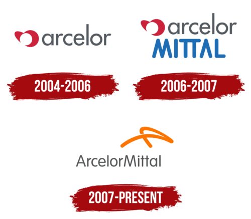
2004 – 2006
2006 – 2007
2007 – today
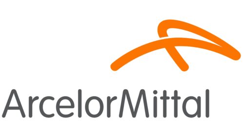
The ArcelorMittal logo was designed by Future Brand. The stripe is thought to contain the capital letters “A” and “M,” but they are quite hard to distinguish. The symbol is abstract rather than alphabetic. It symbolizes flexibility because steel can take any shape when cast. The molten metal takes on the same orange hue as the curved line on the emblem. This bright color is associated with prosperity and energy. It is balanced by the gray company name. The text is in a font from the VAG Rounded family, which has a uniform stroke thickness and rounded corners.
The logo looks like a quick drawing that someone turned into art. That sinuous orange line resembles molten metal, ready to turn into anything. The orange color here isn’t just bright; it’s like an explosion of energy in a jar. The name of the company is made in cold gray tones as if it says: “We can handle it; we are resilient.” The rounded font is like the cherry on top, giving everything a friendly and approachable look.
ArcelorMittal color codes
| Safety Orange | Hex color: | #fc7500 |
|---|---|---|
| RGB: | 252 117 0 | |
| CMYK: | 0 54 100 1 | |
| Pantone: | PMS Bright Orange C |
| Davy’s Gray | Hex color: | #555658 |
|---|---|---|
| RGB: | 85 86 88 | |
| CMYK: | 3 2 0 65 | |
| Pantone: | PMS Cool Gray 11 C |
