


![]() Argos Logo PNG
Argos Logo PNG
Shopping from A to Z is symbolized by the Argos logo. The emblem’s color scheme hints at discounts and hot offers; it is enough to follow a simple sequence of actions. Customers are waiting for pleasant emotions and fast service.
Richard Tompkins launched Green Shield Stamps in 1958 after studying the S&H Green Stamps model in Chicago. Customers collected stamps at partner stores such as Tesco and exchanged them for goods. When Tesco abandoned the scheme in the 1970s, the business lost its core driver.
In November 1972, Tompkins registered Argos as a separate venture. In 1973, the first stores opened alongside a large catalog distribution. The model relied on showrooms, order forms, and warehouse pickup, reducing costs compared to chains like Woolworths. Demand exceeded expectations. By October 1973, reports highlighted queues and supply strain. Expansion accelerated, supported by assets transferred from Green Shield, including logistics infrastructure.
In May 1979, Argos was sold to BAT Industries for £32 million. Growth continued with new categories such as Elizabeth Duke jewelry. By the late 1980s, the network surpassed 300 stores. In April 1990, Argos was listed independently on the London Stock Exchange. By 1997, revenue reached £1.5 billion. The company entered the Irish market in 1996 and was acquired by GUS plc in 1998, expanding to about 800 stores.
Online operations began in 2000 and became a major revenue channel by 2001. In 2006, Argos joined the Home Retail Group following a restructuring. Attempts to enter India and China between 2007 and 2013 were later abandoned. In 2016, Sainsbury’s acquired Home Retail Group for £1.4 billion, outbidding Steinhoff International. Integration shifted Argos toward in-store concessions within Sainsbury’s locations. In 2020, most standalone Argos stores were closed, with operations consolidated into supermarket formats.
Meaning and History
![]()
The company has gone through several stages of development and has built a successful network of general-purpose goods across websites and city stores. It had 883 retail outlets that generated revenue from a huge customer base. In real stores, 29 million people bought goods each year, and about 1 billion bought them online. Franchising abroad was also well developed.
This continued until the brand’s parent company ceded it to Sainsbury, which owns a chain of supermarkets in Britain. After a £ 1.4bn takeover, Argos has become one of the branded divisions. This happened in the fall of 2016. But the event did not affect the identity in any way, as the new owner kept the old logo to maintain recognition among regular customers.
At the end of 2020, Argos was shaken by a flawed Sainsbury marketing strategy. As a result, the owner announced that 420 retail outlets would be liquidated by 2024. However, 120 stores that were temporarily closed due to the pandemic will never reopen. That is, in 2021, a well-known retail brand is facing a crisis that threatens to cost it its widely recognized emblem. And there are three of them in his career.
What is Argos?
Argos is a British retailer of clothing, footwear, food, sports equipment, jewelry, toys, furniture, appliances, and much more. It operates both in physical stores and on online platforms where customers can order goods for delivery. The company was launched in 1972 by Richard Tompkins and was acquired by the supermarket chain Sainsbury’s in 2016. The word “Argos” originates from the name of an ancient Greek city.
1973 – 1999
![]()
The debut logo is based on the trade network’s name. The word “Argos” is in a non-standard font with a connecting line at the bottom. It goes through “g” and links the first “A” to the final “s.” All characters are serifs, surrounded by a double border – white and black stripes.
1999 – 2010
![]()
In the version approved in 1999, the designers divided the bottom line into two unequal parts. The long segment is the leg “A”; the short is the letter “s” without rounding. They also shortened the “g,” removed the outline and serifs, and made the lettering clean and smooth. Only the red color remained from the previous design.
2010 – today
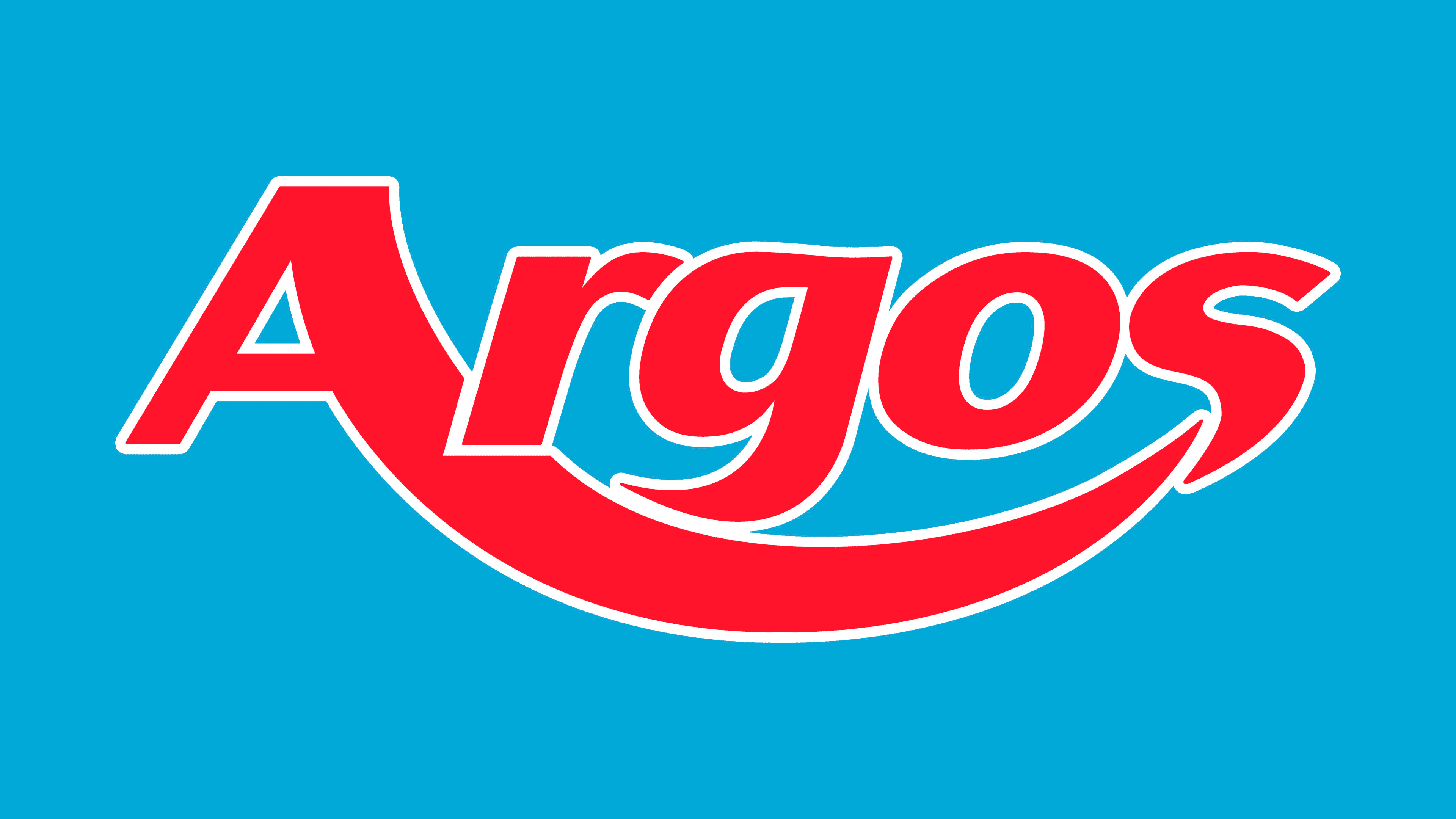
![]()
The current emblem is simplified. Everything is laconic in it – both graphics and text. From the connecting line’s image in the form of an inverted arch, an arc in the form of a smile remained, and from the wide signs, narrow symbols. The consulting design agency Brand Union (the author of the modern logo) implemented an inversion: it changed the colors of the letters and the background. Therefore, now the white text is positioned on the red rectangle.
Since 2010, the brand has been undergoing rebranding. In January, she received a new logo and a relaunch of a major online store. The remaining alterations will take several more years and, according to preliminary estimates, will cost 70 million pounds sterling. However, the updated emblem differs from the previous ones: it is much simpler and less distinctive.
Font and Colors
Although there is a font named Argos, it has nothing to do with the trademark logo’s typeface. In the first two versions, an individual inscription, in the current one, a modification of the Magnum Sans Pro Bold Italic sans serif.
The palette did not change (except for shades) and always consisted of red and white. At first, the letters were colored, and the font was light, but now it’s the opposite.