


![]() Asana Logo PNG
Asana Logo PNG
The ability to rise above problems, communicate, and work in a team is encoded in the symbols of the Asana logo. The image shows the birth of an ideal solution when efforts are combined. The emblem is a sample of the technologies that guard democracy and equality.
Dustin Moskovitz and Justin Rosenstein met at Facebook, where they observed inefficiencies in team coordination. An internal tool called Tasks helped track responsibilities but was never released publicly. On October 3, 2008, Moskovitz left Facebook and co-founded Asana with Rosenstein. The product aimed to structure work processes and reduce fragmentation in task management.
From 2008 to 2011, development remained private. In April 2009, the company raised $1.2 million, followed by a $9 million round in November, backed by Peter Thiel and Sean Parker. In November 2011, Asana launched publicly with free access for teams of up to 30 users, relying on internal adoption within organizations. Paid plans followed in April 2012, alongside a $28 million Series B round led by Founders Fund.
In 2014, Asana introduced the Work Graph, which maps relationships among tasks, projects, and teams. Competitors like Trello, later acquired by Atlassian in 2017, focused on simpler board-based workflows. By 2016, over 100,000 organizations were paying customers. In 2018, a $50 million Series D round was led by Generation Investment Management. The same year, Asana repositioned itself as a work management platform.
By 2019, total funding reached about $213 million. Revenue for fiscal 2020 grew to $142 million, up 86% year over year. On September 30, 2020, Asana went public on the New York Stock Exchange via direct listing, similar to Spotify. Valuation reached about $5.5 billion. In June 2025, Moskovitz stepped down as CEO, with Dan Rogers taking the role and Moskovitz becoming chairman.
Meaning and History
![]()
The Asana app has evolved thanks to the healthy self-criticism of Rosenstein and Moskovitz. The developers realized that users disliked the interface’s dullness, so they decided to redesign it. But in the process, difficulties arose: a new illustration style, improved typography, and a light color palette had to match the logo. Until 2015, it looked like a simple lowercase letter “a” in blue with three vertically spaced pale green dots.
The company owners did not know what this graphic composition meant: either a list of items or a listing. Therefore, it was not at all difficult to abandon the brand name. In a meeting hosted by Amanda’s chief designer, the team decided to change their perception of the Asana brand, though the outcome was hazy. They began a cautious experiment, could not resist, and did colossal work on the corporate style.
Moving Brands helped identify key landmarks to embody a new philosophy in visual identity. They proposed several variants of the logo, one of which looked like three dots arranged in a triangle. Two more versions contained other elements, but they were not iconic for Asana.

It took just over a month to learn all the concepts. Designers watched their development, viewed them in different contexts, and still returned to iconic points. They had to adjust the spacing between the circles and polish the wordmark to give the letters the desired shape. A whole system was created in the final stage, including a new color scheme and interface fonts.
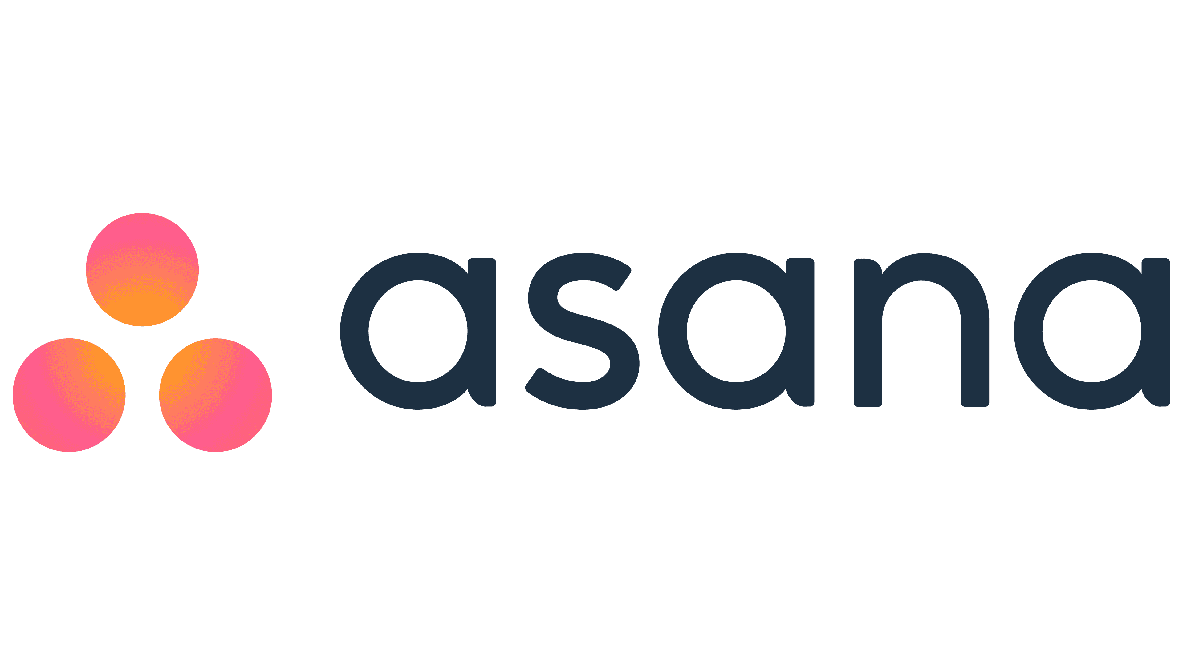
The Asana logo has two versions: vertical and horizontal. They differ only in the arrangement of the pink circles that give the brand a personality. These geometric shapes are the evolution of the classic dots that once complemented the letter “a.” But now they are not lined up; they are opposite each other, symbolizing close interaction.
In turn, the triangular shape looks like an upward-pointing arrow, a capital “A,” and the mathematical sign “therefore.” True, not all company representatives liked this emblem. Some thought it looked like the outline of the Predator laser sight from a sci-fi action movie.
What is Asana?
This is the company’s common name; it was founded in the American city of San Francisco in 2008, and its main product is project management software. Software development helps teams assign and track tasks and provides several other useful features.
2008 – 2015
![]()
The Asana logo consists of two parts: verbal and graphic. The name is located first. It occupies the vast majority of the emblem because it consists of large, bold letters. They have rounded corners, smooth transitions, and smooth sides. All glyphs are lowercase and aquamarine.
Moreover, “n” resembles an inverted bracket or a high arch because it lacks a side stroke. To the right of the inscription are three green dots. They are lined up vertically and do not go beyond the word “asana,” remaining slightly below it.
2015 – today
![]()
After changing the concept, the company adopted a new logo. Everything has changed, both in typography and in images. As a result, a different font appeared, also lowercase and rounded, but with an identical side element for all letters. This helped to unify the inscription visually. Three dots precede the company name. Now they are large, pink, and folded into a triangle shape. As conceived by the Moving Brands studio staff, they symbolize an upward-pointing arrow indicating the brand’s growing possibilities.
Font and Colors
The typography and color of the logo convey a sense of balance. The font was developed in close collaboration between Moving Brands and Asana’s corporate designers. The improved lettering is the cornerstone of the brand’s modern identity: it comprises proportional circular letters with distinctive edge cuts.
![]()
The palette is very different from before. Until 2015, the program used a blue-green icon, which bored many. To become a “multi-colored narwhal,” as designer Micah Daigle put it, she switched to bright pinks and yellows. This color combination was inspired by a concept created during the sketching experiment. The bright gradient symbolizes the flow of energy. It is balanced by the word “asana,” written in dark blue (# 283343) letters.
FAQ
What is the concept of the Asana logo?
The logo features three dots arranged in a triangular pattern, forming an abstract ‘A.’ This design symbolizes the limitless potential of people working together, highlighting collaboration and unity.
The logo’s simplicity and elegance convey clarity and focus, aligning with Asana’s goal of helping teams stay organized and efficient. The abstract ‘A’ represents the company’s name and suggests connectivity and collective effort.
What is the purpose of the Asana brand?
The company aims to help humanity thrive by enabling teams to work together effortlessly. The mission is to improve collaboration and productivity, making it easier for teams to reach their goals.
In a world that can feel negative, the company focuses on the positive impact of teamwork and efficiency. The brand provides tools to streamline workflows and enhance communication, helping teams tackle challenges and achieve more. Fostering a collaborative environment aims to contribute to a better world through improved teamwork and productivity.
What does the Asana logo mean?
The logo has three pink circles with an orange gradient, symbolizing connection, cohesion, and cooperation. These circles form a triangle, representing the capital “A” for Asana.
The design reflects balance and harmony, aligning with Asana’s goal of creating a seamless and productive work environment. The circles represent unity and teamwork, while the triangle highlights structure and organization.
What font is the Asana logo?
The logo features three circles and a wordmark in lowercase, rounded sans-serif letters. Corporate designers and experts from Moving Brands created the custom font for the name “Asana.”
This custom font emphasizes simplicity, clarity, and modern design. The rounded letters convey approachability and friendliness, aligning with Asana’s mission to enhance teamwork and productivity. The unique wordmark design complements the logo, creating a cohesive and recognizable brand identity.