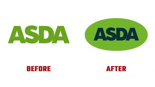
Asda, a leading UK retailer, has launched a new rebranding initiative. This includes a refreshed logo and a complete overhaul of its visual identity to modernize the brand and enhance its customer experience.
The new logo Asda still features the company name but now has a softer, more engaging design. The previous stark, corporate lettering is replaced with an oval-encased version, making the brand feel more approachable and friendly. The vibrant green-on-green color scheme adds liveliness, aligning with Asda’s mission to create a pleasant shopping environment.
This updated logo reflects a dedication to quality and affordability. The oval shape symbolizes inclusivity and unity, emphasizing a focus on being customer-centric.
A notable aspect of rebranding is introducing a new custom-type family designed by Colophon Foundry. This includes three styles: Display, Subline, and Text, each serving different communication needs. The Display style stands out with its unicase format, adding uniqueness and playfulness to headlines. Inspired by traditional hand-painted grocer signage, this typeface brings the brand a nostalgic yet modern feel. The numerals in the Display style are particularly striking, and the British Pound sign is praised for its appealing design.
The rebranding introduces a vibrant color palette, infusing energy and warmth into identity. This new scheme is prominently used in promotional stickers and price tags. The stickers highlight deals and promotions, adding a dynamic element to in-store and online communications. The eye-catching price tags, red and white combination, and subtle arrow designs reinforce the focus on competitive pricing.
Clever and engaging copywriting is another feature of the rebranding. Puns and playful language connect with customers on a personal level. Slogans like “Romaine calm” add humor and relatability, enhancing the shopping experience.
This new approach aims to make Asda’s messaging more memorable and build a stronger emotional connection with customers. By infusing humor and creativity, Asda differentiates itself from other retailers and fosters customer loyalty.
The rebranding reflects its evolution as a top UK retailer. The updated visual identity is versatile and effective across all touchpoints, including supercentres, superstores, supermarkets, Living stores, petrol stations, and online services. This rebranding effort aligns with the company’s goal of providing a cohesive and enjoyable shopping experience, whether in-store or online.


