 Ashley Logo PNG
Thoughts of a cozy home fill the Ashley Furniture HomeStore logo. With the company’s furniture, each client can create their dream interior. The emblem invites you to look into the store and choose the right product.
Ashley Furniture began in 1945, when Carlyle Weinberger founded Ashley Furniture Corporation in Chicago. The company sold wooden occasional furniture, including coffee tables, stands, and dressers, to local retailers. At first, it did not manufacture its own products, which kept the model lean but limited cost control.
In 1970, Weinberger invested in Arcadia Furniture, a small factory in Arcadia, Wisconsin, led by Ronald Wanek. The plant employed about 35 people and produced tables and cabinet-style stands for national distribution. In 1976, Wanek and investors took control of Ashley Furniture, while Arcadia handled production and Ashley focused on sales.
The two businesses merged in 1982 as Ashley Furniture Industries, Inc., moving headquarters from Chicago to Arcadia. Annual sales reached $12 million, but the company faced higher transport costs as much of the U.S. furniture industry shifted toward North Carolina. Ashley answered with tight production control and later built a broader supply chain.
In 1989, Todd Wanek moved to Asia to lead Ashley Furniture Industries Taiwan, building manufacturing ties in China, Malaysia, Thailand, and Indonesia. In 1996, the company added leather upholstery, and Todd became president and COO. The first Ashley Furniture HomeStore opened in Anchorage in 1997 under a licensed-dealer model, helping the brand expand its retail coverage while competing with Ethan Allen, Rooms To Go, and IKEA. In 2002, Todd Wanek became CEO, while Ronald Wanek moved to chairman.
Meaning and History
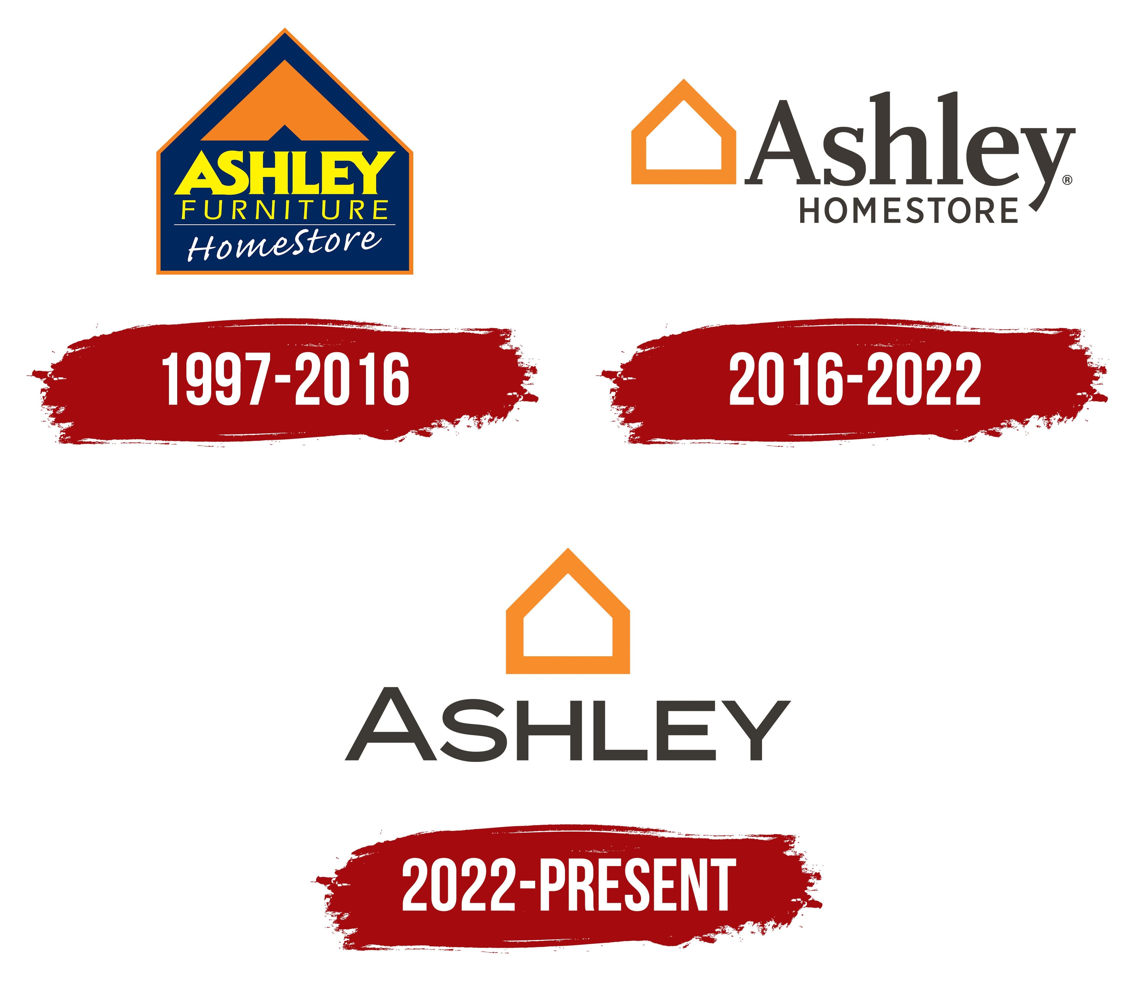
The home furnishings sales leader began in Alaska’s most populous city, Anchorage, in 1997. Ronald Wanek came up with the idea of opening stores to expand sales. Americans appreciated the furniture, which drove rapid store growth. In 4 years (2003-2007), the company tripled its outlets from 100 to 300. And over the next 15 years, it added another 700 locations.
Ashley Homestore doesn’t update its visual sign often. Perhaps it doesn’t want to interfere with the business of 1,000 partners representing the company in different countries, or maybe it’s already in a leadership position and the visual mark is well recognized. The logo has been updated once during its existence. Both logo versions are associated with Ashley Furniture Industries, the parent firm.
What is Ashley Furniture HomeStore?
This is a furniture retailer of the American company Ashley Furniture. It is headquartered in Florida. Branches are open in 123 countries. They sell about 30 million pieces of furniture worth $10 billion annually.
1997 – 2016

The visual centers on the word Home. The logo is shaped like a house silhouette. Since the company sells home furnishings, customers come to furnish their homes.
Ashley’s house symbolizes coziness and home. It immediately evokes warm associations and encourages purchases. It reflects the company’s main message: to please customers and make creating a home environment a pleasant task.
The inscriptions were set against a dark blue background on three “floors” within the silhouette. At the top, in big letters, is the word Ashley; below, in thinner, smaller letters, is furniture. On the first floor, under the line, the HomeStore inscription appears slightly askew, written in chalk. This presentation evoked a handwritten shopping list at home.
White symbolized the beginning. It signaled a new proposal from a large, well-known company. The background reinforced the sense of novelty and became lighter toward the lower part of the inscription.
Inside the roof is a large orange corner that repeats the visor’s contours. The same corner is the parent company’s symbol. Its upper placement symbolizes protection and existence under the main company’s wing.
The emblem became as concise and clear as possible.
2016 – 2022
By 2016, Ashley had expanded to several continents and opened its first store in Russia. The company needed a new, more modern logo suitable for a large firm.
The updated version kept its connection to the furniture company owner and followed the same style as hers. Ashley Furniture Industries’ orange roof in front of the company name matches the orange silhouette of the house by Ashley HomeStore. Then comes the large company name, and underneath in smaller letters, the essence of the offering, HomeStore.
Visually, the logo has stretched out, and the letters are longer. The inscription extends beyond the house, just as the company has spread around the world, not just the U.S.
The schematic image of the house symbolizes home products. With no doors or windows, a single continuous line evokes protection and completeness.
2022 – today

Font and Colors

The main colors of the “Ashley Homestore” logo are dark blue, black, and orange.
- Dark blue represents reliability, tranquility, and a great experience.
- Orange represents warmth and homeliness.
- Black represents confidence in the future and a strong foundation.
Ashley’s main lettering font is FF Scala Pro Bold.