


![]() Ask.com Logo PNG
Ask.com Logo PNG
The Ask logo is also a URL and includes the platform’s domain name. This design is a well-thought-out marketing technique because it is an Internet resource and the fastest way to access it, given the exact “coordinates” in advance.
In 1996, Garrett Gruener and David Warthen founded Ask Jeeves in Berkeley, California, at a time when search engines such as AltaVista, Yahoo, and Excite relied heavily on keyword guessing. Engineer Gary Chevsky wrote the original search algorithm, while Warthen, Chevsky, and Justin Grant helped build the site. The idea was to let users type normal English questions instead of search commands.
The name came from P. G. Wodehouse’s character Reginald Jeeves, a polished British valet who solved problems for his employer. The cartoon butler became the face of the service. Ask Jeeves opened to the public in April 1997 and grew fast. It handled 300,000 queries a day in October 1998, 1,000,000 by May 1999, and 2,000,000 by October 1999. Its June 1999 IPO was among the strongest U.S. market debuts of that period.
Ask Jeeves bought Direct Hit Technologies in 2000 and Teoma in 2001, gaining ExpertRank, a search technology based on expert communities. But Google, founded by Larry Page and Sergey Brin, changed the market with PageRank. By 2003-2004, Google had taken the lead from Yahoo, AltaVista, and Ask Jeeves. In 2005, Barry Diller’s InterActiveCorp bought Ask Jeeves for $1.85 billion.
Jeeves retired in 2005, and in 2006, the company became Ask.com. It kept its own crawler for a time and added Binoculars, a page preview tool. In 2010, Ask.com stopped using its own search technology and moved to Google results, returning to a question-and-answer format. Jeeves briefly returned on uk.ask.com in 2009, while IAC closed Ask.com’s search business in 2025.
Meaning and History
![]()
Ask was based on the original information retrieval algorithm embedded in the AskJeeves.com platform. At the same time, Jeeves was a personal assistant who could answer any question. It was the name of a literary character – a valet who worked for Bertie Wooster from the works of P. G. Wodehouse.
In 2006, the owners dropped the second part of the name, removed the prefix, and launched an actual search engine. It still helps Internet users get answers to questions asked in a natural, mundane way. It also focuses on keywords generated by the dictionary, math, and conversion algorithms. The company launched the beta version in the spring of 1997 and the full version in the fall. In this form, the search service existed until 2001, when Teoma bought it.
Four years later, the service became the property of its current owner, IAC (InterActiveCorp). He converted the site to a new format and removed the Jeeves add-on, keeping the web resource in its original form as questions and answers. This decision was made in 2010 due to intense market competition. Each major step in their work on Ask was reflected in their visual identity. However, it has changed little: the adjustments were minor. There are four logos in its history, but they are all of the same type.
What is Ask?
Ask is a search engine that answers both free-form questions and keyword queries. It was implemented in 1996 by Garrett Gruener and David Warthen based on an algorithm developed by Gary Chevsky. The platform was originally called AskJeeves.com, which the owners changed to the modern version in 2006. InterActiveCorp now owns the service.
1996 – 1999
![]()
The logo that set the style for all subsequent signs belongs to that time. Its distinguishing features were a red background oval and bold white letters. In this version, the geometric figure was placed horizontally, and the symbols within it were disproportionate and appeared randomly arranged. And the thing is, each of them had its own configuration; there was no graphic consistency between them. For example, “K” had a distinct rightward slant, “S” looked incomplete due to short curves, and “A” looked like an Indian wigwam. In addition, the inscription contained an exclamation mark of the same color as the title. It had a diamond-shaped “dot” at the bottom and a diagonally cut top.
1999 – 2007
![]()
After the redesign, the emblem did not change much outwardly, but certain differences emerged that were not immediately apparent. In particular, the designers converted the font to lowercase (except for the first letter), turned the red oval diagonally, and placed the inscription at an angle. They also added a black shadow at the right and bottom of the white signs to make the inscription more expressive, clearer, and voluminous. The oval also had a shadow, but it was gray. Another innovation addressed the form of printed characters: the developers unified them by removing the incorrect style. The tops of “A” and “k” touched the edge of the red background and even slightly went beyond it. At the bottom of the oval in white space was the site’s domain name “.com.” It was done in black grotesque.
2007 – 2010
![]()
In 2007, the Ask logo was given a glossy, bulging look with highlights and a gradient. The designers removed all even shadows, leaving only their blurry outlines, so the dark areas under the letters appeared to be shadows cast by the objects above. They shortened the letters “A” and “k” so that their tops did not extend beyond the oval. And the left side of the base was lighter than the right, as evidenced by the scarlet color and white highlights. The inscription at the bottom, denoting the domain name, has become thinner.
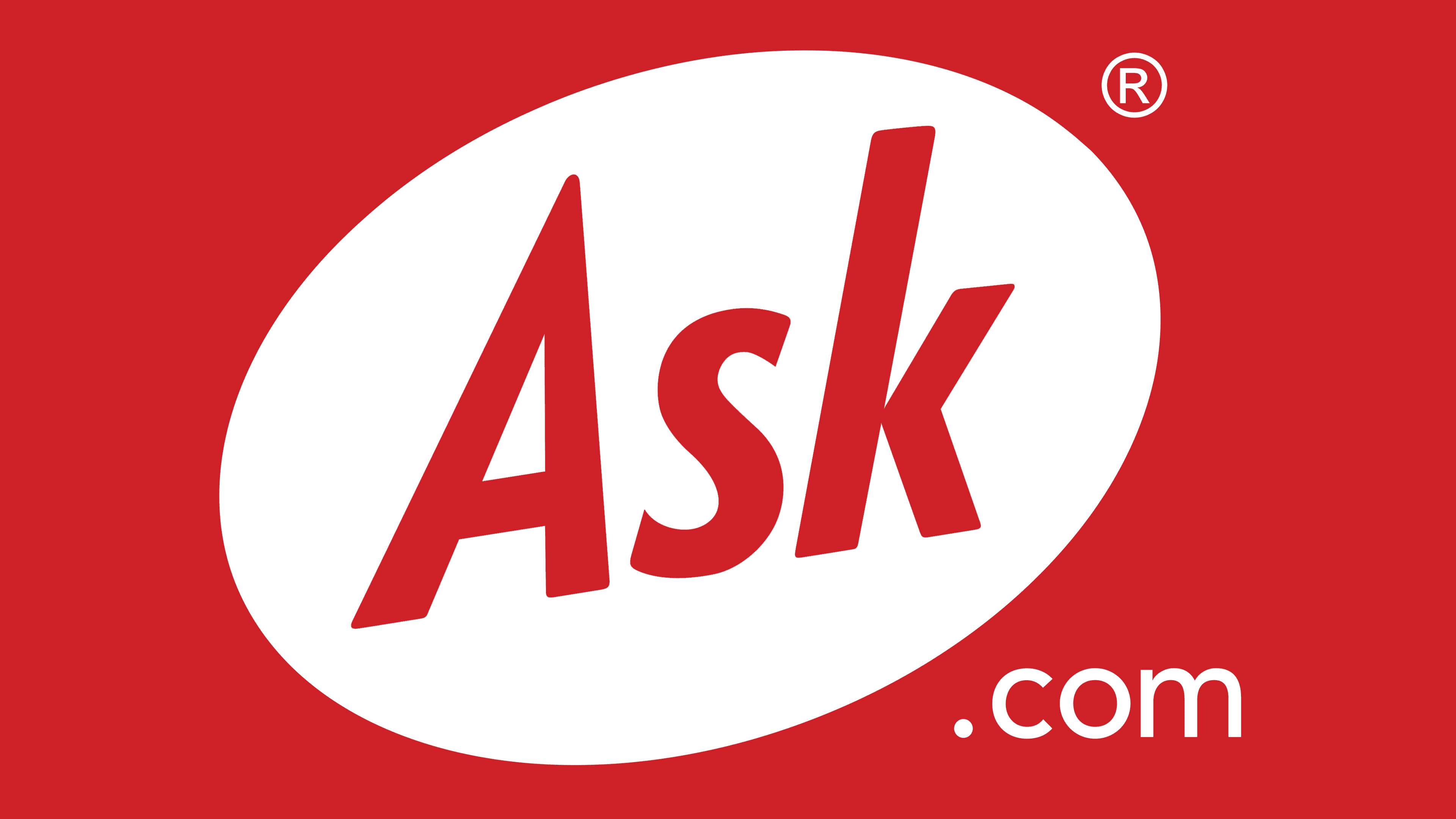
2010 – present
![]()
The Ask logo has gained a two-dimensional, plane-like quality due to the fashion trend. Moreover, this is not only a trend but also a practical innovation that allows you to see the logo on any media, from electronic to advertising. In this regard, it has been simplified: no shadows, no highlights, and no gradient. Now the entire oval is painted in the same red tint, and the letters are not blacked out. The extra “.com” particle at the bottom right of the oval is light gray.
Font and Colors
A key feature of the Ask brand’s visual identity is the oval. It is painted red and is located diagonally, so the inscription inside is angled as well. The main modification concerned the letters, which have changed a lot by now. They have gone from disproportionate signs to geometrically even symbols.
The logo’s basis is a typeface as close as possible to Richmond Medium Italic. It is designed in the spirit of the underground style of such personalities as Dwiggins Metro, Jakob Erbar, and Edward Johnston. Its closest free counterpart is the Open Sans Bold Italic Font, designed by Steve Matteson. Ask’s corporate palette includes the three most common colors: black, white, and red.