


 ASOS Logo PNG
The ASOS logo is simple yet expressive, emphasizing the image of a large retailer with a wide range of products. The minimalist design symbolizes the service’s simplicity and usability, making shopping easy and enjoyable.
ASOS began with an unexpected retail insight. In 1999, Nick Robertson and Quentin Griffiths were running Entertainment Marketing, a company that placed brands in films and television. After hearing that NBC had received 4,000 calls from Friends viewers asking about a floor lamp seen on screen, they saw a market for products linked to popular culture.
On June 3, 2000, Robertson, Griffiths, Andrew Regan, and Deborah Thorpe founded AsSeenOnScreen.com. The idea was direct: track items from films and TV shows, find the originals or close alternatives, and sell them online. One early hit was a wallet inspired by Pulp Fiction and Samuel L. Jackson’s character. In 2001, the company was listed on AIM, and in 2002, its name was shortened to ASOS. In 2003, the holding company became ASOS plc.
The business soon moved beyond screen replicas. Sales data showed that customers were more interested in fashion than props, and Robertson shifted the company toward clothing. In 2004, ASOS reported its first profit, nearly doubled sales, and launched its own women’s line. In 2005, buyer Lorri Penn joined Philip Green’s Arcadia Group, strengthening the fashion direction. In 2006, ASOS opened sites for the United States, France, Germany, and Australia.
Growth continued with setbacks. A 2010 fire destroyed about 20% of the stock at the Barnsley warehouse. Still, ASOS recovered and became Europe’s largest online clothing retailer in 2011. Revenue reached £2.3 billion by 2018, with 22 million active customers. In 2021, ASOS bought Topshop, Topman, Miss Selfridge, and HIIT from Arcadia Group for £265 million. The deal later proved disappointing: ASOS posted a loss of about £300 million in 2023, and in 2024, it sold 75% of Topshop and Topman to Bestseller.
Meaning and History
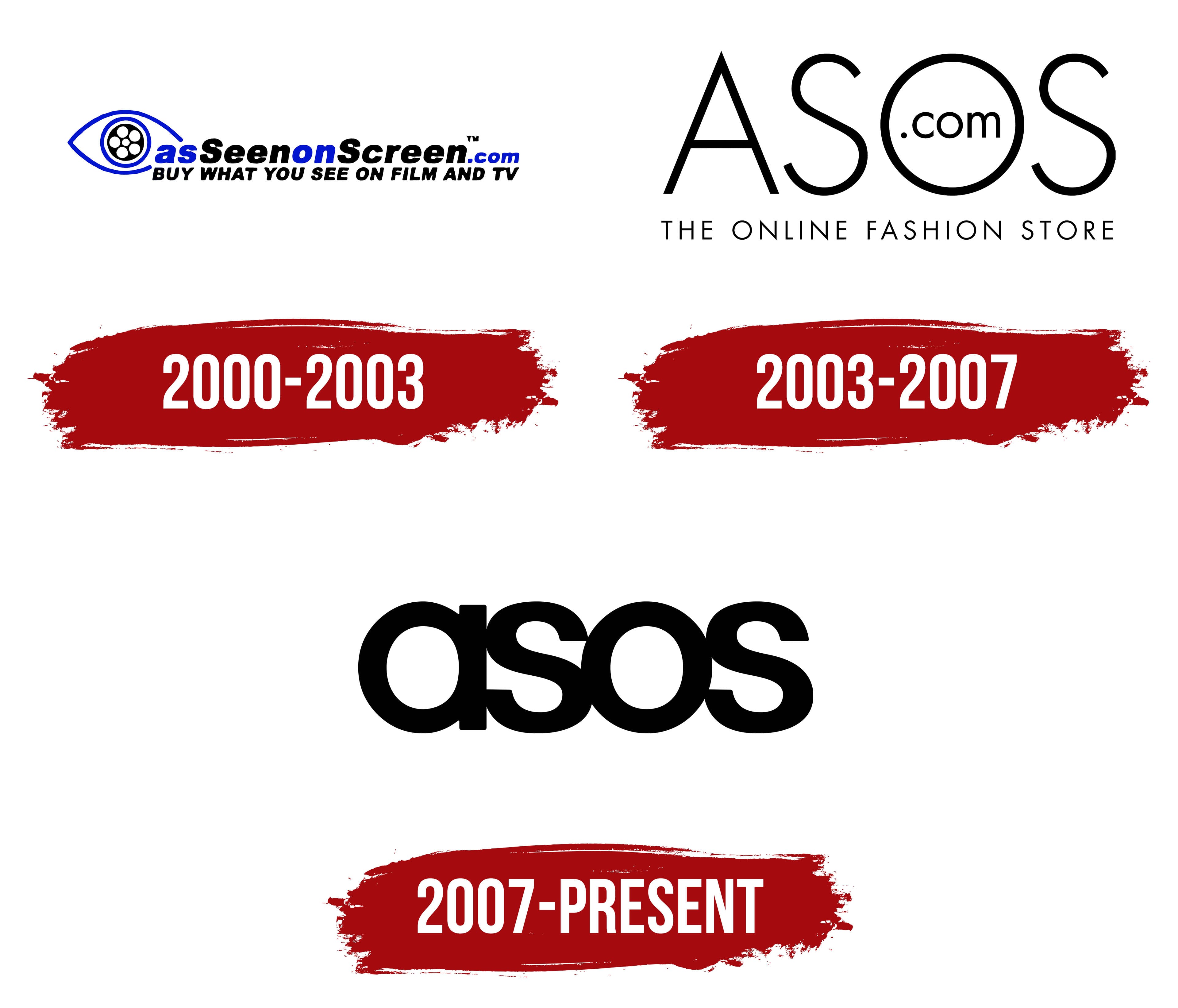
The logo is based on the store’s original concept of selling products made popular by showing them on TV models and actors. This idea has been reflected in different variations of the emblem throughout its evolution. The main characteristic of logos is their compactness, which is important when placed on web pages. Eventually, the logo was reduced to a minimalist design, leaving only four characters.
What is ASOS?
ASOS is a London-based online clothing and cosmetics retailer with revenues of around €4 million, operating in the Americas, Europe, Asia, and Australia. The company’s main warehouse is located in Barnsley, and its headquarters are in Middlesex.
As part of its marketing campaigns, ASOS collaborates with influencers and celebrities, attracting young people and offering fashionable novelties reflecting the latest trends. In addition, ASOS offers customers free delivery and returns, which simplifies the shopping process and adds convenience.
2000 – 2003

The first logo visually reflected the company’s motto. The logo featured an eye with the advertising phrase “As Seen On Screen” emerging from it. Inside the pupil is a reel of film, and the words of the subsequent inscription are connected, representing an unfolding movie.
For clarity, the words “As” and “On” are in blue, while “Seen” and “Screen” are in black. Below is an additional inscription: “buy what you see in the movies or on TV.” With this composition, the owners wanted to emphasize that the store offers fashionable, up-to-date clothing similar to that worn in popular movies and TV shows. This approach was based on young people’s desire to imitate their idols.
This phrase also became the site’s name, as reflected in the logo by adding “.com.”
2003 – 2007
2007 – today
Subsequently, the name As Seen On Screen was shortened to an acronym (2003), which formed the basis of the updated logo. It still conveys the original message of stylish clothing.
The letters in the inscription, compared to previous logos, have become denser and larger. This reflects the company’s growth and expansion of its product line (the update was due to the addition of menswear).
The reduction to four letters, without further explanation, is a testament to the platform’s popularity. Now, ASOS is not just a website name but has become a widely recognized clothing brand that needs no deciphering.
The lack of a capital letter shifts the focus from the retailer to the many brands featured in the store.
Font and Colors
The logo is black, which symbolizes global sales, the retailer’s scale, and the impressive turnover of goods (about 4,000 new offers appear on the site every week). The black color harmoniously pairs with clothes in any shade and with the brands represented on the platform, which is important for creating a balanced image of the online store.
The logo’s font is Marlin Sans Bold, with a denser character spacing to make the lettering more compact. This reflects the variety of products available on one online platform.