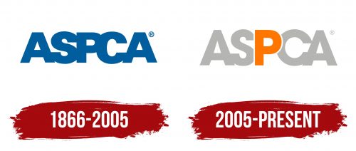
The ASPCA logo emphasizes the uniqueness of our animal companions and focuses on human responsibility for animals. The emblem indicates that the organization aims to prevent mistreatment rather than deal with their consequences.
ASPCA: Brand overview
| Founded: | April 10, 1866 |
| Headquarters: | New York City, U.S. |
| Website: | aspca.org |
Meaning and History
The organization’s emblems are simple, primarily consisting of letter combinations. Minimal attention is given to their design. Interestingly, the logo doesn’t use drawings or images of animals, even though it would seem fitting. The primary emphasis is on the dedicated work and actions of humans. The 2005 rebranding updated the logo to contemporary standards and infused it with additional meaning.
What is ASPCA?
It is the American Society for the Prevention of Cruelty to Animals. Henry Bergh dedicated his life to the cause after witnessing numerous instances of cruelty while in Europe. The organization advocates for humane treatment, establishes and supports veterinary clinics, and promotes laws against animal abuse.
1866 – 2005
The organization’s logo consists of five large blue letters interconnected. The abbreviation is a shorthand for the full title “American Society for the Prevention of Cruelty to Animals.”
The capital letters emphasize the gravity of the issue the society confronts. Their size conveys dedication. For instance, the movement’s founder worked at the ASPCA voluntarily, donating his money until he received a significant donation of $100,000.
The interlinking of the letters carries a special meaning:
- People must unite in the fight against injustice.
- The society provides protection and support to both animals and their owners.
The wording seems like a protective barrier formed by activists. It represents hours of hard work, protest actions, and rescue efforts. Over 1 million individuals volunteer and assist at ASPCA.
2005 – today
In 2005, the staff was deployed to the Gulf of Mexico to rescue animals post-hurricanes. The new emblem crafted after that features light-colored initials of the abbreviation. A prominent bright orange “P” with a broad white outline is brought to the forefront.
The play of colors describes the joy of rescue. The light background and outline symbolize a fresh start. For the evacuated animals, safe shelters were established where they began a new chapter of their lives.
The letter R emphasizes “Prevention,” highlighting the movement’s primary objective – to prevent cruelty, violence, and other unlawful actions. The organization designs effective measures that should be consistent throughout the US territory. The letter also hints at the word “Pets,” showing that pets are at the core of the organization’s concerns.
Font and Colors
The main shades used in ASPCA logos are blue, white, and orange.
- Blue symbolizes the law. ASPCA operates on the legal foundation of the Cruelty Prevention Act of 1866. The organization methodically lobbies for crucial resolutions and laws protecting pets’ rights.
- White and light gray represent safety and medical assistance. The company opens veterinary clinics, promoting using X-ray, ultrasound, anesthesia, and other advanced medical technologies for animals.
- Orange signifies the need for gentle care and nurturing. For over 100 years, the organization managed a system of animal shelters and continues to enhance the “adoption” of abandoned pets and reduce euthanasia, implying the joy animals bring.
The font of the inscription is bold and impressive, showcasing the determination to protect and seek justice. The company has a response team that goes to places where animal rights are massively ignored, rescuing the affected animals. After ASPCA’s proactive efforts, the number of individuals held accountable for cruelty increased by 200%.


