One of the oldest Canadian sports organizations – Athletics Canada (Ottawa, Ontario), the national athletics association, announced another change of its identity. The organization has been leading its history since 1884, has undergone many changes during this time, including names, the last of which has remained unchanged for 31 years. The main task of the organization is to help achieve high athletic success in Paralympic athletics, cross-country running, and highway running at all levels.
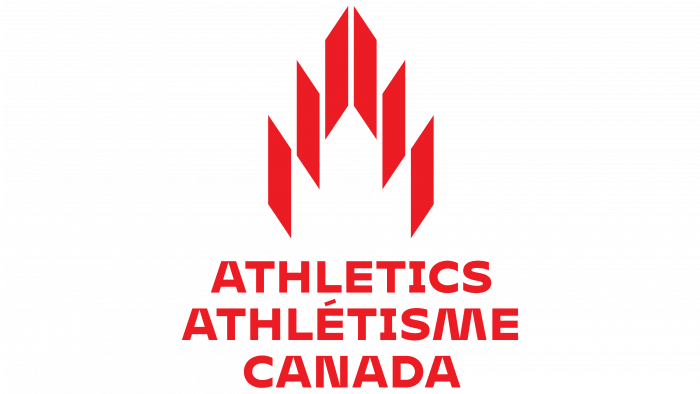
To carry out the rebranding, the association invited One Twenty Three West specialists from Vancouver, who developed a new logo that harmoniously combines modern design, a direct connection with the company’s long history and its direction of activity. The traditionally used bright red color in the image of the symbol of Canada – the maple leaf, was applied uniformly for all elements of the logo, including the font.
The sheet remained the main symbol of the company, but its image was stylized and, in its form and execution, acquired a variety of semantic shades. The original creative approach of the developer allowed to creation of a unique figure. It resembles the contours of a torch – a symbol of the pursuit of excellence. The Blazing Flame is the central figure showing passion and hope, aspiration and enlightenment. At the same time, each element of the sign resembles runners’ tracks, and their symmetrical inclination of the edges symbolizes movement, speed, body inclination when overcoming sharp turns. Each track is located symmetrically to each other with a clear separation between each other. The middle of the sign is left without filling. And if you look closely at it, you can see the contours of the maple leaf – the main symbol of Canada. In addition, the sign also resembles a stylized letter, which was used for this particular sport at the first Olympic Games in Ancient Greece.
Such a wide variety of semantic loads that the developers could reflect in one element of the logo is admirable. Not being a reflection of any of them, a specific sign allows one to perceive at once all the tasks and goals of the association, its orientation and idea, spirit and aspirations, belonging to a country, and attitude to a specific sport.


